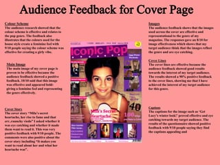
1. Colour Scheme
The audience research showed that the
colour scheme is effective and relates to
the pop genre. The feedback also
illustrates that the colours used for the
house style create a feminine feel with
9/10 people saying the colour scheme was
effective for creating a girly vibe.
Images
The audience feedback shows that the images
used across the cover are effective and
representational to the genre of my
magazine. The responses gave an 8/10 for
image effectiveness which shows that my
target audience think that the images reflect
the genre and are eye catching.
Main Image
The main image of my cover page is
proven to be effective because the
audience feedback showed a positive
feedback. 10/10 said that this image
was effective and appeared bold-
giving a feminine feel and representing
the genre effectively.
Cover Lines
The cover lines are effective because the
audience feedback showed good results
towards the interest of my target audience.
The results showed a 90% positive feedback
to the cover lines, showing me that I have
achieved the interest of my target audience
for this genre.
Cover Story
The cover story “Mila’s secret
heartache, her rise to fame and that
err..raunchy viedo” I asked whether it
was eye catching and whether it made
them want to read it. This was very
positive feedback with 9/10 people. The
comments were also positive about the
cover story including “It makes you
want to read about her and what her
heartache was”.
Captions
The captions for the image such as ‘Get
Lucy’s winter look!’ proved effective and eye
catching towards my target audience. The
results of the questionnaire showed positive
feedback with 9/10 people saying they find
the captions appealing and
2. Images
The images used on this page include a
collage of four main images and then a
smaller image on the bottom right hand side.
The responses to the images were positive
with 8/10 responses being positive. The
written notes left included “the images are
very feminine and they strongly connote
Pop”.
Heading
The heading along the top of this contents
page includes a black background, the
magazines name and extra details like the
date of this issue and the website address.
This is eye catching according to results
from the questionnaire receiving 9/10
results showing positive feedback to the
heading on this page.
Content Boxes
These boxes contain the content of the
magazine and separate the content page into
sections which makes it easier to read an
simpler to find pages because it creates
shortcuts. The question given was “Do you
think that the content boxes are effective for
separating the content into sections?” These
responses were positive with 100% positive
feedback.
Titles of the Content Boxes
I titled the content boxes with titles that
would appeal to my key demographic.
These are “YouYouYou”, “Interviews”
and “In this Issue”. This break down the
content and put each feature and article
into a section. The titles were popular
with 9/10 positive feedback. The only
nagative was that there is no flexibility to
a male audience with these titles such as
“YouYouYou”.
Use of Colour
The use of colour here is pink, black and
white. These are the main house style
colours used across this magazine apart
from purple which dominated the cover
page. The amount of varied colours was
decreased on the contents page so that the
attention was on the images and content
boxes. This proved 100% effective with
the audience of the questionnaire.
Image Captions
The captions on the images are to show
the readers what the main articles are
about. This shows my audience whether
this is an article that appeals to them or
whether it is something they wouldn’t
read. The captions proved explanatory
because the results from the questionnaire
showed 8/10 positive feedback.
3. Main Image
The main image is supposed to connote a feminine
feel, and a fun, girly vibe. This proved effective
because the response from the questionnaire was
10/10.
Heading
The heading question read “Do you think this
heading is appealing? Does it make you want to
read the feature?” The response to this was
positive with 9/10 saying yes they would read it.
One comment left read “yes. Because you want to
know what was too raunchy.”
Pull Quotes
The pull quotes are there to intrigue the reader into
reading the feature by taking the dramatic quotes
from the star. My two quotes read “I’m aiming for
an Oscar, a Grammy and to be prime minister”
and “There was too much pressure, it was crazy!”
the first quote is used to confuse readers, because
she is a model and the second is to intrigue them.
These quotes proved effective because the
feedback showed 9/10 positive results.
Feature
The feature text of this is an interview between the
interviewer and the star. The audience feedback
for the quality of the feature was 10/10.
Comments left were “it is well constructed” and
“it is generally interesting”.
Smaller Images
The smaller images question read “Do you think these images are effective for
looking like they are taken at different stages through her life?” The responses from
the questionnaire were positive with 9/10 saying yes. These images were actually
taken a few years before the main image was taken so they work well for this
purpose.