
Recommended
More Related Content
What's hot
What's hot (17)
Viewers also liked
Similar to Analysisofmagazines 1
Similar to Analysisofmagazines 1 (20)
Recently uploaded
Recently uploaded (20)
Analysisofmagazines 1
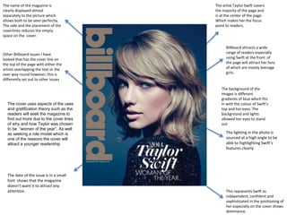
- 1. The name of the magazine is clearly displayed almost separately to the picture which allows both to be seen perfectly. The side and the placement of the coverlines reduces the empty space on the cover. Other Billboard issues I have looked that has the cover line on the top of the page with either the artists overlapping the text or the over way round however, this is differently set out to other issues The artist Taylor Swift covers the majority of the page and is at the center of the page. Which makes her the focus point to readers. Billboard attracts a wide range of readers especially using Swift at the front of the page will attract her fans of which are mostly teenage girls. The cover uses aspects of the uses and gratification theory such as the readers will seek the magazine to find out more due to the cover lines of why and how Taylor was chosen to be “women of the year”. As well as seeking a role model which is one of the reasons the cover will attract a younger readership The date of the issue is in a small font shows that the magazine doesn’t want it to attract any attention. This represents Swift as independent, confident and sophisticated in the positioning of her especially on the cover shows dominance. The background of the images is different gradients of blue which fits in with the colour of Swift’s top and her eyes. The background and lights allowed her eyes to stand out The lighting in the photo is sourced at a high angle to be able to highlighting Swift’s features clearly.
- 2. Main coverline stands out creates the idea that it is cool and an issue not to be missed and may be signifying the view that pop punk is fun and creative. A lot of text in a space along with multiple segments makes it look messy and cluttered. This avoids the cover having a main focus Text of the bands on the featured cover band members are not very visible. It looks very childish because of the animated/cartoon work which could ultimately turn older people away from the magazine as the aspects draw most focus. The target audience is 15- mid 20’s who like rock music and also, who are looking for the entertainment . The band members look fun loving as they pose with the cartoon food. These people could be seen as entertaining which is why someone might pick up the magazine. Using a tags such as ‘plus’ and ‘also inside’ may attract readers as it leads them to believe they are getting alot for their money which will persuade people that might not normally buy the magazine, purchase it. Masthead is over covered by the photo this may suggest that the magazine can be identified other ways such as the style of the cover could be an continuing feature. The genre of the magazine is a rock/pop- punk music magazine which is displayed by the name of the magazine ‘Rocksound’ . The coverlines also, display that the magazine is conforming to the ideas that rock/ pop punk is becom There is a lot of vibrant and bright colours used to of which subverts the idea of the music genre being represented as dark. This also, contrasts with the clothes that the artist are wearing which makes the other aspects of the cover look mismatched. I personally would not use the that cartoon aspects of my cover and also, would not use a large amount of text to avoid to look clustered.
- 3. Masthead is clear and stands out from the background. Enabling readers to see it. Alternative Press target audience is teenagers and adults around the ages of 16-30 years old. Limited colours that work together well and makes the different information stand out from each other with the use of differing colour and this also, matches the artist’s clothing which makes them blend into the cover well. I would use a similar format in which there is little in terms of text which keeps it clear and not cluttered also, gives little information enticing the reader to read inside. The main coverline over shadows the other coverline to show the reader who is on the front of the magazine attracting fans and enticing people who are interested in them. The use of a cliché in quotations on the cover leaves the reader with questions about the interview and also, demonstrates the bands relationship is strong. Clear use of alliteration to catch the attention of the reader and it is short giving them an idea of what the band is about. The band is being represented as mysterious because they are wear balaclavas which means they only features shown are eyes and mouth which could denotate that they want to hide their identity or could the concept of their music along with the coverlines show that they want to ‘ hide’ the world and they are clearly looking into the camera shows a sense of confidence however their poses juxtapose this displaying vulnerability. The coverlines are separate from the masthead which makes the text clear and easy to see at the bottom right hand corner to also, always focus to be on the photo and the writing. Tag lines are used to show the reader that they are getting a lot of content for their money and also, things that they wont find anywhere else
- 4. Referring to other forms of media in the form of converging which will appeal to different audiences. Rolling Stones target audience are 15-24 years olds who enjoy listening music and reading about a variety of things. The photo is taken as a mid close up from the chest upwards with the model is at the center of the composition being the focus as well as positioning the photo to have a clear open space for coverlines Troye Sivan is being presented as being ambitious as suggested in the coverline. His name is a main coverline to inform people of who her and attract fans that may not usually and in a bold font to highlight this. The choices in clothing which is a blue top with a denim presents him as casual and in fashion which would make him be seen relatable and looked up to by a teen readers. The outfit also, enhances the colour of his eyes. Dateline Clear masthead which easily stands out, the ‘Rolling Stone ‘ masthead is always red creating an iconic and recognisable image for the readers. The genre of the magazine is current music and also, interested in other medias as the coverlines include a lot of artist from different genres of music and also, with the addition of the best of 2015 albums and other media that readers may use as a form of entertainment to pass time. A features I may use in my magazine is the use of a colour scheme which makes the information all fit together nicely.