
Recommended
More Related Content
What's hot
What's hot (19)
Viewers also liked
Viewers also liked (19)
Similar to Representations
Similar to Representations (20)
Recently uploaded
Recently uploaded (20)
Representations
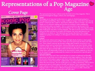
- 1. The representation of age is shown across the front cover of my magazine. This is portrayed through the images, colours, font and language. Images The images are of „pop stars‟ in the street, in a gym, at a festival and posing for a photographer (modelling). This is a range of different images which shows that the age group is varied and they could be interested in different aspects of music. The close up images are of celebrities smiling and therefore by looking at others smiling this subconsciously makes you happier- this is a representation of age because of the welcoming, happy vibe that you get from looking at the cover page showing that young girls would prefer this than a serious magazine. The Mise En Scene used in these images such as the little red dress is very girly and feminine, but sweet and innocent, not rebellious or too short etc. This represents age because this shows that younger children are going to be reading it, as this appeals to them rather than controversial clothing. Colours The house style colours used range from a really light shade of pink to a dark purple. The colours are kept in between this colour spectrum apart from the black and white text. These colours represent age because younger girls would be attracted to very feminine colour such as fuchsia pink, whereas older girls accept more flexible colours such as red, blue etc. This also shows representation of age because it shows that not girls under the age of around eight would read this because they would not receive the colour effect and additionally would not be interested in a music magazine as they are not developed enough to understand the content or be interested in a specific genre. Font and language The font used is sans serif, I have used this font to connote an informal and friendly appearance on the front cover as this appeals to the target audience. I have also made the fnt bold which makes it appear more black which takes the informal look further and connotes a more relaxed look. Additionally, I have used informal language to mirror the sans serif font. The use of full stops act as a filler or hesitation, which reflects spontaneous speech which appears friendly and informal. This is appealing to the target audience as this is what they are used to and they will find familiar. I have used language such as “err” which is colloquial language because it is a filler which also imitates spontaneous Speech which gives the same effect.
- 2. Images The images are all of girls on the front cover which is going to appeal to females because of their identity. These are „Pop stars‟ and therefore younger girls look at them as role models or inspirations. This is dependant on how you address the pop star- younger girls will find them appealing if they are represented as their „friend‟. The images are of women with a „celebrity status‟ which would appeal to the target audience because most young girls have a strong interest in their „idols‟ and their favourite artists. This therefore would be in their interest and it therefore is a representation of gender because boys are not usually looking for idols in celebrity women. The images are of bright colours also which would appeal to females because this subconsciously makes you happier as bright colours are associated with summer etc., whereas boys would not be bothered by the used colours in images. Colours The use of colours across the cover page are feminine colours such as the use of pinks and purples. These connote a strong girly vibe and therefore this shows this is a feminine magazine and the content is related to the interests of girls. The use of bright colours across the images such as the bright red dress, the bright blue outfits and the edited pink effect on the „Instagram‟- is appealing to females because they are attracted to brighter colours rather than dull colours. The pink effect on the image of Instagram is for the effect of a filter used on the social networking site, Instagram which has a larger fan base of females. So therefore this cover line “unseen Instagram snaps” is a representation of gender based on the fan base of the networking site. Font and Language The font used is Sans serif and therefore is informal which connoted a friendliness across the cover which appeals to my target gender because this makes them feel more involved because the cover page is welcoming, The language used such as “Get Lucy‟s winter look!” Represents gender because only girls would be interested in what „Lucy‟ wears and how to achieve her look. This cover line is dressed up to look like this „pop star‟ is the readers friend and wants to give them her fashion advice. The use of a prosodic feature which connotes raise in pitch and tone which shows this is an exciting article on „Lucy‟.
- 3. The age is represented through the use of; cover lines, colours, font and language. Cover Lines This is appealing to my target age group because the cover lines are within the interest of my target audience such as “The Good The Bad The Ugly- The outfits worn by music stars”. This is a feature that my target audience would be interested because of their age group. This age group is exposed to celebrity status and a lot of young girls this age look at celebrities as icons and/or role models. Therefore this age group will be interested in looking at images of pop stars and judging their fashion style. This age group are also interested in what looks good and the latest trending styles. Colours The colours used follow on from the cover page forming a consistent house style. The colours represent age because they are appealing to girly girls around the age from ten to sixteen. The house style colours consist of black, white, pink and lilac, I did not use purple in this contents page because of the age group, I did not want to make the page too dark. The colour pink is predominant on this page and the other dominant colour is black. The colour pink connotes passion and love and the deeper the pink the more energetic vibe is taken from the design. This is appropriate for this age group because they are attracted to bright, energetic colours an the use of a colour representing „love‟ is appropriate in this case because the „pop stars‟ are dressed up to act as the readers friends and therefore the pink enhances this which makes the reader feel more involved. Font and Language The font used is sans serif which keeps a consistent house style going throughout the magazine. This is to keep an informal tone going throughout the magazine and this also creates a friendly front which entices the reader. This is a representation of age because it makes the reader feel more involved and this is what this age group like to feel when reading. I have kept the text in bold to heighten the informal tone. The language used in informal to mirror the font. I have used slang such as “OMG” this is the dialect that this age group use and therefore this is what they can relate to. It is colloquial language which is how friends speak to one another and this is what makes the reader particularly this age group feel involved when reading it.
- 4. The contents page has many representations of gender. This is through the use of the colour scheme, font and language, cover lines and images. Colour The colours across the contents page are very feminine and consist of pink, lilac, white and black. These are feminine colours but also the black and white keep it subtle and keeps the writing clear against the white. This is a representation of gender because the colours appeal to girls and don‟t appeal to boys. Font and Language The font used is representational to gender because it is appealing to my target genderfemales because they like to feel relaxed while reading and feel involved in the magazine. The sans serif keeps the magazine informal and friendly which the target gender find appealing. The language is informal and colloquial which is not representational to the gender because colloquial language is appealing to both genders. Cover lines The cover lines are representational to gender because they are features that only girls would want to read such as “Get Rosie‟s look” only girls are interested in achieving the style of their role model celebrity. The target audience age group are interested in achieving the style of their role model celebrity. The target audience ge group are interested in this because they are exposed to the latest fashions and therefore like to learn about styles that celebrities are wearing. Images The images are represented of gender because they are mainly of girls dressed up to look like your friends such as the image on the bottom right of „The Sundays‟. The are smiling at the reader and therefore look friendly and welcoming and this is to make them look like they are friends with the reader which makes them look like they are friends with the reader which makes the audience feel more involved. Additionally, the other images such as „10 songs to get Happy‟ is an image of a girl pulling a funny face and swinging on a swing which connotes a relaxed, silliness. The model is mirroring the behaviour of an average teenage girl and therefore these images are representational to the gender because young girls like to feel involved with the music stars and feel like they know them.
- 5. The double page spread represents age in different features across the page. These consist of; the main image, the pull quotes, the smaller images, colour scheme, and font and language. Main Image The main image represents age- this is through the representation of a down to earth, happy, friendly girl. The target audience like to see this as at this age, they like to feel involved and enjoy feeling like they are „friends with the star featured. The use of the wolf hat, shows that she is funny and silly- this is representational of age because she is messing around with the „photography crew‟ and this mirrors the behaviour of a young teen and therefore the age group like to see this. Pull Quotes The pull quotes used are very representational to age- this is because they jump out to the age group from around 11- 18. These are quotes that particularly if you were into this artist, would make you want to read this feature because of the curiosity to learn more about why “modelling wasn‟t enough for her”. The pull quote “There was too much pressure. It was crazy!” Really makes you want to know what was too much pressure and why whatever she is on about was crazy. The curiosity would be strong for fans but also these pull quotes would appeal to those who do not know this artist. This is because it shows that she has suffered with pressure and a hectic lifestyle from Smaller Images the quote “There was too much pressure, it was crazy” which would The smaller images o this page are representational to age because the target age make you want to know what she had to deal with. group would be interested to see her outside of her stage body and see behind the scenes into her normal life surrounded by friends and family. This is exciting for this Colour Scheme age group to be able to see into the celebrities private life- because it feels like the star The colour scheme consists of black, white and pink. This is a very is sharing with the reader their reserved life as a normal person and allowing them to flexible colour scheme from the black and white but because this is used for background and text, the pink that is highlighted in areas see them as a regular person like the reader. makes the house style become feminine. The colour pink is bright and Font & Language therefore catches the attention of the audience because of the age The font is sans serif throughout which the age group find appealing because it connotes informality and gives a relaxed tone. The text is not in bold this time as it group, bright colours will still be eye catching to them. The colour pink is attractive to girls because it symbolises passion and love, so therefore gives a seriousness about the feature but this is powered down with the therefore it mirrors their feelings towards this artist. bold, sans serif font used for the pull quotes, title and stand first. The captions to the smaller images are in a different colour to the feature text to represent the contrast between the seriousness of her stage life, and then the relaxed friendly feel of her in her private life.
- 6. Content of Feature The content of the in-depth feature is very representational to gender because it talks about Mila‟s life and her modelling career- which only females would be interested in reading. It also covers her singing career and how she founded this profession, this consists of her aspirations and her taking time out. The overall interview is very feminine because of the content- she talks about her modelling career which only girls would be interested in learning about. She then tries to sell her new album „Queen Devigne‟ which is targeted at young girls because she is seen as a role model and her music is pop genre, which like Rita Ora and Beyoncé is aimed at girls because they appear a strong character, who are feminists and believe who run the world? Girls! So, the content of this feature strongly appeals to females. The representation of gender is apparent through the use of the main image, colour scheme, smaller images, and content of the feature. Main Image The use of the main image shows the audience that this feature is intended for females because of the use of pink on the lips and clothing. It also shows that it is a representation of gender because of the relaxed, silly vibe that you get from the image- this is what young girls like to see because it makes them feel like they are similar to the star or visa versa. The main image is also representational to gender because the star is dressed up to look like the readers friend and therefore by the use of the wolf hat and the appropriate clothing- the star is made to look like a role model for this age group and gender and this is why it is representational to the gender because only girls would appreciate this. Colour Scheme The colour scheme is very representational to gender because of the strong fluency of the pink. The black and white make it flexible to either gender but then the dominant colour of pink turns it feminine and creates a girly feel to the feature. The pink is eye catching to females because of the stereotypical „pink is a girl colour‟ and therefore by using pink, this shouts out to girls that this magazine is intended for young females. Smaller Images The two smaller images are representational to gender because they are images which feature only girls. This is to show that this star is a happy, fun person because she is laughing with her friends. This is representational to gender because they are dressed up to appear as the readers friend and role models to the reader. They are dressed appropriately and are happy people.