
Recommended
More Related Content
What's hot
What's hot (17)
Viewers also liked
Viewers also liked (16)
Similar to Magazine research
Similar to Magazine research (20)
Recently uploaded
Recently uploaded (20)
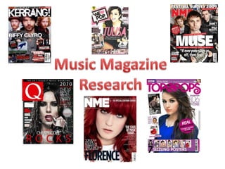
Magazine research
- 2. Focal Point A medium shot of Adele is used as the main focus of the front cover as she is seen to be very powerful, giving the impression this is a powerful magazine. Adele is well known so it will have a bigger target audience than a magazine for just girls or boys. Adele is looking straight at us which engages the reader and with her hand on her lips she is present in a sexual way to appeal to the male readers. Sell lines. The sell lines are used to advertise what is in the magazine. With the front cover being a photo of Adele drawing in more feminine readers, having well known male signers will help to advertise the male audience too. Inserts An insert to show it is the 300th issue makes this a special edition and helps to draw the target audience in as it will encourage them to buy it. This insert is gold which matches her golden hair to tie the whole front cover in. Masthead The logo is on a red background which shows power, passion and love. This helps to engage the target audience in and are drawn into the magazine through the colour used. Costume Adele is wearing a purple top and has her nails purple too. Purple is the colour of royalty which helps to emphasise the point of this being a powerful magazine.
- 3. Masthead The consist colour of black, white and red helps to make the magazine to stay minimal and clean. The colours are very masculine and gives it a sophistication feel compared to a girly magazine which has more girly colours of pink and yellow. Having Q in the corner of every heading on the page it gives the magazine a consist and familiar feel. Image A close up shot of Adele is used as the main imagine on the contents page as the magazine is trying to encourage the reader to read that page. As the contents page is the second page if the target audience flicks through the magazine they will be encouraged to read the magazine if they are a fan of Adele. With the target audience being most men Adele is looking straight at the audience which can be seen as sexual and will appeal to men. Column A long column is used to show what page things are on. Having a straight long column which looks very neat and together adds the feel of sophistication. This will appeal to the target audience as they will be mostly middle aged men. The consistency of the masculine colours also runs through into the column which creates the familiar feel to the magazine. Review Having a review on the contents page makes the magazine appear important and adds to the sophistication. Through using famous people to do the review it attracts their target audience to the contents page and to read it instead of just trying to find a page number.
- 4. Heading Through using the heading ‘The most exciting people in music’ makes the reader think this is an exciting article to read. This will help to draw their target audience in as most of them will be middle aged men who are interested in more sophisticated singers rather than singers like ‘Justin Bieber’ who would fit a more girly target audience. Watermark All of Qs double page spreads have the first letter of the artists name watermarked in red. The red watermark does not cover too much of the writing so it is still visible too read. The red letter adds a sense of power to the person as the colour red is seen to be very powerful. It is also a very masculine colour and the masculine feel runs thought the magazine which empathises there male target audience. Image An image of Jay Z takes up the whole space of one A4 side with the contrast colours of red and blue. The colours are used because the quote ‘Better red than dead’ was said by Jay Z. Blue is seen as very calm colour which is contrasted because when we think of death we associate the colour red because of blood. So to say that it is better to be red than dead and use the blue to symbolise the death is a contrast that most will not be used too. This will help to keep the reader interested as it is something new. Quote Quotes are used to draw the reader in as they can quickly read the quote and decided if they will find this article interesting. This is why they use the quote that covers the main topic of the article and the one they believe their target audience will find the most interesting. ‘Noel Gallagher’ is mentioned in this quote and the target audience will know noel which will encourage them to read this article as they will want to know what Jay z means.
- 5. Masthead The heading of top of the pops is being covered by Robert Pattinson’s head. This is to draw the reader into the main image and not focus on the logo. This also shows the importance of Robert Pattinson. Focal Point A medium shot of Robert is used as the main focus of the front cover as he is very popular with young girls helping to appeal to the target audience. Robert is well known for Twlight which will make this appeal to any twlight fans as well as Robert’s fans. Robert is looking straight at us which engages the reader and will help to draw girls into the magazine. Costume Robert is wearing a green hoodie which is the same colour as his eyes which makes him stand out from the other stuff on the magazine as he is the only main thing on the magazine that is green. Green is also a calm and relaxing colour which will encouraging readers to pick up the magazine if they want to reader it whilst they relax. Inserts An insert of JLS and ‘Your true love match’ encourages girls to buy this magazine as they will want to know who is there match. These inserts attract more of their target audience with them being yellow and pink. Slogan Robsessed is the slogan used which will encourage the target audience to buy the magazine if they believe they are obsessed with Robert Pattinson. Advert An advert promoting clothing items with Miley Cyrus as the celebrity used is to encourage girls who like Miley Cyrus to buy the magazine. The bright pink title attracts girls with the word ‘amazing’ giving the feel like magazine is amazing.
- 6. Image An image of the front cover is used in the contents page to make it easier for the reader to access what they saw advertised on the front cover. This will appeal to a younger target audience as it is easier and will encourage the reader to read them stories first. Strapline The bright coloured pink headline keeps a consist girly feel to the magazine and helps to attract girls to the contents page and too read it. Other sophisticated magazines have the word ‘Contents’ as the heading, however with the heading being ‘Inside the mag..’ it gives empathises on the young feel to the magazine. Having shortened the word ‘magazine’ to ‘mag’ it helps to connect with the young target audience through using slang. Headings The use of the different headings in the contents page makes it easier for the target audience to find what they are looking for. These will helps to draw the reader in as they have the heart symbol which is shown on the front cover. It will have the same connotation of the love for what they are reading due to the heart which will represent love in their mind. Advertising Through using offers and chances to win things in the magazine it will encourage the target audience to keep buying the magazines as they will think that ever week they might be I the chance of winning something. The offers they give will appeal to their target audience and are once in a life time opportunities which will encourage the reader to enter and keep trying to win. With celebrities such as Justin Bieber and The Wanted their target audience of young girls will be interested in their offers.
- 7. Heading The heading of this article uses the symbol of the moon to attract twilight fans. The symbol is easy to recognise and will draw the readers in. Most fans will idolise over Bella and want to be like her. So with this article covering ‘Being Bella’ showing what Kristen/Bella does on her day to day life the reader will want to keep reading as they will feel like they can connect with Bella and know what it is like to be Bella. Image An imagine of Kristen is used from when she was very young and looing very different. Kristen talks about how she felt uncomfortable in her own skin, which will help the target audience engage with the article as the target audience for this magazine is young girls. They will want to know more about how she dealt with it and what helped her get through the difficult time. This is because young girls always go through a certain time in their young life's when they don’t feel confident so by showing how someone famous and who they will look up go through it, it helps them to not feel alone. Interview Bella is seen to be quite tomboyish in the movie so having the whole article in pink and black it will add a contrast to what the target audience are used to. This will make them want to read on and stay engaged in the article. The interview helps the keep the reader interested as they will want to know what she has said and her views on things. Quote/Image All the images have a quote next to them which will attract the reader to the image and then after reader the quote they will want to read the main article helping to draw them in.
- 8. Focal Point A medium shot of Cheryl is use as the main focus on the front cover. This is to draw the target audience in as some girls with idolise over her. Cheryl is wearing a light pink top which emphasises the feminine feel and shows her to be innocent and girly. Cheryl is looking straight at the reader to engage them into the magazine. She is also smiling very friendly which will attract young girls as if they are a fan they will think she is smiling at them. Masthead As the main logo for the magazine they use a pink heart which is an abbreviation for the word ‘love’. This helps to engage with the young target audience as they use this symbol in text form. The heart is also in pink which appeals to the girly target audience. Sell lines. The sell lines are used to advertise what is in the magazine. The girly theme runs into the sell lines with the pink headings and the use of purple and yellow surrounding them. The lines ‘Watch out’ in the bright pink will attract the target audience as they will want to know what they are having to watch out for. It works like a rhetorical question as it gets the reader thinking, which will encourage them to buy the magazine. Advertisements Advertisements are used to draw the young target audience in, as fashion is a what most girls want to be on trend with. Having an advertisement for the ‘summer shopping guide’ it will make the target audience buy the magazine as they will think they will be getting hints on the best trends and what to buy. Posters Through offering free posters inside it makes the target audience of young girls want to buy the magazine more as they will want to have posters of their favourite pop stars to put on the wall.
- 9. Masthead The use of the same logo but having the colour of the heart change helps to appeal to both genders. The bright blue colour also makes this issue feel more unisex instead of the intense girly feel. Slogan Having ‘we love this…’ makes the reader they will love it too as it engages them with the story. The letter ‘o’ has been coloured in black which draws the attention of the reader into the word love, this will empathise the love for this page and with the reader thinking love they will think they love it too. This will encourage them to keep reading and have positive thoughts as they read it. Column Through using a column of their main story lines attracts the reader to them stories and makes them want to read them first. With the numbers of the pages they are on it will make them go to them pages first as they do not have to go through all the contents page to see what they want to read as the main story lines have been picked out for them. Posters In this issue the posters have been advertised in the contents page with the page numbers on where to find them. Having them advertised on the contents page will draw the reader into the posters and want to find the poster they want to use. Advertising free posters will mean that their target audience will keep buying the magazine as they will want to see with posters they ill get.
- 10. Heading This heading uses a pun with Olly Murs name and Merry Christmas. Merry Christ is in white with Murs in yellow. This is to make the pun clear and draws the attention to Murs. This gives the impression that this interview is about what Olly does for Christmas. As he has many fans that will not know this information it is a good way to draw the reader in. The heading also has a picture in the right had corner of Olly holding a present, this gives the impression he has sent a present which will encourage the reader to read on to find out who he has sent this present to. Focal Point A medium long shot of Olly is used as the main focus point with him doing a slight wink and half smile. This to make him appeal to the girl target audience. He is wearing a red and blue jumper which ties in with the colour scheme of red, blue and yellow. Interview The interview questions are in red with the interesting things Olly says in yellow. This draws the reader into the questions and especially draws them in to the answers as they highlighted. Quotes This page has quotes all around to draw the reader into them and make them want to read. The main quote used is at the bottom saying “Rylan walked around naked most of the time.” This quote is in red and very bold to make it stand out.
- 11. • After analysing the magazines I found that the front covers all have a main image that is very striking for the reader to be drawn in to. They have a boldmasterhead and a consistent colour scheme. They all have adverts for what is inside the magazine to also draw the in and making them want to buy the magazine. • All of the content pages have some imagines of what to expect inside to make the reader go to them pages. They also have catching titles such as ‘We love this’ making the reader drawn to that specific thing first. • Every double page spread has a large image of the person the spread is about. They have quotes that are in the article to draw the reader in. They us a consistent colour scheme that runs through the page so it flows and does not look untidy.