SlideShare a Scribd company logo
1 of 5
The main image is an image of 
Taylor Swift, who is mentioned in 
the main headline of this 
magazine as well. She is being 
represented as happy and 
friendly, because of her facial 
expression and body language; 
she looks inviting to the 
magazine which makes the 
readership want to buy it. The 
image is made to look like she is 
singing into a hairbrush, 
something that the young target 
audience would be able to relate 
to as they probably do it at home 
when they’re dancing around 
their bedroom. Swift is also a big 
artist within the pop industry, and 
has a big fan base; this would 
attract the fans of her music to 
buy the magazine. 
The masthead 
immediately tells us the 
genre of music that this 
magazine is about by 
calling it ‘we pop’. 
The heart is used 
instead of a word so it 
is more visually 
attractive, and this 
relates to the target 
audience as they’d be 
more interested in 
images and 
abbreviations because 
of their young age. The 
heart is pink to interest 
the young girls, and to 
make it stand out in 
shops. The title of the 
magazine is in capital 
letters to make it bold 
and will catch the eye 
of potential readers. A 
simple font is used so 
the magazine doesn’t 
look too crowded and 
unappealing. 
In a bigger version of the shape in the top right hand corner, almost like a large puff, 
of the magazine is ‘Zing into Spring’– this adds rhyming words into the magazine to 
make it sound more appealing to buy. This is a fashion section, and tells the 
readership that if they buy the magazine, they could have the best outfits. This 
would interest young girls because they’re usually interested in fashion and looking 
good.
The puff is centre of the 
magazine, and is red with 
yellow writing, and this helps to 
attract the audience to the 
magazine. ‘Style snoop’ is 
written around the side of the 
puff, suggesting that its 
exclusive to this magazine. 
Nicole Scherzinger is well 
known, and young girls would 
love to look like her, so buying 
this magazine would interest 
them as they get to see her 
wardrobe. 
The main sell-line 
mentions Taylor, who is 
also the main image on 
the magazine. It says ‘Her 
first interview since Harry!, 
and this draws in the 
audience to buy the 
magazine because they’ll 
think that Taylor is telling 
things that no one else has 
been told and so they 
have to be first to know the 
gossip. The exclamation 
mark is used at the end to 
emphasise it, and show 
the importance. It is placed 
on the main image, and is 
large so it will be one of 
the first things that the 
readership’s eye will see. 
Pink, white and black are 
used so they stand out. 
The bottom of the magazine has ’10 posters every issue’, which links to 
the target audience because young girls usually have posters on their 
bedroom walls of their favourite artists; it will also interest them in buying 
the magazine because they would want these posters, and especially for 
free. The magazine is made more visual by showing images of some of 
the posters they’re going to receive if they purchase it. Yellow and pink are 
used, to show continuity throughout the magazine. 
The yellow puff in the top left 
hand corner has ‘WIN!’ written 
in big letters, and tells you 
what you have the chance of 
winning if you buy the 
magazine. The exclamation 
mark gives a sense of 
excitement in the magazine, 
and relates to the fun genre of 
pop. Young people like 
chocolate, and so having the 
chance to win it would attract 
them to buying the magazine, 
likewise with Harry Styles, 
because he is popular within 
the pop genre.
Around the masthead it says 
‘Boys uncensored!’ and ‘Don’t 
bore us. Get to the chorus’. 
This appeals the readership 
because young girls are 
interested in boys, and 
‘uncensored’ tells the 
audience that they’re going to 
be giving all the details and 
not hiding anything. ‘Don’t 
bore us. Get to the chorus’ 
uses rhyme to suggest the 
magazine is all about fun stuff 
and nothing boring, and this 
relates to the fun genre of pop. 
Pink, white and black are used 
again to show continuity 
between the magazine, and 
these are also colours that will 
stand out and attract young 
girls to the magazine when it’s 
in a shop next to hundreds of 
other magazines. 
The puff in the right hand 
corner of this issue of ‘we 
pop’ says ‘101 
unbelievable one direction 
facts’ which would 
immediately interest the 
readership to buying the 
magazine; one direction 
are a very big band within 
the pop genre with a large 
fan base. The word 
‘unbelievable’ has been 
used to appeal to the 
audience and make them 
want to buy this issue 
straight away because 
they’ll want to know the 
facts that are so shocking. 
White and pink are used 
again with ‘unbelievable’ in 
black so it stands out and 
puts emphasis on that 
word so reader’s don’t 
miss it. 
There is a list of artist and band names within the pop genre on the right hand side of the magazine, which 
will interest the readership because it shows that many different artists are featuring in the magazine, and so 
it would be worth the money. Yellow and white are used to follow the brand identity of the magazine. It is 
written in list form so that there is not too much writing on the front cover, because that would make the 
audience bored and un-interested in buying the magazine.
On the left hand side of this magazine is three different 
insights of articles that will be in the magazine. ‘Union J 
shocker!’ is the first one, with an image of one the band 
members. A quote from the article is used underneath the 
sell-line to interest the reader; because they’ve read that 
line, they have to find out what happened after, and 
therefore they have to buy the magazine. The second sell-line 
says ‘Justin Scandal!’, and this would interest the 
readership because Justin is huge in the pop industry, and 
‘scandal’ has been capitalised to emphasise it. ‘Did he spit 
in a girl’s drink?’ is written underneath, and this makes 
people want to know what really happened so they’ll buy 
the magazine. The third sell-line says ‘JLS exclusive!’ and 
has ‘Arguments, abs and America’ written underneath, and 
so alliteration is used to attract the reader to buying the 
magazine. ‘Shocker’, ‘scandal’ and ‘exclusive’ have been 
used to emphasis the articles, and interest readers to 
make them want to buy it. ‘Exclusive’ suggests that this is 
the only place they will find that information, and this 
makes the reader’s definitely buy the magazine. 
Exclamation marks have been used on each sell-line to 
emphasis that the articles will have all the latest gossip so 
they should purchase the magazine. These sell-lines are 
also in the left hand third so eyes will go directly to that part 
of the magazine. 
Direct address has been used on this magazine front cover to tell the audience that this is the magazine for 
them, as it refers to them personally. All the artists in the images, including the main image, are giving eye 
contact directly to readers. Words like ‘us’ are used, to make the magazine feel like your friend, and that the 
magazine will always ‘be there for you’ and will always be there to provide the best and latest gossip/news 
that would interest young girls.
The colours used on this 
magazine are mainly 
yellow, pink, and white 
which are very feminine 
colours, and white 
represents innocence 
which relates to the young 
target audience. This 
colour scheme is kept 
through all the issues of ‘ 
we pop’, to maintain it’s 
brand identity. Bright 
colours are also used to 
reflect the fun personality 
of the pop genre. 
The fonts are also kept the 
same on each issue to 
maintain brand identity. 
Simple fonts are used to 
ensure the magazine 
doesn’t look too overdone, 
and so the front cover looks 
effective. 
I think this front cover is 
effect because it includes 
information of what and 
who will be in the 
magazine, and the 
colours used make the 
front cover attractive. I 
think it will be successful 
in drawing in the target 
audience because its so 
visually attractive, and 
pink is the dominant 
colour used which is most 
young girl’s favourite 
colours. 
I chose this magazine to 
analyse because it is a 
well-known magazine 
within the pop genre, and 
it gives me ideas of how 
to layout my magazine. 
The layout of every issue is kept like this, which again, maintains the brand identity of the 
magazine. The sell-lines are placed in the left hand third so the reader’s eye goes straight to 
them, and persuades them to buy the magazine. The layout is used to make the front cover 
of the magazine visually attractive to the audience, which is suitable for the young target 
audience, as they don’t want to see lots of writing.

More Related Content

What's hot

Front cover analysis
Front cover analysisFront cover analysis
Front cover analysislilytaylor99
 
L.i.i.a.r analysis of q magazine
L.i.i.a.r analysis of q magazineL.i.i.a.r analysis of q magazine
L.i.i.a.r analysis of q magazineemily_rhian18
 
Survey Analysis - Media Studies
Survey Analysis - Media StudiesSurvey Analysis - Media Studies
Survey Analysis - Media StudiesNorah Fields
 
The Music Magazine Industry
The Music Magazine IndustryThe Music Magazine Industry
The Music Magazine Industryizzymoore99
 
Textual Analysis - Media Studies
Textual Analysis - Media StudiesTextual Analysis - Media Studies
Textual Analysis - Media StudiesNorah Fields
 
Unit 13 LO1
Unit 13 LO1Unit 13 LO1
Unit 13 LO1Ldowley
 
Music Magazine Questionnaire Analysis
Music Magazine Questionnaire AnalysisMusic Magazine Questionnaire Analysis
Music Magazine Questionnaire Analysissineadrosemc
 
Font analysis
Font analysisFont analysis
Font analysis10afrmal
 
Evaluation
EvaluationEvaluation
Evaluationbhatty97
 
Coveranalysis[1]
Coveranalysis[1]Coveranalysis[1]
Coveranalysis[1]BigCheese1
 
Music Magazine Planning
Music Magazine PlanningMusic Magazine Planning
Music Magazine Planningsineadrosemc
 
5 media controlled assesment
5 media controlled assesment5 media controlled assesment
5 media controlled assesmentKate Hurst
 
Media Evaluation 2
Media Evaluation 2Media Evaluation 2
Media Evaluation 2LaurenBC
 
Music magazines Analysis
Music magazines AnalysisMusic magazines Analysis
Music magazines AnalysisA99elpula
 
Codes and conventions
Codes and conventionsCodes and conventions
Codes and conventionsbhatty97
 

What's hot (19)

Front cover analysis
Front cover analysisFront cover analysis
Front cover analysis
 
Front Cover Overview
Front Cover OverviewFront Cover Overview
Front Cover Overview
 
L.i.i.a.r analysis of q magazine
L.i.i.a.r analysis of q magazineL.i.i.a.r analysis of q magazine
L.i.i.a.r analysis of q magazine
 
Media Courcework: Research Xx
Media Courcework: Research XxMedia Courcework: Research Xx
Media Courcework: Research Xx
 
Survey Analysis - Media Studies
Survey Analysis - Media StudiesSurvey Analysis - Media Studies
Survey Analysis - Media Studies
 
The Music Magazine Industry
The Music Magazine IndustryThe Music Magazine Industry
The Music Magazine Industry
 
Textual Analysis - Media Studies
Textual Analysis - Media StudiesTextual Analysis - Media Studies
Textual Analysis - Media Studies
 
My Main Task All Research x
My Main Task All Research xMy Main Task All Research x
My Main Task All Research x
 
Unit 13 LO1
Unit 13 LO1Unit 13 LO1
Unit 13 LO1
 
Music Magazine Questionnaire Analysis
Music Magazine Questionnaire AnalysisMusic Magazine Questionnaire Analysis
Music Magazine Questionnaire Analysis
 
Font analysis
Font analysisFont analysis
Font analysis
 
Evaluation
EvaluationEvaluation
Evaluation
 
Coveranalysis[1]
Coveranalysis[1]Coveranalysis[1]
Coveranalysis[1]
 
Music Magazine Planning
Music Magazine PlanningMusic Magazine Planning
Music Magazine Planning
 
5 media controlled assesment
5 media controlled assesment5 media controlled assesment
5 media controlled assesment
 
Media Evaluation 2
Media Evaluation 2Media Evaluation 2
Media Evaluation 2
 
Music magazines Analysis
Music magazines AnalysisMusic magazines Analysis
Music magazines Analysis
 
Overviews
OverviewsOverviews
Overviews
 
Codes and conventions
Codes and conventionsCodes and conventions
Codes and conventions
 

Similar to Front Cover Analysis 2

Similar to Front Cover Analysis 2 (20)

Front Cover Analysis 1
Front Cover Analysis 1Front Cover Analysis 1
Front Cover Analysis 1
 
Front cover analysis
Front cover analysisFront cover analysis
Front cover analysis
 
Signs and signifiers
Signs and signifiersSigns and signifiers
Signs and signifiers
 
Front Cover Analysis
Front Cover AnalysisFront Cover Analysis
Front Cover Analysis
 
Unit 13 LO1
Unit 13 LO1Unit 13 LO1
Unit 13 LO1
 
Contents page totp
Contents page totpContents page totp
Contents page totp
 
Contents Page Analysis - 'Top Of The Pops'
Contents Page Analysis - 'Top  Of The Pops'Contents Page Analysis - 'Top  Of The Pops'
Contents Page Analysis - 'Top Of The Pops'
 
Contents Page Analysis- We Love Pop
Contents Page Analysis- We Love PopContents Page Analysis- We Love Pop
Contents Page Analysis- We Love Pop
 
Contents page totp
Contents page totpContents page totp
Contents page totp
 
Contents page totp
Contents page totpContents page totp
Contents page totp
 
Contents Page 'Top Of The Pops'.
Contents Page 'Top Of The Pops'.Contents Page 'Top Of The Pops'.
Contents Page 'Top Of The Pops'.
 
Front Cover Analysis
Front Cover AnalysisFront Cover Analysis
Front Cover Analysis
 
Genre layout and conventions
Genre layout and conventionsGenre layout and conventions
Genre layout and conventions
 
Magazine Front Cover Analysis
Magazine Front Cover AnalysisMagazine Front Cover Analysis
Magazine Front Cover Analysis
 
Music Analysis
Music Analysis Music Analysis
Music Analysis
 
Front Cover Analysis
Front Cover AnalysisFront Cover Analysis
Front Cover Analysis
 
Mediaaaaaa
MediaaaaaaMediaaaaaa
Mediaaaaaa
 
Codes and conventions of pop magazines
Codes and conventions of pop magazinesCodes and conventions of pop magazines
Codes and conventions of pop magazines
 
Magazines
MagazinesMagazines
Magazines
 
Contents Page Analysis One
Contents Page Analysis OneContents Page Analysis One
Contents Page Analysis One
 

More from KirstyMaeHarragan (20)

Introduction To Artists
Introduction To ArtistsIntroduction To Artists
Introduction To Artists
 
Introduction To Artists
Introduction To ArtistsIntroduction To Artists
Introduction To Artists
 
Pre-Lim Target Audience Profile
Pre-Lim Target Audience ProfilePre-Lim Target Audience Profile
Pre-Lim Target Audience Profile
 
Pre-Lim Target Audience Profile
Pre-Lim Target Audience ProfilePre-Lim Target Audience Profile
Pre-Lim Target Audience Profile
 
Pre-Lim Mission Statement
Pre-Lim Mission StatementPre-Lim Mission Statement
Pre-Lim Mission Statement
 
Focus Group PowerPoint
Focus Group PowerPointFocus Group PowerPoint
Focus Group PowerPoint
 
Final Front Cover
Final Front CoverFinal Front Cover
Final Front Cover
 
Final Contents Page
Final Contents PageFinal Contents Page
Final Contents Page
 
Double Page Spread
Double Page SpreadDouble Page Spread
Double Page Spread
 
Evaluation For Foundation Portfolio
Evaluation For Foundation PortfolioEvaluation For Foundation Portfolio
Evaluation For Foundation Portfolio
 
Overview
OverviewOverview
Overview
 
VO
VOVO
VO
 
Mock - Ups
Mock - UpsMock - Ups
Mock - Ups
 
Final Images
Final ImagesFinal Images
Final Images
 
Conventions Of Pop Music
Conventions Of Pop MusicConventions Of Pop Music
Conventions Of Pop Music
 
Preliminary Task
Preliminary TaskPreliminary Task
Preliminary Task
 
Introduction To Artists
Introduction To ArtistsIntroduction To Artists
Introduction To Artists
 
Font Analysis
Font AnalysisFont Analysis
Font Analysis
 
Costume Analysis
Costume AnalysisCostume Analysis
Costume Analysis
 
Double Page Spread 3
Double Page Spread 3Double Page Spread 3
Double Page Spread 3
 

Recently uploaded

Z Score,T Score, Percential Rank and Box Plot Graph
Z Score,T Score, Percential Rank and Box Plot GraphZ Score,T Score, Percential Rank and Box Plot Graph
Z Score,T Score, Percential Rank and Box Plot GraphThiyagu K
 
Ecosystem Interactions Class Discussion Presentation in Blue Green Lined Styl...
Ecosystem Interactions Class Discussion Presentation in Blue Green Lined Styl...Ecosystem Interactions Class Discussion Presentation in Blue Green Lined Styl...
Ecosystem Interactions Class Discussion Presentation in Blue Green Lined Styl...fonyou31
 
POINT- BIOCHEMISTRY SEM 2 ENZYMES UNIT 5.pptx
POINT- BIOCHEMISTRY SEM 2 ENZYMES UNIT 5.pptxPOINT- BIOCHEMISTRY SEM 2 ENZYMES UNIT 5.pptx
POINT- BIOCHEMISTRY SEM 2 ENZYMES UNIT 5.pptxSayali Powar
 
Presentation by Andreas Schleicher Tackling the School Absenteeism Crisis 30 ...
Presentation by Andreas Schleicher Tackling the School Absenteeism Crisis 30 ...Presentation by Andreas Schleicher Tackling the School Absenteeism Crisis 30 ...
Presentation by Andreas Schleicher Tackling the School Absenteeism Crisis 30 ...EduSkills OECD
 
Organic Name Reactions for the students and aspirants of Chemistry12th.pptx
Organic Name Reactions  for the students and aspirants of Chemistry12th.pptxOrganic Name Reactions  for the students and aspirants of Chemistry12th.pptx
Organic Name Reactions for the students and aspirants of Chemistry12th.pptxVS Mahajan Coaching Centre
 
The basics of sentences session 2pptx copy.pptx
The basics of sentences session 2pptx copy.pptxThe basics of sentences session 2pptx copy.pptx
The basics of sentences session 2pptx copy.pptxheathfieldcps1
 
BASLIQ CURRENT LOOKBOOK LOOKBOOK(1) (1).pdf
BASLIQ CURRENT LOOKBOOK  LOOKBOOK(1) (1).pdfBASLIQ CURRENT LOOKBOOK  LOOKBOOK(1) (1).pdf
BASLIQ CURRENT LOOKBOOK LOOKBOOK(1) (1).pdfSoniaTolstoy
 
1029 - Danh muc Sach Giao Khoa 10 . pdf
1029 -  Danh muc Sach Giao Khoa 10 . pdf1029 -  Danh muc Sach Giao Khoa 10 . pdf
1029 - Danh muc Sach Giao Khoa 10 . pdfQucHHunhnh
 
A Critique of the Proposed National Education Policy Reform
A Critique of the Proposed National Education Policy ReformA Critique of the Proposed National Education Policy Reform
A Critique of the Proposed National Education Policy ReformChameera Dedduwage
 
Activity 01 - Artificial Culture (1).pdf
Activity 01 - Artificial Culture (1).pdfActivity 01 - Artificial Culture (1).pdf
Activity 01 - Artificial Culture (1).pdfciinovamais
 
Beyond the EU: DORA and NIS 2 Directive's Global Impact
Beyond the EU: DORA and NIS 2 Directive's Global ImpactBeyond the EU: DORA and NIS 2 Directive's Global Impact
Beyond the EU: DORA and NIS 2 Directive's Global ImpactPECB
 
Accessible design: Minimum effort, maximum impact
Accessible design: Minimum effort, maximum impactAccessible design: Minimum effort, maximum impact
Accessible design: Minimum effort, maximum impactdawncurless
 
Nutritional Needs Presentation - HLTH 104
Nutritional Needs Presentation - HLTH 104Nutritional Needs Presentation - HLTH 104
Nutritional Needs Presentation - HLTH 104misteraugie
 
Introduction to Nonprofit Accounting: The Basics
Introduction to Nonprofit Accounting: The BasicsIntroduction to Nonprofit Accounting: The Basics
Introduction to Nonprofit Accounting: The BasicsTechSoup
 
BAG TECHNIQUE Bag technique-a tool making use of public health bag through wh...
BAG TECHNIQUE Bag technique-a tool making use of public health bag through wh...BAG TECHNIQUE Bag technique-a tool making use of public health bag through wh...
BAG TECHNIQUE Bag technique-a tool making use of public health bag through wh...Sapna Thakur
 
The Most Excellent Way | 1 Corinthians 13
The Most Excellent Way | 1 Corinthians 13The Most Excellent Way | 1 Corinthians 13
The Most Excellent Way | 1 Corinthians 13Steve Thomason
 
social pharmacy d-pharm 1st year by Pragati K. Mahajan
social pharmacy d-pharm 1st year by Pragati K. Mahajansocial pharmacy d-pharm 1st year by Pragati K. Mahajan
social pharmacy d-pharm 1st year by Pragati K. Mahajanpragatimahajan3
 
APM Welcome, APM North West Network Conference, Synergies Across Sectors
APM Welcome, APM North West Network Conference, Synergies Across SectorsAPM Welcome, APM North West Network Conference, Synergies Across Sectors
APM Welcome, APM North West Network Conference, Synergies Across SectorsAssociation for Project Management
 
1029-Danh muc Sach Giao Khoa khoi 6.pdf
1029-Danh muc Sach Giao Khoa khoi  6.pdf1029-Danh muc Sach Giao Khoa khoi  6.pdf
1029-Danh muc Sach Giao Khoa khoi 6.pdfQucHHunhnh
 

Recently uploaded (20)

Z Score,T Score, Percential Rank and Box Plot Graph
Z Score,T Score, Percential Rank and Box Plot GraphZ Score,T Score, Percential Rank and Box Plot Graph
Z Score,T Score, Percential Rank and Box Plot Graph
 
Ecosystem Interactions Class Discussion Presentation in Blue Green Lined Styl...
Ecosystem Interactions Class Discussion Presentation in Blue Green Lined Styl...Ecosystem Interactions Class Discussion Presentation in Blue Green Lined Styl...
Ecosystem Interactions Class Discussion Presentation in Blue Green Lined Styl...
 
POINT- BIOCHEMISTRY SEM 2 ENZYMES UNIT 5.pptx
POINT- BIOCHEMISTRY SEM 2 ENZYMES UNIT 5.pptxPOINT- BIOCHEMISTRY SEM 2 ENZYMES UNIT 5.pptx
POINT- BIOCHEMISTRY SEM 2 ENZYMES UNIT 5.pptx
 
Mattingly "AI & Prompt Design: The Basics of Prompt Design"
Mattingly "AI & Prompt Design: The Basics of Prompt Design"Mattingly "AI & Prompt Design: The Basics of Prompt Design"
Mattingly "AI & Prompt Design: The Basics of Prompt Design"
 
Presentation by Andreas Schleicher Tackling the School Absenteeism Crisis 30 ...
Presentation by Andreas Schleicher Tackling the School Absenteeism Crisis 30 ...Presentation by Andreas Schleicher Tackling the School Absenteeism Crisis 30 ...
Presentation by Andreas Schleicher Tackling the School Absenteeism Crisis 30 ...
 
Organic Name Reactions for the students and aspirants of Chemistry12th.pptx
Organic Name Reactions  for the students and aspirants of Chemistry12th.pptxOrganic Name Reactions  for the students and aspirants of Chemistry12th.pptx
Organic Name Reactions for the students and aspirants of Chemistry12th.pptx
 
The basics of sentences session 2pptx copy.pptx
The basics of sentences session 2pptx copy.pptxThe basics of sentences session 2pptx copy.pptx
The basics of sentences session 2pptx copy.pptx
 
BASLIQ CURRENT LOOKBOOK LOOKBOOK(1) (1).pdf
BASLIQ CURRENT LOOKBOOK  LOOKBOOK(1) (1).pdfBASLIQ CURRENT LOOKBOOK  LOOKBOOK(1) (1).pdf
BASLIQ CURRENT LOOKBOOK LOOKBOOK(1) (1).pdf
 
1029 - Danh muc Sach Giao Khoa 10 . pdf
1029 -  Danh muc Sach Giao Khoa 10 . pdf1029 -  Danh muc Sach Giao Khoa 10 . pdf
1029 - Danh muc Sach Giao Khoa 10 . pdf
 
A Critique of the Proposed National Education Policy Reform
A Critique of the Proposed National Education Policy ReformA Critique of the Proposed National Education Policy Reform
A Critique of the Proposed National Education Policy Reform
 
Activity 01 - Artificial Culture (1).pdf
Activity 01 - Artificial Culture (1).pdfActivity 01 - Artificial Culture (1).pdf
Activity 01 - Artificial Culture (1).pdf
 
Beyond the EU: DORA and NIS 2 Directive's Global Impact
Beyond the EU: DORA and NIS 2 Directive's Global ImpactBeyond the EU: DORA and NIS 2 Directive's Global Impact
Beyond the EU: DORA and NIS 2 Directive's Global Impact
 
Accessible design: Minimum effort, maximum impact
Accessible design: Minimum effort, maximum impactAccessible design: Minimum effort, maximum impact
Accessible design: Minimum effort, maximum impact
 
Nutritional Needs Presentation - HLTH 104
Nutritional Needs Presentation - HLTH 104Nutritional Needs Presentation - HLTH 104
Nutritional Needs Presentation - HLTH 104
 
Introduction to Nonprofit Accounting: The Basics
Introduction to Nonprofit Accounting: The BasicsIntroduction to Nonprofit Accounting: The Basics
Introduction to Nonprofit Accounting: The Basics
 
BAG TECHNIQUE Bag technique-a tool making use of public health bag through wh...
BAG TECHNIQUE Bag technique-a tool making use of public health bag through wh...BAG TECHNIQUE Bag technique-a tool making use of public health bag through wh...
BAG TECHNIQUE Bag technique-a tool making use of public health bag through wh...
 
The Most Excellent Way | 1 Corinthians 13
The Most Excellent Way | 1 Corinthians 13The Most Excellent Way | 1 Corinthians 13
The Most Excellent Way | 1 Corinthians 13
 
social pharmacy d-pharm 1st year by Pragati K. Mahajan
social pharmacy d-pharm 1st year by Pragati K. Mahajansocial pharmacy d-pharm 1st year by Pragati K. Mahajan
social pharmacy d-pharm 1st year by Pragati K. Mahajan
 
APM Welcome, APM North West Network Conference, Synergies Across Sectors
APM Welcome, APM North West Network Conference, Synergies Across SectorsAPM Welcome, APM North West Network Conference, Synergies Across Sectors
APM Welcome, APM North West Network Conference, Synergies Across Sectors
 
1029-Danh muc Sach Giao Khoa khoi 6.pdf
1029-Danh muc Sach Giao Khoa khoi  6.pdf1029-Danh muc Sach Giao Khoa khoi  6.pdf
1029-Danh muc Sach Giao Khoa khoi 6.pdf
 

Front Cover Analysis 2

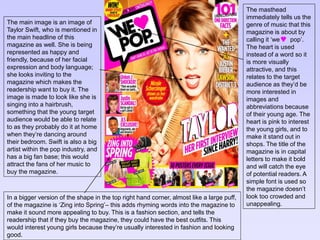
  • 1. The main image is an image of Taylor Swift, who is mentioned in the main headline of this magazine as well. She is being represented as happy and friendly, because of her facial expression and body language; she looks inviting to the magazine which makes the readership want to buy it. The image is made to look like she is singing into a hairbrush, something that the young target audience would be able to relate to as they probably do it at home when they’re dancing around their bedroom. Swift is also a big artist within the pop industry, and has a big fan base; this would attract the fans of her music to buy the magazine. The masthead immediately tells us the genre of music that this magazine is about by calling it ‘we pop’. The heart is used instead of a word so it is more visually attractive, and this relates to the target audience as they’d be more interested in images and abbreviations because of their young age. The heart is pink to interest the young girls, and to make it stand out in shops. The title of the magazine is in capital letters to make it bold and will catch the eye of potential readers. A simple font is used so the magazine doesn’t look too crowded and unappealing. In a bigger version of the shape in the top right hand corner, almost like a large puff, of the magazine is ‘Zing into Spring’– this adds rhyming words into the magazine to make it sound more appealing to buy. This is a fashion section, and tells the readership that if they buy the magazine, they could have the best outfits. This would interest young girls because they’re usually interested in fashion and looking good.
  • 2. The puff is centre of the magazine, and is red with yellow writing, and this helps to attract the audience to the magazine. ‘Style snoop’ is written around the side of the puff, suggesting that its exclusive to this magazine. Nicole Scherzinger is well known, and young girls would love to look like her, so buying this magazine would interest them as they get to see her wardrobe. The main sell-line mentions Taylor, who is also the main image on the magazine. It says ‘Her first interview since Harry!, and this draws in the audience to buy the magazine because they’ll think that Taylor is telling things that no one else has been told and so they have to be first to know the gossip. The exclamation mark is used at the end to emphasise it, and show the importance. It is placed on the main image, and is large so it will be one of the first things that the readership’s eye will see. Pink, white and black are used so they stand out. The bottom of the magazine has ’10 posters every issue’, which links to the target audience because young girls usually have posters on their bedroom walls of their favourite artists; it will also interest them in buying the magazine because they would want these posters, and especially for free. The magazine is made more visual by showing images of some of the posters they’re going to receive if they purchase it. Yellow and pink are used, to show continuity throughout the magazine. The yellow puff in the top left hand corner has ‘WIN!’ written in big letters, and tells you what you have the chance of winning if you buy the magazine. The exclamation mark gives a sense of excitement in the magazine, and relates to the fun genre of pop. Young people like chocolate, and so having the chance to win it would attract them to buying the magazine, likewise with Harry Styles, because he is popular within the pop genre.
  • 3. Around the masthead it says ‘Boys uncensored!’ and ‘Don’t bore us. Get to the chorus’. This appeals the readership because young girls are interested in boys, and ‘uncensored’ tells the audience that they’re going to be giving all the details and not hiding anything. ‘Don’t bore us. Get to the chorus’ uses rhyme to suggest the magazine is all about fun stuff and nothing boring, and this relates to the fun genre of pop. Pink, white and black are used again to show continuity between the magazine, and these are also colours that will stand out and attract young girls to the magazine when it’s in a shop next to hundreds of other magazines. The puff in the right hand corner of this issue of ‘we pop’ says ‘101 unbelievable one direction facts’ which would immediately interest the readership to buying the magazine; one direction are a very big band within the pop genre with a large fan base. The word ‘unbelievable’ has been used to appeal to the audience and make them want to buy this issue straight away because they’ll want to know the facts that are so shocking. White and pink are used again with ‘unbelievable’ in black so it stands out and puts emphasis on that word so reader’s don’t miss it. There is a list of artist and band names within the pop genre on the right hand side of the magazine, which will interest the readership because it shows that many different artists are featuring in the magazine, and so it would be worth the money. Yellow and white are used to follow the brand identity of the magazine. It is written in list form so that there is not too much writing on the front cover, because that would make the audience bored and un-interested in buying the magazine.
  • 4. On the left hand side of this magazine is three different insights of articles that will be in the magazine. ‘Union J shocker!’ is the first one, with an image of one the band members. A quote from the article is used underneath the sell-line to interest the reader; because they’ve read that line, they have to find out what happened after, and therefore they have to buy the magazine. The second sell-line says ‘Justin Scandal!’, and this would interest the readership because Justin is huge in the pop industry, and ‘scandal’ has been capitalised to emphasise it. ‘Did he spit in a girl’s drink?’ is written underneath, and this makes people want to know what really happened so they’ll buy the magazine. The third sell-line says ‘JLS exclusive!’ and has ‘Arguments, abs and America’ written underneath, and so alliteration is used to attract the reader to buying the magazine. ‘Shocker’, ‘scandal’ and ‘exclusive’ have been used to emphasis the articles, and interest readers to make them want to buy it. ‘Exclusive’ suggests that this is the only place they will find that information, and this makes the reader’s definitely buy the magazine. Exclamation marks have been used on each sell-line to emphasis that the articles will have all the latest gossip so they should purchase the magazine. These sell-lines are also in the left hand third so eyes will go directly to that part of the magazine. Direct address has been used on this magazine front cover to tell the audience that this is the magazine for them, as it refers to them personally. All the artists in the images, including the main image, are giving eye contact directly to readers. Words like ‘us’ are used, to make the magazine feel like your friend, and that the magazine will always ‘be there for you’ and will always be there to provide the best and latest gossip/news that would interest young girls.
  • 5. The colours used on this magazine are mainly yellow, pink, and white which are very feminine colours, and white represents innocence which relates to the young target audience. This colour scheme is kept through all the issues of ‘ we pop’, to maintain it’s brand identity. Bright colours are also used to reflect the fun personality of the pop genre. The fonts are also kept the same on each issue to maintain brand identity. Simple fonts are used to ensure the magazine doesn’t look too overdone, and so the front cover looks effective. I think this front cover is effect because it includes information of what and who will be in the magazine, and the colours used make the front cover attractive. I think it will be successful in drawing in the target audience because its so visually attractive, and pink is the dominant colour used which is most young girl’s favourite colours. I chose this magazine to analyse because it is a well-known magazine within the pop genre, and it gives me ideas of how to layout my magazine. The layout of every issue is kept like this, which again, maintains the brand identity of the magazine. The sell-lines are placed in the left hand third so the reader’s eye goes straight to them, and persuades them to buy the magazine. The layout is used to make the front cover of the magazine visually attractive to the audience, which is suitable for the young target audience, as they don’t want to see lots of writing.