
Recommended
More Related Content
What's hot
What's hot (19)
Similar to Contents Page Research 2 - Brass Band World February 2014
Similar to Contents Page Research 2 - Brass Band World February 2014 (20)
Recently uploaded
Recently uploaded (20)
Contents Page Research 2 - Brass Band World February 2014
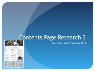
- 1. Contents Page Research 2 Brass Band World February 2014
- 2. Language The language used in the contents page is specialist language that would require background knowledge in the subject. This means the magazine has a specific target audience, who I believe to be aged over 40.
- 3. Images & Representations There are four images, all showing men, used portray the genre of ensemble music, owing to the instruments used in the images, and the clothing worn by the subjects. The tuxedo and the uniform are synonymous with American concert and military bands.
- 4. Colours The main colour on this contents page reflects the colours used on the front cover, creating synergy throughout the magazine.
- 5. Cover Story & Front Cover Links There is no indication on the contents page which story is the article featured on the cover. This breaks conventions of music magazine. There are also no discernable links to the front cover.
- 6. Text Wrapping There is no text wrapping on the contents page, instead columns are used. This is unusual for contents pages, but in this case complies with the formality of the magazine.
- 7. Font Style and Size The font used on this contents page is mainly sans serif, with the heading of the page being written in a serif font. The size of the font is very similar throughout.
- 8. Features/Special Features Unlike the contents I analyzed in my previous analysis, this contents page has no special features such as competitions or ways to interact with the magazine on social media. It does however, have a section with details as to how to subscribe to every copy of the magazine.