1. This is a music magazine
content page
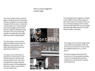
The colour scheme of this contents
page is mostly grey with a few pieces
of colour scattered around the page.
However the font colour is black and
is quite hard to see the text clearly
due to the background this shows
that the magazine developers have
not taken in to account the large
number of people who have sight
difficulties when reading objects.
The information on the contents
page lists different bands that are
playing at certain places it also
states what day these bands are
expected to preform on.
The masthead of the magazine is located
in the middle of the contents page in a
plain white colour this makes it easier to
see on the grey background this shows
that they have taken into account people
who have sight difficulties but not with
the font colour on the text.
The layout of the information is
spread out in three boxes on the
contents page this should make
the text easier to see and not to
overwhelm the reader. However
with the colours of the background
and font it makes it quite hard to
see and read clearly.
The images on the contents page shows
some kind of record player in the top
left hand corner which is in theme with
the magazine because it is a music
genre.
The other image at the bottom left
hand corner is of two people standing
in front of a building this could be a
reference to a band and this could be
promoting them.
2. Another example of a music magazine contents page
Background image is showing a massive letter
V behind the main image it sis partially
covered by the main image and the masthead
contents this is the first letter of the magazines
name.
The information on the magazine gives
the reader information on what to
expect in the magazine they are
reading
Logo of the magazine is in the top right
hand corner this might be so the reader
doesn’t forget what the name of the
magazine he or she is reading also there
is the month that the magazine was
issued also the year of release.
December 2008
Colour scheme
The colour scheme of the magazine is
mainly red and with white coloured
font this in contrast with the
background so that it is easy to read
for people who have sight difficulties.
The main image of the magazine
is a picture of a man who has an
interesting taste in jewellery he
might be trying to model himself
on Mr T from the A team
television series. The image is
close up shot showing the mans
head and most of his torso.
The mans right arm is partially
covered by some writing this
shows that the image is included
in the background not a separate
picture.
3. This is the final example of a music magazine
contents page
The masthead of this magazine is
located at the top of the page just
below of the information it also
includes the month and year that the
magazine was released and it also
includes the logo of the magazine (Q)
The information that the contents page provides is
slightly blurred due to the poor quality of the image
however it will provide the information that is relevant to
the theme of the magazine for example it will provide the
dates for the bands that might be playing at popular
stadiums.
The main and only image on the
contents page is a close up shot only
showing the head of the artist
however the man has eye contact with
the camera.
The colour scheme of the
magazine contents page shows
that it is a plain white background
with the only colour is in the font
and the image.