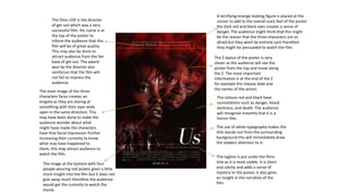
Call Girls in Najafgarh Delhi 💯Call Us 🔝8264348440🔝
Poster analysis
1. The films USP is the director
of get out which was a very
successful film. His name is at
the top of the poster to
inform the audience that this
film will be of great quality.
This may also be done to
attract audience from the fan
base of get out. The award
won by the director also
reinforces that the film will
not fail to impress the
audience.
The main image of the three
characters faces creates an
enigma as they are staring at
something with their eyes wide
open in the same direction. This
may have been done to make the
audience wonder about what
might have made the characters
have that facial impression further
increasing their curiosity to know
what may have happened to
them, this may attract audience to
watch the film.
The tagline is put under the films
title as it is most visible. It is short
and catchy and adds a sense of
mystery to the poster, it also gives
an insight in the narrative of the
film.
The colours red and black have
connotations such as danger, blood
darkness, and death. The audience
will recognise instantly that it is a
horror film.
The use of white typography makes the
title stands out from the surrounding
background this will immediately draw
the viewers attention to it.
The Z layout of the poster is very
clever as the audience will see the
poster from the top and move along
the Z. The most important
information is at the end of the Z
for example the release date and
the names of the actors.
A terrifying strange looking figure is placed at the
corner to add to the overall scary feel of the poster
the dark red and black eyes creates a sense of
danger. The audience might think that this might
be the reason that the three characters are so
afraid but they wont be entirely sure therefore
they might be persuaded to watch the film.
The image at the bottom with four
people wearing red jackets gives a little
more insight into the film but it does not
give away much therefore the audience
would get the curiosity to watch the
movie.
2. The film tile is very unique as it has New
York's skyline in it. This gives the
audience a clear indication that the film
is set in New York . The title stands out
against the dark background making it
eye-catching for the audience to see.
This poster is a teaser therefore it
does not have the release date on it
this has been done to raise awareness
of the film before it is released to get
more audience to watch it.
The USP of the film is Chadwick as he
is a very famous and successful actor
and very well known among
audiences. His name is at the top of
the poster to attract his fan base to
watch this movie. The tagline is very unconventional as it is
usually small and mostly written under the
film title. The tagline in this poster is
cleverly written over Chadwick’s face as it
labels him as a powerful protagonist.
The blue and red lighting on each
side of the characters face relates
to the police as they have
emergency vehicle lighting on their
cars. This gives an indication of the
police being involved in the movie.
The character is staring
directly at the audience, his
facial expression looks very
serious indicating that there
might be a very important
issue that needs to be solved
this creates a sense of enigma
as the audience don’t know
what will happen and may
want to know more therefore
they might watch the film.
The thriller genre would be recognisable
with the emergency lighting and the
seriousness of the characters face.
Indicating that the most likely target
audience for this film would be people
who like crime thrillers.
A clear indication that Chadwick is
the star of the film: his name is on
the top of the poster and his face is
positioned in the middle, he is the
only one on the poster.