Unknown Actor's Poster Sells Film Through Director
1. Suraj Sharma is the main star of the film, yet
he was very unknown during the
advertisement of the movie. His star power
is not large, therefore naming him on the
poster is unimportant.
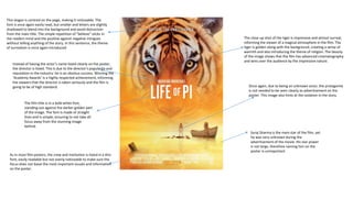
The close up shot of the tiger is impressive and almost surreal,
informing the viewer of a magical atmosphere in the film. The
tiger is golden along with the background, creating a sense of
warmth and also introducing the theme of religion. The beauty
of the image shows that the film has advanced cinematography
and wins over the audience by the impressive nature.
The film title is in a bold white font,
standing out against the darker golden part
of the image. The font is made of straight
lines and is simple, ensuring to not take all
focus away from the stunning image
behind.
Instead of having the actor’s name listed clearly on the poster,
the director is listed. This is due to the director’s popularity and
reputation in the industry: he is an obvious success. Winning the
‘Academy Awards’ is a highly respected achievement, informing
the viewers that the director is taken seriously and the film is
going to be of high standard.
As in most film posters, the crew and institution is listed in a thin
font, easily readable but not overly noticeable to make sure the
focus does not leave the most important visuals and information
on the poster.
Once again, due to being an unknown actor, the protagonist
is not needed to be seen clearly as advertisement on the
poster. This image also hints at the isolation in the story.
This slogan is centred on the page, making it noticeable. The
font is once again easily read, but smaller and letters are slightly
shadowed to blend into the background and avoid distraction
from the main title. The simple repetition of “believe” sticks in
the readers mind and the positive against negative intrigues
without telling anything of the story. In this sentence, the theme
of surrealism is once again introduced.
2. This poster is digitalised, initiating the futuristic and
surreal atmosphere of the film. Cool tones suggest
digitalisation whilst also creating an unapproachable
appearance, hinting that the world behind the
heroes is dangerous or in danger. The actors each
have warm tones, contrasting against the cold
background and gaining an appearance of trust and
safety. Gold tones are shown in skin, proving the
power of the characters. By creating the idea of
power, the likeability of the characters is enhanced
and perks the interest of the audience. The contrast
of oranges against blues makes the image more
noticeable, again attracting viewers.
Robert Downey Jr. is shown larger than the rest of
the cast, being the one with the largest star power.
The actor is known for starring in successful action
films, informing the viewer that the film is going to
be of that genre and will probably a high standard.
Chris Hemsworth is also extremely well known, also
landing a place in the foreground to attract viewers.
The cast is named in an easily understandable font
and all capitals to ensure the stars can be identified
and convince fans of their acting to watch the film.
Each star is well known to other genres of film as
well as action with large followings, meaning that
stating the cast will ensure viewers interested in
other genres.
The release date is in a stark white font (the same as
the title’s font to stand out) against a black
background to make sure it is easily identified. The
placement of the centre of the poster also ensures
that it will not be missed.
The film title is centred and stands out against the
background clearly. The slight gradient on the text
creates a metallic and once again futuristic
appearance.
The motif of red and white appears continuously
through the poster, advertising the brand ‘Marvel’
and attracting their strong following.
Information of the cast and crew is presented in a
blue font which could easily disappear into the
background. This is done to avoid taking the
attention away from the main focuses: the title, the
brand, the stars and the special effects
3. The main stars of the film are listed at the top of the
page, each placed onto the their heads in the image.
This is to advertise the movie through the popularity
of the actors: both very well known and found in many
blockbusters – even back then. The font is capitalised
and simple, the white font ensuring it is easily read
and understood against the darkened image.
This embrace is slightly sensual, the character of
Rose’s skin of her neck showing slightly with the
character of Jack caressing her in a protective manner.
This hints to the audience that although they are
obviously in love, they have struggles within the film.
Jack is wearing a white/cream shirt, presenting him to
be an angel like figure (foreshadowing his fate). The
pair’s placement being in the sky, editing showing a
fade into the clouds also hints at them being angelic
and god-like.
The tip of the boat appears to be cutting between the two,
further foreshadowing their tragic fate. The boat is silver
and appears slightly like a sword, further hinting at danger.
The camera angle is looking up at the boat, making it
appear impressive and scary. Half of the boat is shadowed
and dark, further proving horror. Furthermore, it is centred
to inform the importance of the boat in the story.
Kate Winslet is purposefully looking to her right to present the wealth of her
character, shown in the diamond earing. By looking to the ground, it is once
again proving her struggle and introducing her as a complex character through
the portrait.
Contradicting with the storyline, this text works as
irony whilst also emphasising their love: “nothing” can
come between them so their love must be powerful
and worth watching. It is ironic due to the outcome of
the film but also due to their unhappy expressions in
the image. Rose is also facing away from Jack, hinting
at her ending without him.
The director is listed in a large font as his past films
were successful, however his name is not as well-
known as the actors, meaning the text does not have
to be as visible. The font is a musty gold colour which
hints at wealth and matches the cast and crew list
below: visible but not distracting.
The title is listed in a large font, centred on the page
ensuring it catches the audience’s eyes. The stark
white font stands out against the dark grey of the boat
to further keep it visible.
The previous films made by the director are listed in
white, reeling in fans of past films and informing the
viewer of the standard of the film through their past
experience.