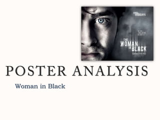
3. Mise-en-scene The mise-en-scene shows a close-up of part of the male character’s face, a few of the film details and a ghost-like image in the smoky background. This suggests that it is of a thriller genre, allowing the audience to, already, familiarize with this type of genre. It also creates a sense of suspicion and curiosity.
4. Main Image This character connotes anger and intimidation through his stern facial expression and the eye-contact with the audience. His dark features also complement the dark, solemn poster. This is strengthened through the close-up camera angle which takes up half the poster. Also, since half the character’s face is cut off, a mood of suspicion and a coldness is created. Additionally, the fact that he’s the only character and the only one in colour compels the audience to notice him first and makes him appear most important in the film.
5. The Other Image This ghost-like figure will clearly raise questions and evoke terror. Although it’s the most subtle in the poster, it is the most scariest and conventional. One reason it could raise questions is that this face is white, though the title is called ‘The Woman in Black’, causing suspicion and curiosity. This is heightened by the fact that only past of the figure is seen.
6. Colour Scheme The colour scheme used in this poster is very minimal. The white text, the gloomy-looking character and the different shades of grey combine to create an ominous feel. The most eye-catching is, arguably, the character’s blue eyes staring straight at the audience. This look, already, brings an intimidating impression. The bright white title also stands out, attracting the audience and leading them to the ghost-like image in the background.
7. Text Font There is very little text on this poster; the vital texts featured consists of the film title, release date, main actor’s name and tagline. This is effective as each attracts more attention and the image becomes even more eye-catching. The tagline ‘Do you believe in ghosts’ not only gives away the genre of the movie, it also suggests that the figure in the background is a ghost. The decorative, yet simple font builds a powerful brand identity for the film whilst creating a sense of continuity. The fact that it is sans serif adds to the forbidding tone of the poster.