Report
Share
Recommended
Finished question 5.0
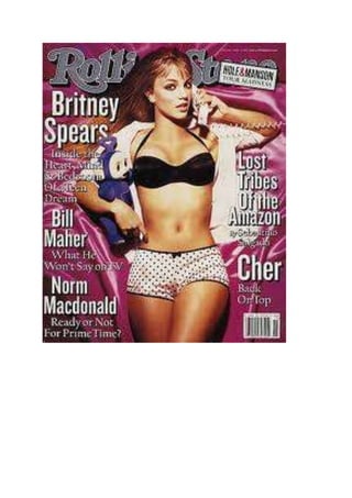
Blue was discussed as a unisex color that would make articles easy to find. Having a female pictured within appealing to female audiences was also mentioned. Page numbers were suggested so readers could find stories.
My magazine draft ideas
This document discusses the front cover of a magazine, including placing a picture in the center that overlaps the mast head, listing the cost of the magazine, and providing the unique selling proposition or focus of that particular issue.
Styles for magazines
This document provides examples of styles for a front cover, contents page, and double page spreads that the author wants to use for their project. The styles shown are meant to guide the overall layout and design of the different sections.
How did i use technology
The document discusses the various technologies used to create a magazine. WordPress was used as a blog to upload all coursework, and it integrates with YouTube and SlideShare. SlideShare was helpful for presenting work and uploading directly to WordPress. YouTube provided inspiration by allowing the viewing of other artists and magazines. Microsoft PowerPoint and Publisher were used to create presentations and design the magazine, respectively. Adobe Photoshop helped edit photos. An HTC phone took photos and filmed videos for YouTube. A USB drive transferred files between computers, and the internet connected all the sites and allowed research of other magazines.
Recommended
Finished question 5.0
Blue was discussed as a unisex color that would make articles easy to find. Having a female pictured within appealing to female audiences was also mentioned. Page numbers were suggested so readers could find stories.
My magazine draft ideas
This document discusses the front cover of a magazine, including placing a picture in the center that overlaps the mast head, listing the cost of the magazine, and providing the unique selling proposition or focus of that particular issue.
Styles for magazines
This document provides examples of styles for a front cover, contents page, and double page spreads that the author wants to use for their project. The styles shown are meant to guide the overall layout and design of the different sections.
How did i use technology
The document discusses the various technologies used to create a magazine. WordPress was used as a blog to upload all coursework, and it integrates with YouTube and SlideShare. SlideShare was helpful for presenting work and uploading directly to WordPress. YouTube provided inspiration by allowing the viewing of other artists and magazines. Microsoft PowerPoint and Publisher were used to create presentations and design the magazine, respectively. Adobe Photoshop helped edit photos. An HTC phone took photos and filmed videos for YouTube. A USB drive transferred files between computers, and the internet connected all the sites and allowed research of other magazines.
Finished question 5
Blue is described as a unisex color that stands out and is easy to read. The document also discusses using a female picture and light to give a positive portrayal of female artists, and including tour dates to engage fans.
Mood board of style ideas
This mood board contains style ideas and inspiration for different looks. It features images of outfits, colors, textures and patterns to showcase various aesthetics. The curated selection of visuals is meant to spark creativity and help guide decisions around developing a personal style or theme.
My magazine draft ideas
This document is a draft layout for a magazine issue. It includes elements like the masthead, front cover, table of contents, and double page spreads. The draft outlines where pictures and articles about music artists will be placed throughout the issue, including a centerfold picture, writing on a band, and a weekly competition.
My magazine draft ideas
This document is a draft layout for the front cover and contents page of a magazine. The front cover features the magazine title and cost, as well as the unique selling point for this issue's content. The contents page lists the articles and sections within the magazine, including features on a band through pictures, a question and answer interview, and a competition for readers.
My magazine draft ideas
This document outlines draft ideas for a magazine, including a front cover featuring a central picture overlapping the masthead, a contents page listing articles, and a double page spread with images and a written interview or article. The magazine aims to include competitions as part of its unique selling point to engage readers.
Music magazine questionnaire
The document is a music magazine questionnaire that asks respondents to select their preferences for color scheme, font, favorite artists, unique selling proposition, and favorite music genre from a number of options. Respondents are asked to select no more than 3 options for color scheme and USP, and are given space to write in favorite artists currently and state their favorite genre if they have one.
Questionnaire 2
This document is a music magazine questionnaire that asks respondents to select their preferences for color schemes, fonts, favorite artists, potential unique selling propositions, and favorite music genres. Respondents are asked to select no more than 3 options for the first question about color schemes, choose a preferred font, list favorite current artists, pick one unique selling proposition, and identify their favorite genre or indicate they like varied popular music.
Front cover
This magazine cover features Fergie as the model. She is positioned above the masthead to portray her as a bigger star than the magazine. The photo appeals to the male gaze by showing off her body as she stares at the reader. Her outfit, a black bra covered by a white shirt, represents the magazine's story about how "a bad girl made good." Bold fonts are used to draw the reader's eye to important headlines and taglines, such as Fergie's name and the list of the "209 best songs of 2007." The only flaw is that the price is not clearly displayed.
Double page-spreads
This document discusses several double page spreads from magazines. It analyzes design elements like use of fonts, pictures, colors, and layouts. The spreads profile different artists like Lily Allen and Jamelia. They use visuals and design to quickly grab readers' attention and highlight key people and topics in the spreads. Formats vary from patriotic themes to casual interviews to provocative photos paired with text.
How is meaning created
The document discusses how magazine covers use visual elements like font size and image placement to convey meaning and importance. Larger fonts and images that take up more space signal that the topic is a key story. Covers also use shocking statements and imagery of famous artists to draw attention and intrigue readers into buying the magazine. The placement and size of people's pictures on the cover is used to indicate their significance and status as a unique selling point for the publication.
Contents pages
This document summarizes and compares the contents pages of three different magazines - Q magazine, NME magazine, and a more mainstream magazine. It notes that Q and NME both feature the main story in the middle to draw readers in, while the mainstream magazine does not have a clear lead picture. All three magazines use their house colors consistently and section articles to help readers find content easily. NME and the mainstream magazine additionally employ techniques like varying font sizes and listing upcoming events to further engage readers.
Mood board
This document discusses mood boards. A mood board is a visual representation that helps inspire and communicate design ideas. It brings together colors, textures, images, typography and more to convey a feeling, theme or concept. Mood boards are useful tools for designers to explore ideas and get inspiration in the early creative process.
More Related Content
More from martincooper
Finished question 5
Blue is described as a unisex color that stands out and is easy to read. The document also discusses using a female picture and light to give a positive portrayal of female artists, and including tour dates to engage fans.
Mood board of style ideas
This mood board contains style ideas and inspiration for different looks. It features images of outfits, colors, textures and patterns to showcase various aesthetics. The curated selection of visuals is meant to spark creativity and help guide decisions around developing a personal style or theme.
My magazine draft ideas
This document is a draft layout for a magazine issue. It includes elements like the masthead, front cover, table of contents, and double page spreads. The draft outlines where pictures and articles about music artists will be placed throughout the issue, including a centerfold picture, writing on a band, and a weekly competition.
My magazine draft ideas
This document is a draft layout for the front cover and contents page of a magazine. The front cover features the magazine title and cost, as well as the unique selling point for this issue's content. The contents page lists the articles and sections within the magazine, including features on a band through pictures, a question and answer interview, and a competition for readers.
My magazine draft ideas
This document outlines draft ideas for a magazine, including a front cover featuring a central picture overlapping the masthead, a contents page listing articles, and a double page spread with images and a written interview or article. The magazine aims to include competitions as part of its unique selling point to engage readers.
Music magazine questionnaire
The document is a music magazine questionnaire that asks respondents to select their preferences for color scheme, font, favorite artists, unique selling proposition, and favorite music genre from a number of options. Respondents are asked to select no more than 3 options for color scheme and USP, and are given space to write in favorite artists currently and state their favorite genre if they have one.
Questionnaire 2
This document is a music magazine questionnaire that asks respondents to select their preferences for color schemes, fonts, favorite artists, potential unique selling propositions, and favorite music genres. Respondents are asked to select no more than 3 options for the first question about color schemes, choose a preferred font, list favorite current artists, pick one unique selling proposition, and identify their favorite genre or indicate they like varied popular music.
Front cover
This magazine cover features Fergie as the model. She is positioned above the masthead to portray her as a bigger star than the magazine. The photo appeals to the male gaze by showing off her body as she stares at the reader. Her outfit, a black bra covered by a white shirt, represents the magazine's story about how "a bad girl made good." Bold fonts are used to draw the reader's eye to important headlines and taglines, such as Fergie's name and the list of the "209 best songs of 2007." The only flaw is that the price is not clearly displayed.
Double page-spreads
This document discusses several double page spreads from magazines. It analyzes design elements like use of fonts, pictures, colors, and layouts. The spreads profile different artists like Lily Allen and Jamelia. They use visuals and design to quickly grab readers' attention and highlight key people and topics in the spreads. Formats vary from patriotic themes to casual interviews to provocative photos paired with text.
How is meaning created
The document discusses how magazine covers use visual elements like font size and image placement to convey meaning and importance. Larger fonts and images that take up more space signal that the topic is a key story. Covers also use shocking statements and imagery of famous artists to draw attention and intrigue readers into buying the magazine. The placement and size of people's pictures on the cover is used to indicate their significance and status as a unique selling point for the publication.
Contents pages
This document summarizes and compares the contents pages of three different magazines - Q magazine, NME magazine, and a more mainstream magazine. It notes that Q and NME both feature the main story in the middle to draw readers in, while the mainstream magazine does not have a clear lead picture. All three magazines use their house colors consistently and section articles to help readers find content easily. NME and the mainstream magazine additionally employ techniques like varying font sizes and listing upcoming events to further engage readers.
Mood board
This document discusses mood boards. A mood board is a visual representation that helps inspire and communicate design ideas. It brings together colors, textures, images, typography and more to convey a feeling, theme or concept. Mood boards are useful tools for designers to explore ideas and get inspiration in the early creative process.