
Recommended
More Related Content
What's hot
Similar to Fonts
Similar to Fonts (20)
Recently uploaded
Recently uploaded (20)
Fonts
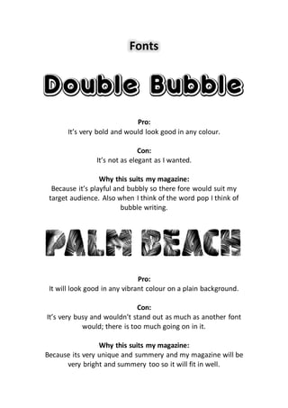
- 1. Fonts Pro: It’s very bold and would look good in any colour. Con: It’s not as elegant as I wanted. Why this suits my magazine: Because it’s playful and bubbly so there fore would suit my target audience. Also when I think of the word pop I think of bubble writing. Pro: It will look good in any vibrant colour on a plain background. Con: It’s very busy and wouldn’t stand out as much as another font would; there is too much going on in it. Why this suits my magazine: Because its very unique and summery and my magazine will be very bright and summery too so it will fit in well.
- 2. Pro: It looks very neat and smart it would go with anything and would suit any page. It is very vogue. Con: Its very basic almost too basic it wont be a good font to use as a title but a sub heading maybe. Why this suits my magazine: This would suit my magazine because it is very basic and the kinds of music/artists I will be featuring in my magazine are mainstream basic artists. Pro: Its very elegant and girly so would fit in very well with my genre. Con: It’s very thin and may not stand out as much as another font would. It wont be easy to see. Why this suits my magazine: This would suit my magazine as it is very girly with the hearts as O’s , its different and will give my front cover a twist.
- 3. Pro: It Is very bold and stands out, the white highlighted outline makes it different. Con: It seems very dull and bold because of the black. Why this suits my magazine: This will suit my magazine when it is changed to a bright vibrant colour, as it will look a lot more ‘pop’. Pro: It would look good in any bright vibrant colour especially pink. Con: It’s a bit too simple; as it doesn’t have a block colour it may not stand out so much on a background. Why its suits my magazine: This font will suit my magazine especially if it’s in pink as its kind of bubbly and suits my genre choice wel.