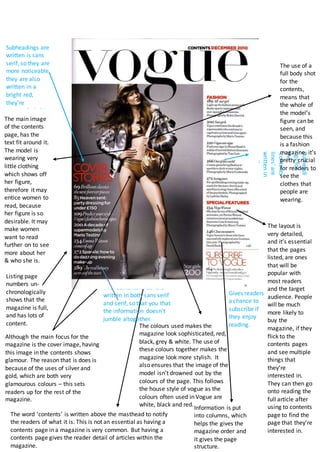
The document discusses the design and layout of a magazine's contents page. It describes how various stylistic choices are made to effectively convey information to readers, engage them, and encourage purchasing the magazine. Specifically, it notes that subheadings are written in bold, sans-serif fonts and red color to stand out, and that both sans-serif and serif fonts are used for contents lines to avoid everything blending together. Color choices are also discussed as projecting sophistication while ensuring the model and images can be clearly seen.