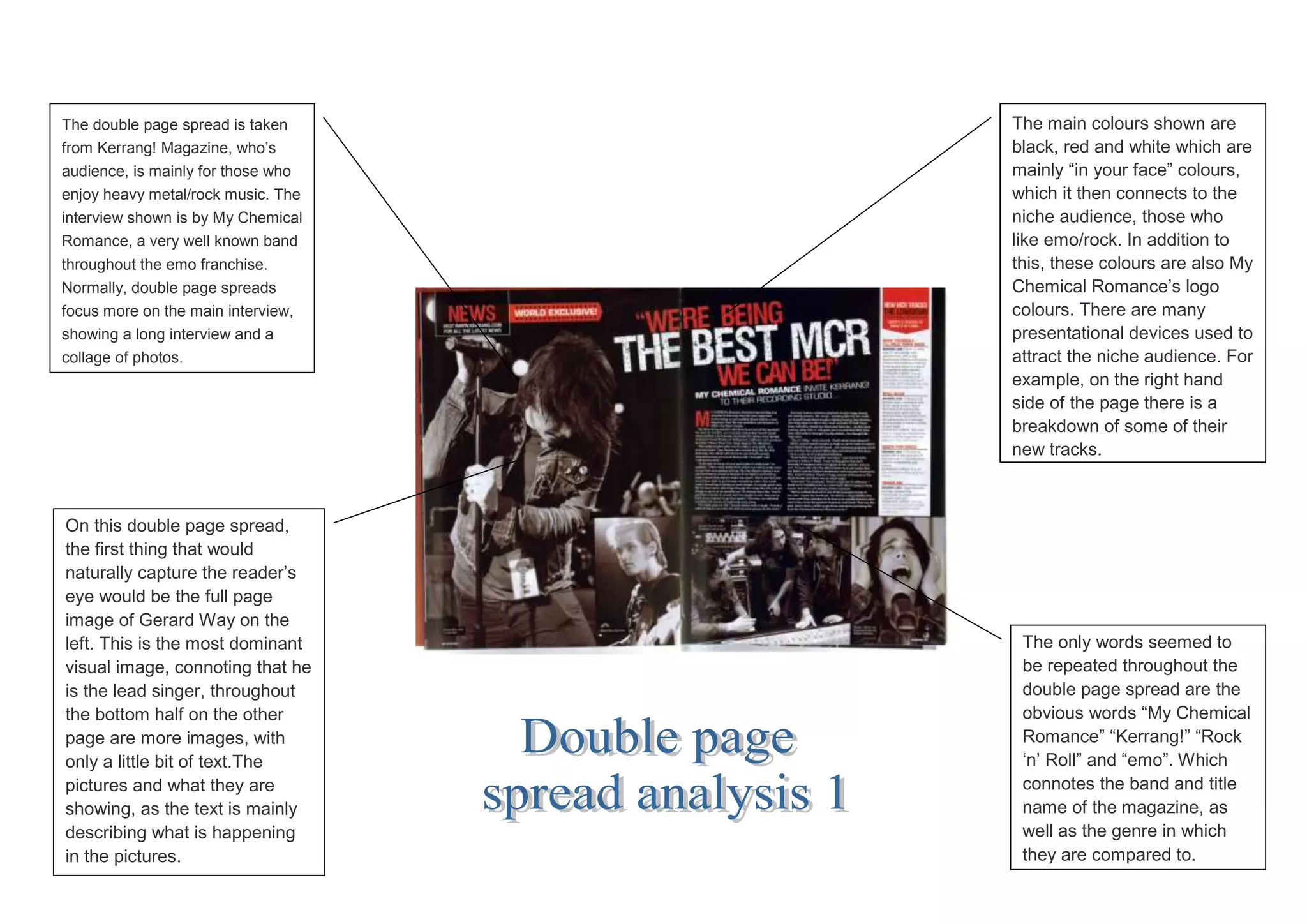
The double page spread is taken     The main colours shown are
from Kerrang! Magazine, who‟s       black, red and white which are
audience, is mainly for those who   mainly “in your face” colours,
enjoy heavy metal/rock music. The   which it then connects to the
interview shown is by My Chemical   niche audience, those who
Romance, a very well known band     like emo/rock. In addition to
throughout the emo franchise.       this, these colours are also My
Normally, double page spreads       Chemical Romance‟s logo
focus more on the main interview,   colours. There are many
showing a long interview and a      presentational devices used to
collage of photos.                  attract the niche audience. For
                                    example, on the right hand
                                    side of the page there is a
                                    breakdown of some of their
                                    new tracks.


On this double page spread,
the first thing that would
naturally capture the reader‟s
eye would be the full page
image of Gerard Way on the
left. This is the most dominant      The only words seemed to
visual image, connoting that he      be repeated throughout the
is the lead singer, throughout       double page spread are the
the bottom half on the other         obvious words “My Chemical
page are more images, with           Romance” “Kerrang!” “Rock
only a little bit of text.The        „n‟ Roll” and “emo”. Which
pictures and what they are           connotes the band and title
showing, as the text is mainly       name of the magazine, as
describing what is happening         well as the genre in which
in the pictures.                     they are compared to.

Double page spread analysis 1

  • 1.
    The double pagespread is taken The main colours shown are from Kerrang! Magazine, who‟s black, red and white which are audience, is mainly for those who mainly “in your face” colours, enjoy heavy metal/rock music. The which it then connects to the interview shown is by My Chemical niche audience, those who Romance, a very well known band like emo/rock. In addition to throughout the emo franchise. this, these colours are also My Normally, double page spreads Chemical Romance‟s logo focus more on the main interview, colours. There are many showing a long interview and a presentational devices used to collage of photos. attract the niche audience. For example, on the right hand side of the page there is a breakdown of some of their new tracks. On this double page spread, the first thing that would naturally capture the reader‟s eye would be the full page image of Gerard Way on the left. This is the most dominant The only words seemed to visual image, connoting that he be repeated throughout the is the lead singer, throughout double page spread are the the bottom half on the other obvious words “My Chemical page are more images, with Romance” “Kerrang!” “Rock only a little bit of text.The „n‟ Roll” and “emo”. Which pictures and what they are connotes the band and title showing, as the text is mainly name of the magazine, as describing what is happening well as the genre in which in the pictures. they are compared to.