FULL ENJOY - 9953040155 Call Girls in Gandhi Vihar | Delhi
Media question 7
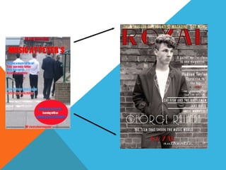
1.
2. This is my mast head when I originally
made it was much smaller and one of the
improvements I was ask to do to my front
cover was to enlarge it as it was getting
lost in the rest of the magazine when its
meant to be the biggest font on the page .
which I feel like now enlarge it to the
write size and it stands out quite nicely
even with the main image overlapping it.
I also change the brightness and contrast
of the colours of the mast head to. This
was so that when it put against the grey
background kit stood out quite well.
With the strap line I feel is quite vintage
in that kind of rustic yellow against the
grey and red colours . This is the
improvement over the original strapline I
had which was black which didn’t really
stand out as well as the yellow because
the strap line is key for advertising the
magazine maybe even an achievement
for the magazine such as the 50th issue if
its quite an old magazine
Another detail to my magazine would be
the cover lines . With these my main aim
was to make them look as indie as possible
for instance with the fonts make them quite
thin and pic quite a vintage graphic font
which would really represent my magazine
quite well. Also another factor involved in
the cover lines in the graphics that separate
some of the stories . This white lines I also
tried to make look as vintage as possible .
I’ve improved the cover lines as before
the were much smaller and I've made the
white colour brighter so that that the
contrast between the grey brick wall and
my writing is very strong.
Over time have made quite a few improvement s to my magazine as I have learnt a lot more
about structuring magazine designs . Also the more I learnt about the indie music genre and
the fashion and other things such as the artists that may act a lot more cooler than the
others in the way they may act or act towards fans and audiences at gigs or dress differently.
Another one of the factors of my d out much
magazine that I have improved over time is
my headline it started out much smaller but
because I've learnt that it should be one of
the biggest fonts on the page I have made
even larger to make sure that it is always
noticed .
It most of the improvements were quite
simple to do and as I've learnt over time I've
got use to software so making these changes
has been quite easy compared to when we
had just started out making the pre-lim task
when I wasn’t really sure how to structure a
magazine cover. I also wasn’t familiar with
working with fonts and picking the write
one , making it the write size to suit the
magazine and so it doesn’t drag any of the
attention away from the mast head or the
headlineOne of the main factors which I have learnt
about is definitely making my main image
stand out he most because that is the main
factor that shows the indie vibe to my
magazine in what my mode, wears such as
his vintage jacket and grey trousers which is
quite mod like and very 50s inspired and the
fact he's not looking at the camera is very
against convention which I have realised is a
very popular indie trait and I feel it fits in well
with my magazine. I think the magazine to
inspire this has to be rolling stones because I
have followed its vintage and hopefully my
magazine has also got quite a cool vibe to it
3.
4. With my contents page I tried to go against
convention because that was the theme I had
chosen to follow because my magazine was
based about indie music. So some e of the
things that I did to not follow conventions on
my contents page was do things such as
putting my mast head in the middle of the
page centre placed instead of at the top of the
page . This means that instead of the reader
possibly seeing the masthead strait away
there are going to be seeing what's in the
magazine what kind of articles and story's are
in there.
I've still continued to make the mast head font
the biggest on the page however its not
extremely large as to take up most of the
space were it is place much like the mast head
on my cover page so that it is the first thing
that the readers will see.Another factor to my magazine is the cover
lines these are also weird place because you
would usually see cover lines on the contents
page towards the bottom of the page on the
side but I've gone against convention to make
it seem more interesting but I didn’t go so
against convention as to confuse the reader
and mix up the structure so that it wouldn’t
make any sense.
With the page numbers I used a very vintage
font which is similar to the ones on old 50s cars
which I had used previously on my cover page
aswell then when I made the improvement's
on my contents page I made sure that they
stood out for instance with the bright red
contrasting with the white and black
background .
Originally I found it quite hard to find a
set colour for my fonts as I was
struggling to make the writing stand
out from the back ground as its quite
awkward in the way it’s both white
and it’s a black background so editing
the colours to stand out with both of
those backgrounds took a while .
When I started my contents page I originally had
one picture of another artist up in the top right of
the page however after my improvements I took it
out as it looked more indie and against
conventions without it as that picture looked out
of place. I think the main stories picture was
enough for it and made it seem quite quirky and
cool.
With the main image of my artist I decided to have
him looking away from the camera to make my
artist seem really quirky an cool . I've also tried to
make my artist seem quite rebellious in what he
does and the way he looks.