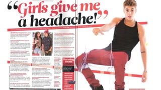
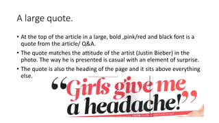
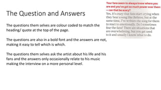
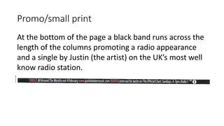
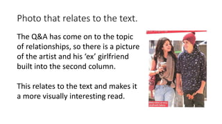
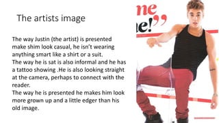
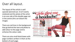
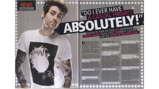
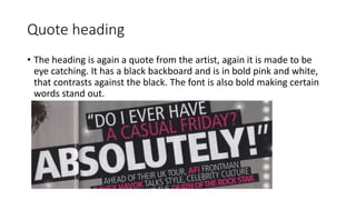
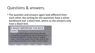
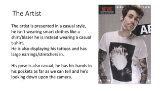
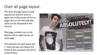
Article/Q&A analysis
Analysis #1
A large quote.
• At the top of the article in a large, bold ,pink/red and black font is a
quote from the article/ Q&A.
• The quote matches the attitude of the artist (Justin Bieber) in the
photo. The way he is presented is casual with an element of surprise.
• The quote is also the heading of the page and it sits above everything
else.
The Question and Answers
The questions them selves are colour coded to match the
heading/ quote at the top of the page.
The questions are also in a bold font and the answers are not,
making it easy to tell which is which.
The questions them selves ask the artist about his life and his
fans and the answers only occasionally relate to his music
making the interview on a more personal level.
Promo/small print
At the bottom of the page a black band runs across the
length of the columns promoting a radio appearance
and a single by Justin (the artist) on the UK’s most well
know radio station.
Photo that relates to the text.
The Q&A has come on to the topic
of relationships, so there is a picture
of the artist and his ‘ex’ girlfriend
built into the second column.
This relates to the text and makes it
a more visually interesting read.
Exclusive interview
An label at the top of the page says ‘exclusive interview’
this will draw attention to the article because
customers/fans know that this is the only place to read
the interview.
The artists image
The way Justin (the artist) is presented
make shim look casual, he isn’t wearing
anything smart like a shirt or a suit.
The way he is sat is also informal and he has
a tattoo showing .He is also looking straight
at the camera, perhaps to connect with the
reader.
The way he is presented he makes him look
more grown up and a little edger than his
old image.
Over all layout.
The layout of the article is well
spaced/ planned out. It isn’t overly
cluttered and the photo of the artist
is on one side of the double page not
in the centre (this can distort the
image).
There are red lines in the background
that go behind the text and photo to
add colour to the page and to
enhance the colour code.
There are also small black boxes with
page numbers written in them at the
bottom of each page.
Analysis #2
Quote heading
• The heading is again a quote from the artist, again it is made to be
eye catching. It has a black backboard and is in bold pink and white,
that contrasts against the black. The font is also bold making certain
words stand out.
Questions & answers.
• The question and answers again look different from
each other, the writing for the questions have a white
backboard and a black font, where as the answers only
have a black font.
NEWS.
In the top left corner of the article there is a black
box with the word ‘NEWS’ in capital/bold and in the
colour red. This will draw attention to the box that is
promoting the website of the magazine.
Large Capital
The large capital draws
attention to the first paragraph
and makes the column look
more professional/artistic .
The Artist
The artist is presented in a casual style,
he isn’t wearing smart clothes like a
shirt/blazer he is instead wearing a casual
t-shirt.
He is also displaying his tattoos and has
large earrings/stretchers in.
His pose is also casual, he has his hands in
his pockets as far as we can tell and he's
looking down upon the camera.
Over all page layout.
The over all page layout is well
spaced out and the artist is
again not in the centre of the to
pages but on the left side (the
artist can be distorted in the
centre).
The page numbers are in the
bottom left or right corner on
each page.
The columns are well space out
/ neat and you can clearly tell
which is the question and which
is the answer.

Article

  • 1.
  • 2.
  • 4.
    A large quote. •At the top of the article in a large, bold ,pink/red and black font is a quote from the article/ Q&A. • The quote matches the attitude of the artist (Justin Bieber) in the photo. The way he is presented is casual with an element of surprise. • The quote is also the heading of the page and it sits above everything else.
  • 5.
    The Question andAnswers The questions them selves are colour coded to match the heading/ quote at the top of the page. The questions are also in a bold font and the answers are not, making it easy to tell which is which. The questions them selves ask the artist about his life and his fans and the answers only occasionally relate to his music making the interview on a more personal level.
  • 6.
    Promo/small print At thebottom of the page a black band runs across the length of the columns promoting a radio appearance and a single by Justin (the artist) on the UK’s most well know radio station.
  • 7.
    Photo that relatesto the text. The Q&A has come on to the topic of relationships, so there is a picture of the artist and his ‘ex’ girlfriend built into the second column. This relates to the text and makes it a more visually interesting read.
  • 8.
    Exclusive interview An labelat the top of the page says ‘exclusive interview’ this will draw attention to the article because customers/fans know that this is the only place to read the interview.
  • 9.
    The artists image Theway Justin (the artist) is presented make shim look casual, he isn’t wearing anything smart like a shirt or a suit. The way he is sat is also informal and he has a tattoo showing .He is also looking straight at the camera, perhaps to connect with the reader. The way he is presented he makes him look more grown up and a little edger than his old image.
  • 10.
    Over all layout. Thelayout of the article is well spaced/ planned out. It isn’t overly cluttered and the photo of the artist is on one side of the double page not in the centre (this can distort the image). There are red lines in the background that go behind the text and photo to add colour to the page and to enhance the colour code. There are also small black boxes with page numbers written in them at the bottom of each page.
  • 11.
  • 13.
    Quote heading • Theheading is again a quote from the artist, again it is made to be eye catching. It has a black backboard and is in bold pink and white, that contrasts against the black. The font is also bold making certain words stand out.
  • 14.
    Questions & answers. •The question and answers again look different from each other, the writing for the questions have a white backboard and a black font, where as the answers only have a black font.
  • 15.
    NEWS. In the topleft corner of the article there is a black box with the word ‘NEWS’ in capital/bold and in the colour red. This will draw attention to the box that is promoting the website of the magazine.
  • 16.
    Large Capital The largecapital draws attention to the first paragraph and makes the column look more professional/artistic .
  • 17.
    The Artist The artistis presented in a casual style, he isn’t wearing smart clothes like a shirt/blazer he is instead wearing a casual t-shirt. He is also displaying his tattoos and has large earrings/stretchers in. His pose is also casual, he has his hands in his pockets as far as we can tell and he's looking down upon the camera.
  • 18.
    Over all pagelayout. The over all page layout is well spaced out and the artist is again not in the centre of the to pages but on the left side (the artist can be distorted in the centre). The page numbers are in the bottom left or right corner on each page. The columns are well space out / neat and you can clearly tell which is the question and which is the answer.