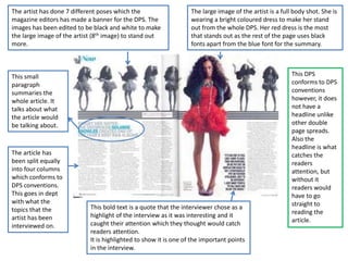
1. The artist has done 7 different poses which the
magazine editors has made a banner for the DPS. The
images has been edited to be black and white to make
the large image of the artist (8th image) to stand out
more.
The large image of the artist is a full body shot. She is
wearing a bright coloured dress to make her stand
out from the whole DPS. Her red dress is the most
that stands out as the rest of the page uses black
fonts apart from the blue font for the summary.
This small
paragraph
summaries the
whole article. It
talks about what
the article would
be talking about.
The article has
been split equally
into four columns
which conforms to
DPS conventions.
This goes in dept
with what the
topics that the
artist has been
interviewed on.
This bold text is a quote that the interviewer chose as a
highlight of the interview as it was interesting and it
caught their attention which they thought would catch
readers attention.
It is highlighted to show it is one of the important points
in the interview.
This DPS
conforms to DPS
conventions
however, it does
not have a
headline unlike
other double
page spreads.
Also the
headline is what
catches the
readers
attention, but
without it
readers would
have to go
straight to
reading the
article.
2. The headline links to a graffiti type font which also
has a contrast to the art/writings on Soulja Boy’s
face.
The colour of the fonts used in the headline are the
same colours used to graffiti over Soulja Boy’s face.
The red and black font
colours makes it stand out in
front of the white
background which catches
the readers attention.
The camera shot
used is a close-up
mid shot of Soulja
Boy with his head
facing the
towards the right
hand side.
He stands out in
front of the light
blue/white
background
because of his
complexion and
the graffiti on his
face.
For the headline they use a quote that Soulja Boy
has said or a quote that the interviewer or
fans/readers has said about him. The use of the
words “Shooting star!” refers to how he became a
star in the media world.
The magazine’s logo is on
the top right corner, this
conforms to magazine
conventions as it shows that
this article is by them.
The columns in this
article are equal
and the layout is
one of the basic
layouts magazine
use when making
double page
spreads, also
mainly double page
spreads use the
minimum of two
columns.
Large use of a letter for
the beginning of the
article conforms with
magazine conventions as
it makes the article more
attractive and interesting.
This small paragraph
summaries what the article
of Soulja Boy is about to
make readers want to read
on.