1. Titles Sequence Analysis
The title is placed on a bold black background making the words of the title stand
out. As time goes on the title moves towards you getting bigger as doing so, this
creates more movement. The font of the title is quite creepy as lines are not
straight. The Jeepers first comes into scene first and then Creepers shortly after
however the Creepers is not as bold as the Jeepers but shortly gains boldness
when the title approaches the audience.
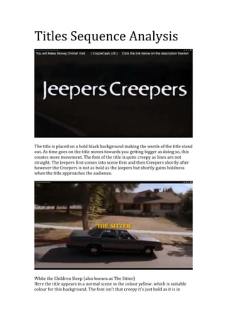
While the Children Sleep (also known as The Sitter)
Here the title appears in a normal scene in the colour yellow, which is suitable
colour for this background. The font isn’t that creepy it’s just bold as it is in
2. capitals and are in a 3D shape. This title sequence is not that scary however the
title does have a little disturbing ring to it.
There is lots’ going on in this one shot for example faint outlines of trees,
splattered paint and blood as well as the title, it looks quite messy however it
works. This is not a bad thing as the title still stands out the most. The title font is
very effective as parts of the letters are missing.
This is my favourite title as the words vibrate like a rattling of a cage and it also
creates an illusion like shadow behind aswell. The background is kept plain and
simple with the title in colour that is not quite white but a dirty, gloomy like
cream.