TITLE RESEARCH
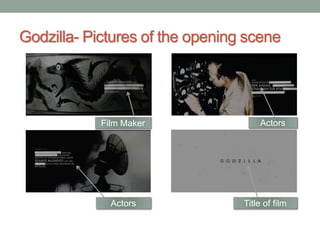
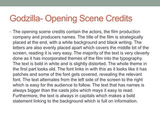
Godzilla- Pictures of the opening scene
Title of film
Actors
Actors
Film Maker
Godzilla- Opening Scene Credits
• The opening scene credits contain the actors, the film production
company and producers names. The title of the film is strategically
placed at the end, with a white background and black writing. The
letters are also evenly placed apart which covers the middle bit of the
screen, reading it is very easy. The majority of the text is very cleverly
done as it has incorporated themes of the film into the typography.
The text is bold in white and is slightly distorted. The whole theme in
the first part looks old. The font links in with this as it looks like it has
patches and some of the font gets covered, revealing the relevant
font. The text alternates from the left side of the screen to the right
which is easy for the audience to follow. The text that has names is
always bigger than the casts jobs which mays it easy to read.
Furthermore, the text is always in capitals which makes a bold
statement linking to the background which is full on information.
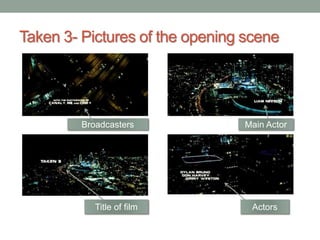
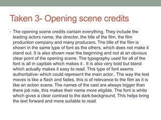
Taken 3- Pictures of the opening scene
Title of film Actors
Main ActorBroadcasters
Taken 3- Opening scene credits
• The opening scene credits contain everything. They include the
leading actors name, the director, the title of the film, the film
production company and many producers. The title of the film is
shown in the same type of font as the others, which does not make it
stand out. It is also shown near the beginning and not at an obvious
clear point of the opening scene. The typography used for all of the
font is all in capitals which makes it . It is also very bold but bland
which actually makes it easy to read. This type of font seems
authoritative- which could represent the main actor.. The way the text
moves is like a flash and fades, this is of relevance to the film as it is
like an action scene. The names of the cast are always bigger than
there job role, this makes their name more eligible. The font is white
which gives a clear contrast to the dark background. This helps bring
the text forward and more suitable to read.
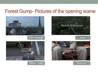
Forest Gump- Pictures of the opening scene
Director
Actor
Other Cast
Film Maker
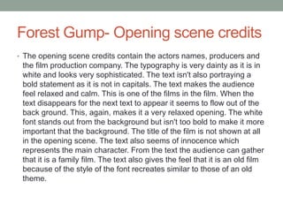
Forest Gump- Opening scene credits
• The opening scene credits contain the actors names, producers and
the film production company. The typography is very dainty as it is in
white and looks very sophisticated. The text isn't also portraying a
bold statement as it is not in capitals. The text makes the audience
feel relaxed and calm. This is one of the films in the film. When the
text disappears for the next text to appear it seems to flow out of the
back ground. This, again, makes it a very relaxed opening. The white
font stands out from the background but isn't too bold to make it more
important that the background. The title of the film is not shown at all
in the opening scene. The text also seems of innocence which
represents the main character. From the text the audience can gather
that it is a family film. The text also gives the feel that it is an old film
because of the style of the font recreates similar to those of an old
theme.

Title Research

  • 1.
  • 2.
    Godzilla- Pictures ofthe opening scene Title of film Actors Actors Film Maker
  • 3.
    Godzilla- Opening SceneCredits • The opening scene credits contain the actors, the film production company and producers names. The title of the film is strategically placed at the end, with a white background and black writing. The letters are also evenly placed apart which covers the middle bit of the screen, reading it is very easy. The majority of the text is very cleverly done as it has incorporated themes of the film into the typography. The text is bold in white and is slightly distorted. The whole theme in the first part looks old. The font links in with this as it looks like it has patches and some of the font gets covered, revealing the relevant font. The text alternates from the left side of the screen to the right which is easy for the audience to follow. The text that has names is always bigger than the casts jobs which mays it easy to read. Furthermore, the text is always in capitals which makes a bold statement linking to the background which is full on information.
  • 4.
    Taken 3- Picturesof the opening scene Title of film Actors Main ActorBroadcasters
  • 5.
    Taken 3- Openingscene credits • The opening scene credits contain everything. They include the leading actors name, the director, the title of the film, the film production company and many producers. The title of the film is shown in the same type of font as the others, which does not make it stand out. It is also shown near the beginning and not at an obvious clear point of the opening scene. The typography used for all of the font is all in capitals which makes it . It is also very bold but bland which actually makes it easy to read. This type of font seems authoritative- which could represent the main actor.. The way the text moves is like a flash and fades, this is of relevance to the film as it is like an action scene. The names of the cast are always bigger than there job role, this makes their name more eligible. The font is white which gives a clear contrast to the dark background. This helps bring the text forward and more suitable to read.
  • 6.
    Forest Gump- Picturesof the opening scene Director Actor Other Cast Film Maker
  • 7.
    Forest Gump- Openingscene credits • The opening scene credits contain the actors names, producers and the film production company. The typography is very dainty as it is in white and looks very sophisticated. The text isn't also portraying a bold statement as it is not in capitals. The text makes the audience feel relaxed and calm. This is one of the films in the film. When the text disappears for the next text to appear it seems to flow out of the back ground. This, again, makes it a very relaxed opening. The white font stands out from the background but isn't too bold to make it more important that the background. The title of the film is not shown at all in the opening scene. The text also seems of innocence which represents the main character. From the text the audience can gather that it is a family film. The text also gives the feel that it is an old film because of the style of the font recreates similar to those of an old theme.