1. Titles Sequence Analysis
The title is placed on a bold black background making the words of the title stand
out. As time goes on the title moves towards you getting bigger as doing so, this
creates more movement. The font of the title is quite creepy as lines are not
straight. The Jeepers first comes into scene first and then Creepers shortly after
however the Creepers is not as bold as the Jeepers but shortly gains boldness
when the title approaches the audience.
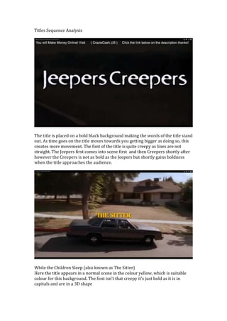
While the Children Sleep (also known as The Sitter)
Here the title appears in a normal scene in the colour yellow, which is suitable
colour for this background. The font isn’t that creepy it’s just bold as it is in
capitals and are in a 3D shape