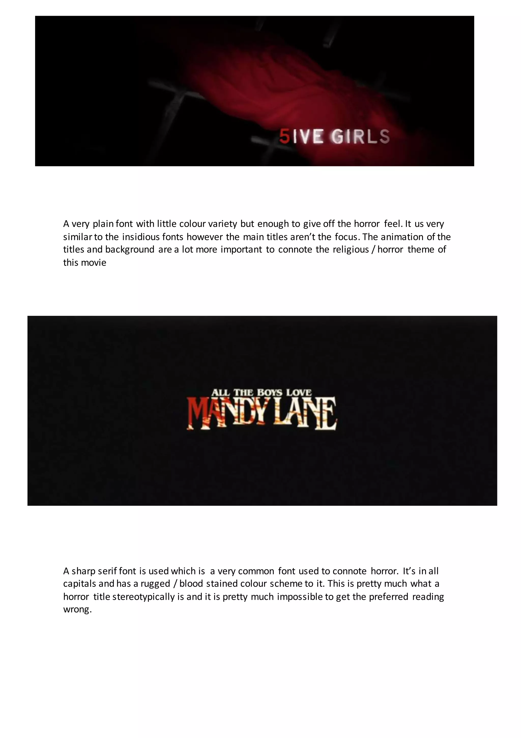
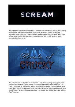
A very plain font with little colour variety but enough to give off the horror feel. It us very
similar to the insidious fonts however the main titles aren’t the focus. The animation of the
titles and background are a lot more important to connote the religious / horror theme of
this movie
A sharp serif font is used which is a very common font used to connote horror. It’s in all
capitals and has a rugged / blood stained colour scheme to it. This is pretty much what a
horror title stereotypically is and it is pretty much impossible to get the preferred reading
wrong.
This extremely iconic title is famous for it’s simplicity and animation of the title. The slashing
sensation the title gives off during the animation is recognised all over and with the
screaming sound effect. It is a slightly bubbled decayed font and it is the decay which gives
off the horror theme. After the slashing sequence in the title the title turns red which
connotes blood and horror.
The serif, romantic like font for the “Bride of” is a very clever way to give a suggestive hint
towards what the killer is going to be as a character. Female for starters and maybe a bit
“wild.” This comes on after a quite sexualised character has walked away in a leather short
dress which adds to the anchorage of the characters personality. Them they added the quite
brutal “Chucky” which is also clever as it looks a lot like the skin “Chucky” has in the “Childs,
Play,” franchise.
This font at a first glance looks quite modern and has a technological vibe to it due to the
underscore. However, at a closer glance you can see it is a serif font and slightly decayed
witch gives it that horror feel. The colour scheme is pretty limited and therefore the horror
genre is also connoted.

Slasher Main Titles

  • 1.
    A very plainfont with little colour variety but enough to give off the horror feel. It us very similar to the insidious fonts however the main titles aren’t the focus. The animation of the titles and background are a lot more important to connote the religious / horror theme of this movie A sharp serif font is used which is a very common font used to connote horror. It’s in all capitals and has a rugged / blood stained colour scheme to it. This is pretty much what a horror title stereotypically is and it is pretty much impossible to get the preferred reading wrong.
  • 2.
    This extremely iconictitle is famous for it’s simplicity and animation of the title. The slashing sensation the title gives off during the animation is recognised all over and with the screaming sound effect. It is a slightly bubbled decayed font and it is the decay which gives off the horror theme. After the slashing sequence in the title the title turns red which connotes blood and horror. The serif, romantic like font for the “Bride of” is a very clever way to give a suggestive hint towards what the killer is going to be as a character. Female for starters and maybe a bit “wild.” This comes on after a quite sexualised character has walked away in a leather short dress which adds to the anchorage of the characters personality. Them they added the quite brutal “Chucky” which is also clever as it looks a lot like the skin “Chucky” has in the “Childs, Play,” franchise.
  • 3.
    This font ata first glance looks quite modern and has a technological vibe to it due to the underscore. However, at a closer glance you can see it is a serif font and slightly decayed witch gives it that horror feel. The colour scheme is pretty limited and therefore the horror genre is also connoted.