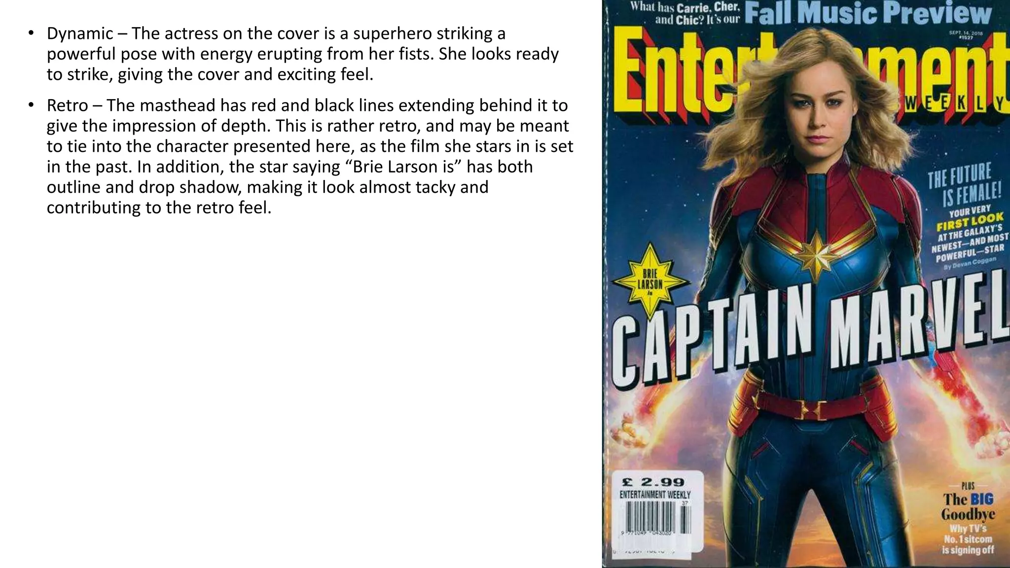
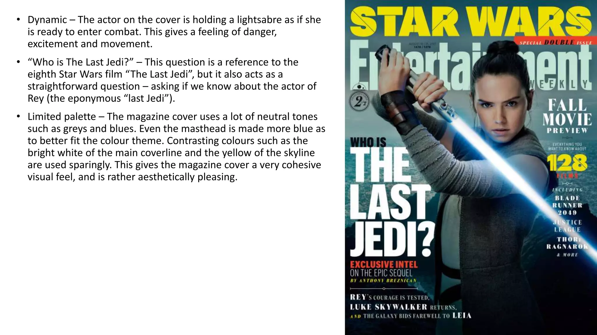
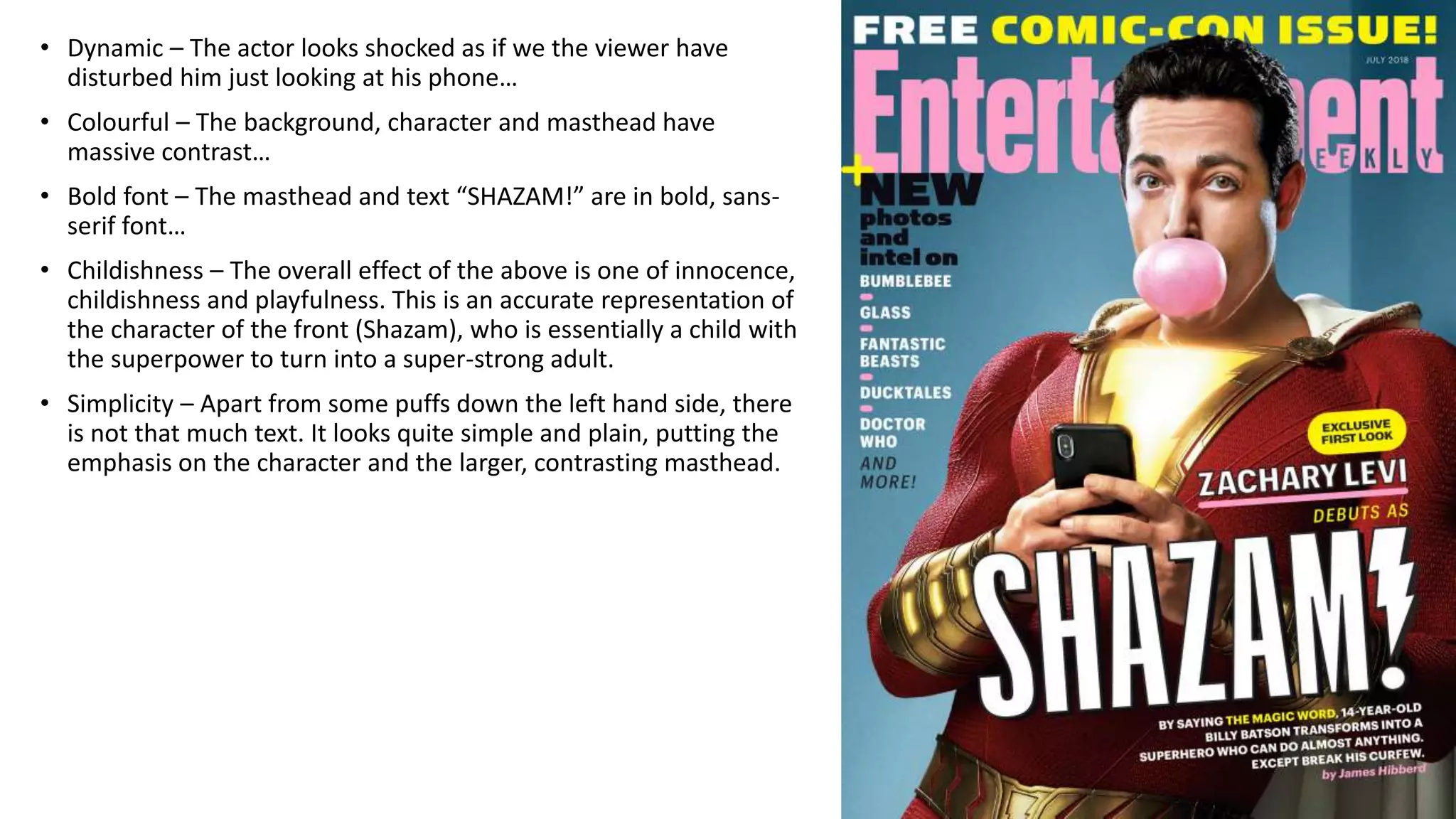
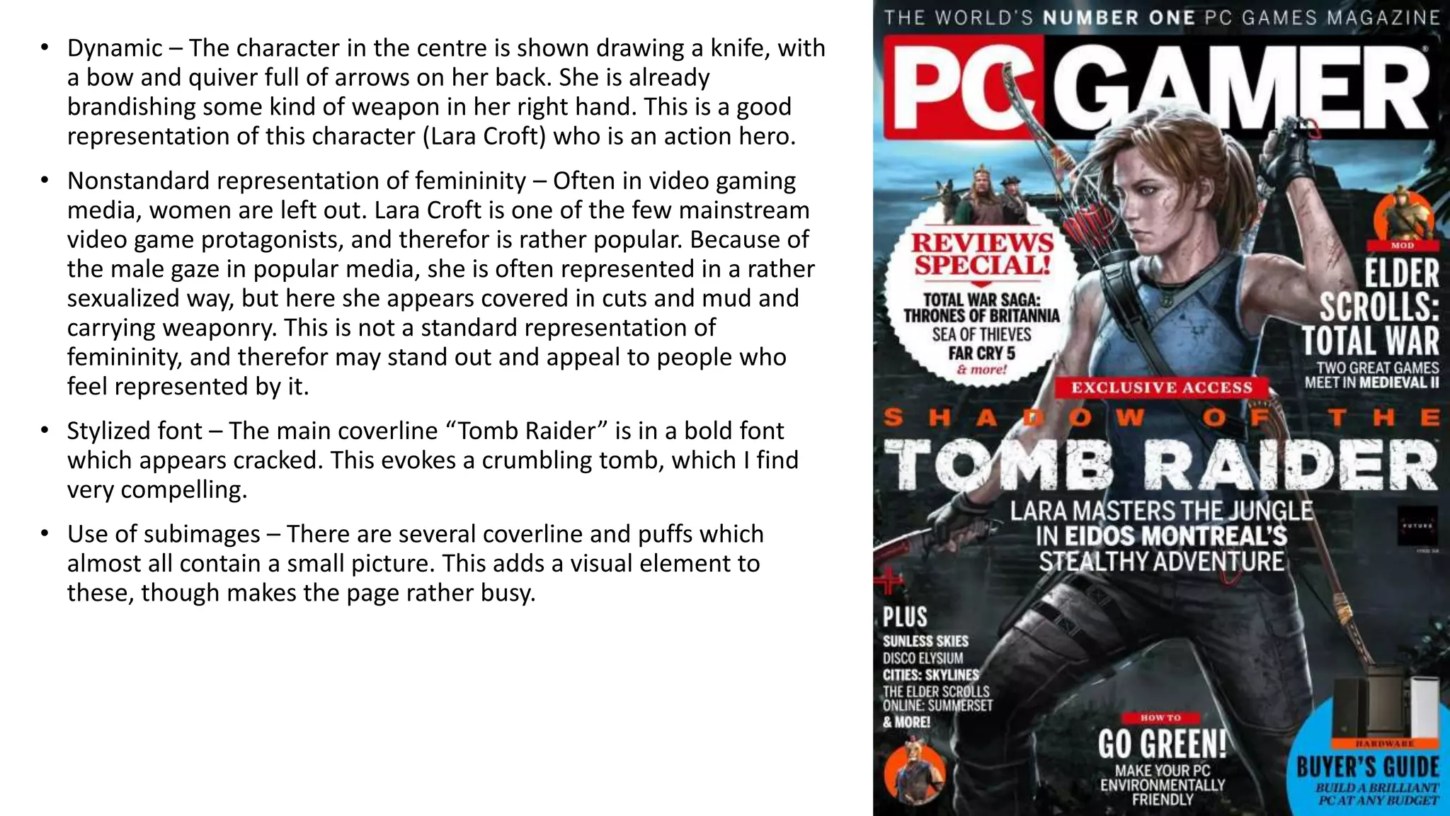
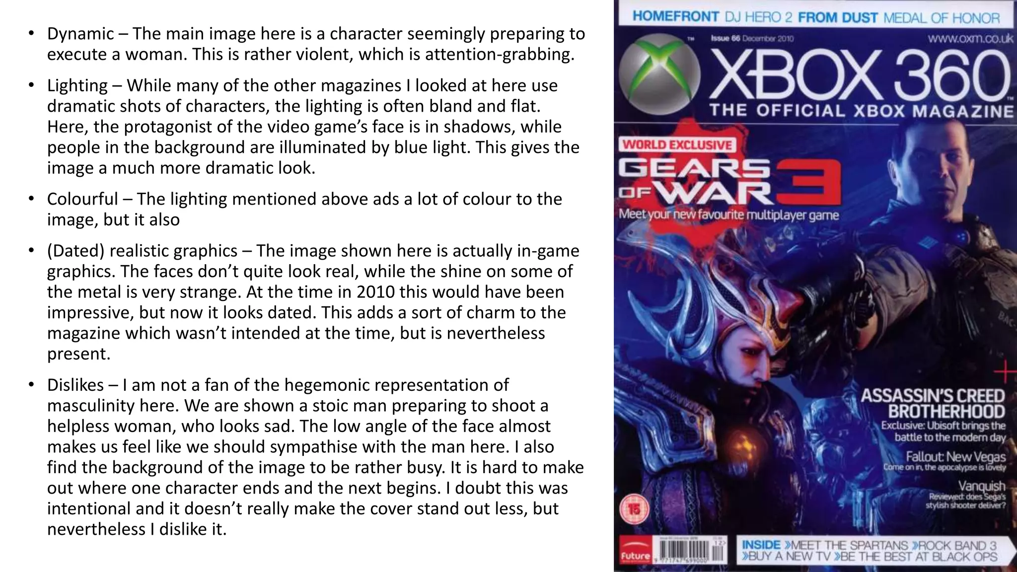
The document analyzes several magazine covers, noting key visual elements and design choices for each. Common themes identified across covers include dynamic poses and actions to convey excitement, limited color palettes for cohesion, and stylized fonts relating to the featured content. Representations of characters and intended tones are also discussed.
MAGAZINE COVERS Analyzing design elements and techniques in video game magazine covers
1. • Dynamic – The actress on the cover is a superhero striking a
powerful pose with energy erupting from her fists. She looks ready
to strike, giving the cover and exciting feel.
• Retro – The masthead has red and black lines extending behind it to
give the impression of depth. This is rather retro, and may be meant
to tie into the character presented here, as the film she stars in is set
in the past. In addition, the star saying “Brie Larson is” has both
outline and drop shadow, making it look almost tacky and
contributing to the retro feel.
2. • Dynamic – The actor on the cover is holding a lightsabre as if she
is ready to enter combat. This gives a feeling of danger,
excitement and movement.
• “Who is The Last Jedi?” – This question is a reference to the
eighth Star Wars film “The Last Jedi”, but it also acts as a
straightforward question – asking if we know about the actor of
Rey (the eponymous “last Jedi”).
• Limited palette – The magazine cover uses a lot of neutral tones
such as greys and blues. Even the masthead is made more blue as
to better fit the colour theme. Contrasting colours such as the
bright white of the main coverline and the yellow of the skyline
are used sparingly. This gives the magazine cover a very cohesive
visual feel, and is rather aesthetically pleasing.
3. • Dynamic – The actor looks shocked as if we the viewer have
disturbed him just looking at his phone…
• Colourful – The background, character and masthead have
massive contrast…
• Bold font – The masthead and text “SHAZAM!” are in bold, sans-
serif font…
• Childishness – The overall effect of the above is one of innocence,
childishness and playfulness. This is an accurate representation of
the character of the front (Shazam), who is essentially a child with
the superpower to turn into a super-strong adult.
• Simplicity – Apart from some puffs down the left hand side, there
is not that much text. It looks quite simple and plain, putting the
emphasis on the character and the larger, contrasting masthead.
4. • Dynamic – The character in the centre is shown drawing a knife, with
a bow and quiver full of arrows on her back. She is already
brandishing some kind of weapon in her right hand. This is a good
representation of this character (Lara Croft) who is an action hero.
• Nonstandard representation of femininity – Often in video gaming
media, women are left out. Lara Croft is one of the few mainstream
video game protagonists, and therefor is rather popular. Because of
the male gaze in popular media, she is often represented in a rather
sexualized way, but here she appears covered in cuts and mud and
carrying weaponry. This is not a standard representation of
femininity, and therefor may stand out and appeal to people who
feel represented by it.
• Stylized font – The main coverline “Tomb Raider” is in a bold font
which appears cracked. This evokes a crumbling tomb, which I find
very compelling.
• Use of subimages – There are several coverline and puffs which
almost all contain a small picture. This adds a visual element to
these, though makes the page rather busy.
5. • Dynamic – The main image here is a character seemingly preparing to
execute a woman. This is rather violent, which is attention-grabbing.
• Lighting – While many of the other magazines I looked at here use
dramatic shots of characters, the lighting is often bland and flat.
Here, the protagonist of the video game’s face is in shadows, while
people in the background are illuminated by blue light. This gives the
image a much more dramatic look.
• Colourful – The lighting mentioned above ads a lot of colour to the
image, but it also
• (Dated) realistic graphics – The image shown here is actually in-game
graphics. The faces don’t quite look real, while the shine on some of
the metal is very strange. At the time in 2010 this would have been
impressive, but now it looks dated. This adds a sort of charm to the
magazine which wasn’t intended at the time, but is nevertheless
present.
• Dislikes – I am not a fan of the hegemonic representation of
masculinity here. We are shown a stoic man preparing to shoot a
helpless woman, who looks sad. The low angle of the face almost
makes us feel like we should sympathise with the man here. I also
find the background of the image to be rather busy. It is hard to make
out where one character ends and the next begins. I doubt this was
intentional and it doesn’t really make the cover stand out less, but
nevertheless I dislike it.