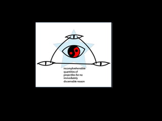
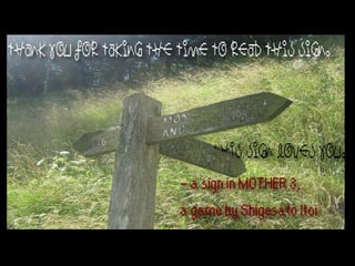
The designer used blues, reds, and blacks to create a mystical, surreal atmosphere that makes the logo unique. The shapes, including stars, yin-yangs, and eyes, are meant to seem unordinary. The quote from the game MOTHER 3 subverts expectations for what would be on a sign and provides a silly, heartwarming moment. The faded, old picture of the sign corresponds to the quote and game. The font comes from MOTHER 3 to connect thematically to its wacky humor. Font colors aid readability and the red quotation text reflects the red title screens of MOTHER games, though a homage to the games was not the initial intent.