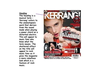
SlideShare a Scribd company logo
1 of 8
Heading
The heading is a
musical term –
‘Kerrang’ refers to
the onomatopoeic
word that derives
from the sound
made when playing
a power chord on a
distorted electric.
This will appeal to
music fans who
know what the
term means. The
shattered effect
on the title will
appeal to rock
music fans as it
gives the magazine
a more rebellious
look which is a
feature of rock
music.
Main image
The main image uses
a pose that gives the
impression that Hayley
Williams is quite
rebellious portraying
her as a ‘proper’ rock
artist. This would
appeal to rock music
fans as rebellion is a
feature of rock music.
It would also appeal
to the target audience
as the image is quite
different as there
aren’t many cover
images that use this
pose.
Main story
The way the story is layout
will appeal to the target
audience as it uses all three
colours of the colour scheme
(those being common colours
amongst rock music) and it
looks exciting and interesting.
The story itself also gives the
impression that Hayley is quite
rebellious. The word ‘NO’ is a
different colour to the other
words, red, this colour also
makes it bolder than the other
words so it emphasises it along
with the use of capitals that
also do this. These make the
word ‘NO’ stand out amongst
the other words and as it’s a
word related to rebellion and
resistance it reinforces this
image of Hayley.
Colour scheme
The colour scheme is
red, white and
black. This is quite
a common colour
scheme for both
Kerrang! Itself and
also many other
music magazines. As
most people don’t
like it when a
magazine tries
something different
than the norm this
would appeal to the
target audience. It
will also appeal to
rock music fans as
they are quite
common colours
amongst rock music.
Small pictures
The small pictures
used on the
magazine will
appeal to the
target audience
as they are
pictures of rock
artists. These
images give the
reader an insight
as to what’s
inside the
magazine so if
they like these
artists they will
be attracted to
the magazine.
Poster special
The poster
special featured
on the front
cover will appeal
to the target
audience as
from my
research I’ve
found that many
rock music fans
like posters and
have bedrooms
full of posters.
Top bar
The top bar makes
the front cover
busier and more
interesting. This will
appeal to the target
audience as after
doing research into
the same audience I
found that rock
music fans prefer
busier front cover.
It also gets the
reader more involved
in the magazine so
this could appeal to
some of the target
audience who like to
have a say in the
magazine or on
bands.
‘Plus’ bar
This feature will
appeal to the
target audience
as it has lots of
rock artists in it
so they will be
more interested in
the magazine if
there’s even more
bands they like.
It also makes the
magazine look as
though there’s
lots of stories in
it which makes
the reader more
interested in it.

More Related Content

What's hot

Magazine advert skying
Magazine advert   skyingMagazine advert   skying
Magazine advert skyingsianolivia
 
Magazine advert - Skying
Magazine advert - SkyingMagazine advert - Skying
Magazine advert - Skyingsianolivia
 
Band and artist analysis of images
Band and artist analysis of imagesBand and artist analysis of images
Band and artist analysis of imagesMorganClough
 
Analysis of album advertisements pp
Analysis of album advertisements ppAnalysis of album advertisements pp
Analysis of album advertisements ppConnor Peters
 
Deconstructions of 3 cd covers
Deconstructions of 3 cd coversDeconstructions of 3 cd covers
Deconstructions of 3 cd coversJess Gough
 
Digipak analysis taylor swift -1989
Digipak analysis   taylor swift -1989Digipak analysis   taylor swift -1989
Digipak analysis taylor swift -1989chessromeo
 
Brand Identity: The 1975
Brand Identity: The 1975Brand Identity: The 1975
Brand Identity: The 1975chessromeo
 
Questionnaire
QuestionnaireQuestionnaire
QuestionnaireCoyotie
 
Band and artist analysis of images
Band and artist analysis of imagesBand and artist analysis of images
Band and artist analysis of imagesMorganClough
 
Magazine advert analysis
Magazine advert analysisMagazine advert analysis
Magazine advert analysissianolivia
 
Digipak Analysis
Digipak Analysis Digipak Analysis
Digipak Analysis Zali Wright
 
Digi pak analysis
Digi pak analysisDigi pak analysis
Digi pak analysisThomashut
 
album magazine advert analysis
album magazine advert analysisalbum magazine advert analysis
album magazine advert analysisciaranolan10
 
Evanescence fallen digipak pwrpoint
Evanescence fallen digipak pwrpointEvanescence fallen digipak pwrpoint
Evanescence fallen digipak pwrpointjjawhite
 
Cd cover analysis and idea’s for my CD
Cd cover analysis and idea’s for my CDCd cover analysis and idea’s for my CD
Cd cover analysis and idea’s for my CDRyparsnips
 

What's hot (20)

Magazine advert skying
Magazine advert   skyingMagazine advert   skying
Magazine advert skying
 
The 1975
The 1975The 1975
The 1975
 
Magazine advert - Skying
Magazine advert - SkyingMagazine advert - Skying
Magazine advert - Skying
 
Band and artist analysis of images
Band and artist analysis of imagesBand and artist analysis of images
Band and artist analysis of images
 
Analysis of album advertisements pp
Analysis of album advertisements ppAnalysis of album advertisements pp
Analysis of album advertisements pp
 
Fall 1
 Fall 1 Fall 1
Fall 1
 
Bugg
BuggBugg
Bugg
 
Deconstructions of 3 cd covers
Deconstructions of 3 cd coversDeconstructions of 3 cd covers
Deconstructions of 3 cd covers
 
Digipak analysis taylor swift -1989
Digipak analysis   taylor swift -1989Digipak analysis   taylor swift -1989
Digipak analysis taylor swift -1989
 
Brand Identity: The 1975
Brand Identity: The 1975Brand Identity: The 1975
Brand Identity: The 1975
 
Album cover analysis
Album cover analysisAlbum cover analysis
Album cover analysis
 
Questionnaire
QuestionnaireQuestionnaire
Questionnaire
 
Band and artist analysis of images
Band and artist analysis of imagesBand and artist analysis of images
Band and artist analysis of images
 
Magazine advert analysis
Magazine advert analysisMagazine advert analysis
Magazine advert analysis
 
Digipak Analysis
Digipak Analysis Digipak Analysis
Digipak Analysis
 
Digi pak analysis
Digi pak analysisDigi pak analysis
Digi pak analysis
 
album magazine advert analysis
album magazine advert analysisalbum magazine advert analysis
album magazine advert analysis
 
Presentation1
Presentation1Presentation1
Presentation1
 
Evanescence fallen digipak pwrpoint
Evanescence fallen digipak pwrpointEvanescence fallen digipak pwrpoint
Evanescence fallen digipak pwrpoint
 
Cd cover analysis and idea’s for my CD
Cd cover analysis and idea’s for my CDCd cover analysis and idea’s for my CD
Cd cover analysis and idea’s for my CD
 

Similar to Kerrang! front cover analysis

Music magazine's signs and signifiers
Music magazine's signs and signifiersMusic magazine's signs and signifiers
Music magazine's signs and signifiersBetsyEGR
 
analysis of magazine pages tasks 1,2 and 3
analysis of magazine pages tasks 1,2 and 3analysis of magazine pages tasks 1,2 and 3
analysis of magazine pages tasks 1,2 and 3JackBeale-Burchell
 
Analysis of a media product
Analysis of a media productAnalysis of a media product
Analysis of a media productEllie Marsh
 
Signs & Signifiers Textual Analysis of Music Magazines
Signs & Signifiers Textual Analysis of Music MagazinesSigns & Signifiers Textual Analysis of Music Magazines
Signs & Signifiers Textual Analysis of Music MagazinesBetsyEGR
 
Analysing Existing Products
Analysing Existing ProductsAnalysing Existing Products
Analysing Existing ProductsRachAH
 
Analysing Existing Products
Analysing Existing ProductsAnalysing Existing Products
Analysing Existing ProductsRachAH
 
Analysing Existing Products
Analysing Existing ProductsAnalysing Existing Products
Analysing Existing ProductsRachAH
 
Front cover analysis
Front cover analysisFront cover analysis
Front cover analysisNattayaday11
 
Magazine name planning and analysis
Magazine name planning and analysisMagazine name planning and analysis
Magazine name planning and analysiscarlaharrisss
 
Magazine Research Analysis
Magazine Research AnalysisMagazine Research Analysis
Magazine Research AnalysisTRUDY
 
Pop music magazines
Pop music magazines Pop music magazines
Pop music magazines gozdetezcan
 
Music magazines – signs and signifiers
Music magazines – signs and signifiersMusic magazines – signs and signifiers
Music magazines – signs and signifierslivmard
 
Research into magazine adverts
Research into magazine advertsResearch into magazine adverts
Research into magazine advertsseannorris353467
 
album magazine advert analysis
album magazine advert analysisalbum magazine advert analysis
album magazine advert analysisciaranolan10
 
Magazine Double Page Spread Research
Magazine Double Page Spread ResearchMagazine Double Page Spread Research
Magazine Double Page Spread ResearchLynley Sykes
 
Kerrang front cover analysis
Kerrang front cover analysisKerrang front cover analysis
Kerrang front cover analysisasmediad14
 
Genres of music magazines
Genres of music magazinesGenres of music magazines
Genres of music magazinesShahEman
 

Similar to Kerrang! front cover analysis (20)

Music magazine's signs and signifiers
Music magazine's signs and signifiersMusic magazine's signs and signifiers
Music magazine's signs and signifiers
 
analysis of magazine pages tasks 1,2 and 3
analysis of magazine pages tasks 1,2 and 3analysis of magazine pages tasks 1,2 and 3
analysis of magazine pages tasks 1,2 and 3
 
Analysis of a media product
Analysis of a media productAnalysis of a media product
Analysis of a media product
 
Signs & Signifiers Textual Analysis of Music Magazines
Signs & Signifiers Textual Analysis of Music MagazinesSigns & Signifiers Textual Analysis of Music Magazines
Signs & Signifiers Textual Analysis of Music Magazines
 
Analysing Existing Products
Analysing Existing ProductsAnalysing Existing Products
Analysing Existing Products
 
Analysing Existing Products
Analysing Existing ProductsAnalysing Existing Products
Analysing Existing Products
 
Analysing Existing Products
Analysing Existing ProductsAnalysing Existing Products
Analysing Existing Products
 
Front cover analysis
Front cover analysisFront cover analysis
Front cover analysis
 
Magazine name planning and analysis
Magazine name planning and analysisMagazine name planning and analysis
Magazine name planning and analysis
 
Magazine Research Analysis
Magazine Research AnalysisMagazine Research Analysis
Magazine Research Analysis
 
Pop music magazines
Pop music magazines Pop music magazines
Pop music magazines
 
Music magazines – signs and signifiers
Music magazines – signs and signifiersMusic magazines – signs and signifiers
Music magazines – signs and signifiers
 
Atl analysis
Atl analysisAtl analysis
Atl analysis
 
Research into magazine adverts
Research into magazine advertsResearch into magazine adverts
Research into magazine adverts
 
album magazine advert analysis
album magazine advert analysisalbum magazine advert analysis
album magazine advert analysis
 
Magazine Double Page Spread Research
Magazine Double Page Spread ResearchMagazine Double Page Spread Research
Magazine Double Page Spread Research
 
Kerrang front cover analysis
Kerrang front cover analysisKerrang front cover analysis
Kerrang front cover analysis
 
Genres of music magazines
Genres of music magazinesGenres of music magazines
Genres of music magazines
 
Front cover overview
Front cover overviewFront cover overview
Front cover overview
 
3 magazines
3 magazines3 magazines
3 magazines
 

Kerrang! front cover analysis

  • 1. Heading The heading is a musical term – ‘Kerrang’ refers to the onomatopoeic word that derives from the sound made when playing a power chord on a distorted electric. This will appeal to music fans who know what the term means. The shattered effect on the title will appeal to rock music fans as it gives the magazine a more rebellious look which is a feature of rock music.
  • 2. Main image The main image uses a pose that gives the impression that Hayley Williams is quite rebellious portraying her as a ‘proper’ rock artist. This would appeal to rock music fans as rebellion is a feature of rock music. It would also appeal to the target audience as the image is quite different as there aren’t many cover images that use this pose.
  • 3. Main story The way the story is layout will appeal to the target audience as it uses all three colours of the colour scheme (those being common colours amongst rock music) and it looks exciting and interesting. The story itself also gives the impression that Hayley is quite rebellious. The word ‘NO’ is a different colour to the other words, red, this colour also makes it bolder than the other words so it emphasises it along with the use of capitals that also do this. These make the word ‘NO’ stand out amongst the other words and as it’s a word related to rebellion and resistance it reinforces this image of Hayley.
  • 4. Colour scheme The colour scheme is red, white and black. This is quite a common colour scheme for both Kerrang! Itself and also many other music magazines. As most people don’t like it when a magazine tries something different than the norm this would appeal to the target audience. It will also appeal to rock music fans as they are quite common colours amongst rock music.
  • 5. Small pictures The small pictures used on the magazine will appeal to the target audience as they are pictures of rock artists. These images give the reader an insight as to what’s inside the magazine so if they like these artists they will be attracted to the magazine.
  • 6. Poster special The poster special featured on the front cover will appeal to the target audience as from my research I’ve found that many rock music fans like posters and have bedrooms full of posters.
  • 7. Top bar The top bar makes the front cover busier and more interesting. This will appeal to the target audience as after doing research into the same audience I found that rock music fans prefer busier front cover. It also gets the reader more involved in the magazine so this could appeal to some of the target audience who like to have a say in the magazine or on bands.
  • 8. ‘Plus’ bar This feature will appeal to the target audience as it has lots of rock artists in it so they will be more interested in the magazine if there’s even more bands they like. It also makes the magazine look as though there’s lots of stories in it which makes the reader more interested in it.