↑Top Model (Kolkata) Call Girls Sonagachi ⟟ 8250192130 ⟟ High Class Call Girl...
2 front cover compare analysis essays
1. Liam Keenan
Foundation Portfolio: Front Cover Analysis
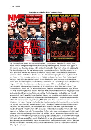
The Target audience of NME is primarily male teenagers roughly 14-27. The magazine contains music
mostly from the indie genre and promotes many new, up and coming bands. The front cover appeals to
this audience and stands out because of the bold serif masthead in the primary optical area according to
The Guttenberg Principle. The lead articles heading is sans serif appealing to the wider audience of the
arctic monkeys as they are very mainstream nowadays. The use of the colour red on the front cover is
consistent with the NME’s house style but could also connote danger giving the band a mysterious feel
and the use of white stands out against parts on the black background and could show the bands good
side. Their expressions are negative and they all wear dark clothing apart from Matt Helders and Alex
Turner (front man) showing their new-found dark personalities. Alex wears a bright white t-shirt displaying
his good side but the dark leather jacket and aviator shades could show his ‘bad boy’ image also
representing his developing rock/indie genre. The un-zipped leather jacket could represent Alex’s new
found personality coming out. This would also appeal to the young primary audience who enjoy rebelling.
The photo is informally balanced and uses the rule of thirds which could also appeal to the younger target
audience as it could represent confusion and rebelling. Their hairstyles are combed back and greased
which reminds me of Elvis which shows they have changed their image because they have been inspired
by old rock ‘n’ roll music. The shutters in the background could also depict a good side and bad side with
light and dark colours dominantly contrasting. Matt Helders has the most positive expression and wears a
light denim shirt maybe showing the whole band aren’t all that bad and depressed and do have a fun side.
The date and more important price also appears in the Primary optical area in an italic font appealing to
the parents who are purchasing the magazine and a red circle with one of the top stories inside is also
included. This stands out as it in front of the band photo but behind Alex’s head showing he is the most
important on the front cover. Alex Turner stands at the front of the band members showing he is the lead
singer and front man. The lead guitarist Jamie Cook stands at the back which is not common within band
photos. This shows them breaking more rules appealing to the target audience. There isn’t much included
in the weak fallow area apart from a small story but in the strong fallow area a large red box stands out
with two big stories inside following the Guttenberg principle. The fonts are consistent as only a few types
are used and repeated. The cover uses House style as it is the same layout for each magazine which can
differ slightly each week.
2. Liam Keenan
In contrast the Metal hammer front cover uses a much darker colour scheme as it covers bands that perform dark,
negative, depressing and aggressive music. The target audience for Metal hammer is also young people but more
rebellious teenagers that want to stand out in the crowd. The use of red and fiery colours on the front cover could
connote pain, violence or even hell. The front cover appeals to this kind of audience because of the negative colour
scheme, the background is black, emotional teenagers who think there different will purchase the magazine. The
colour yellow contrasts against the dark rock associated colours and highlights stories in the primary optical and
strong fallow areas with the Large Red masthead spread across these two areas underneath. The Masthead is
different shades of red mimicking blood or connoting danger, death or violence, these are big themes included in
Metal music and the font is sharp like a knife or weapon. The word ‘hammer’ gives the audience a picture of a
lifeless metallic object used for killing and a hammer is the same type of shape as a guitar also known as an ‘axe’.
The masthead could also mimic the Metallica logo. Metallica are well known in the metal industry and basically the
founders of metal. There are yellow highlights on the masthead giving the magazine a realistic feel that the top
stories are shining and reflecting off the masthead. The barcode is in the weak fallow area so the audience don’t pay
much attention to the price of the magazine and are persuaded to buy it from the image. There is high key lighting
used on the band members showing they are the focus on the cover. An illustration of demonic like creatures and
fire is above the Mastodon lettering. This also ties in with hell and Satan, large topics included in the metal genre.
The ‘mastodon’ lead article font is stylish and organised but has a strange gothic like feel to it. The patterned border
around the main image reminds me of a fairground with a strange, eerie satanic vibe. This highlights the main image
also as it surrounds the band members as if they are trapped in hell. All the band members in the main image have
serious expressions showing they are serious about their music. The dark tattoos on the lead singer’s arms look
depressing and gothic like. He has his arms crossed in a powerful pose. High key lighting is used to highlight their
faces. They all have beards and long hair which are also stereotypes of the metal genre. All their clothes are black
and the pendant around the frontman neck is almost witchcraft like. Magic and satanic forces are also themes of
the metal. The second band member from the left has shorter hair than all the others showing he is different. His
eyes are wide and his expression is quite crazy representing he is mentally unstable. They have earrings and piercing
also connotations of the metal genre. The lead singer has the most light shone on him representing he is the front
man and the light makes them all look almost vampire like. They are in front of the masthead showing they are
more important.
In comparison both covers have the masthead located in the primary optical area and the main story in the terminal
area. They are different because the price is located in the weak fallow area on Metal hammer where as the price is
located in the primary area of the NME. This could show that the audience of the NME are more concerned about
the price of the magazine. Both their uses of red connote danger and rebellion which teenagers will relate to but
the colours used on Metal hammer are much darker to convey a negative mood for the metal fans. They are similar
in the way that both main images appear above the masthead to show that the band is the most important thing on
the covers. Both front men appear at the front of the band members and rule of thirds is used in both of them.