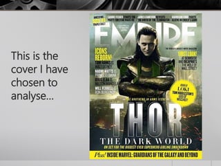
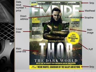
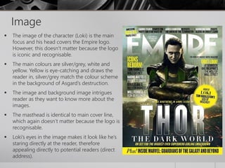
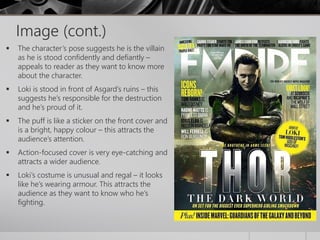
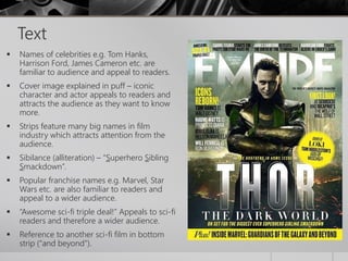
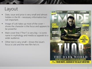
Magazine Cover Analysis 
By Shannon House
This is the 
cover I have 
chosen to 
analyse…
Direct 
address 
Masthead 
Main 
cover line 
Strapline 
Main 
image 
Date, 
issue 
number + 
price 
Puff 
Strip 
Cover 
lines 
Strip
Image 
 The image of the character (Loki) is the main 
focus and his head covers the Empire logo. 
However, this doesn’t matter because the logo 
is iconic and recognisable. 
 The main colours are silver/grey, white and 
yellow. Yellow is eye-catching and draws the 
reader in, silver/grey match the colour scheme 
in the background of Asgard’s destruction. 
 The image and background image intrigues 
reader as they want to know more about the 
images. 
 The masthead is identical to main cover line, 
which again doesn’t matter because the logo is 
recognisable. 
 Loki’s eyes in the image makes it look like he’s 
staring directly at the reader, therefore 
appealing directly to potential readers (direct 
address).
Image (cont.) 
 The character’s pose suggests he is the villain 
as he is stood confidently and defiantly – 
appeals to reader as they want to know more 
about the character. 
 Loki is stood in front of Asgard’s ruins – this 
suggests he’s responsible for the destruction 
and he’s proud of it. 
 The puff is like a sticker on the front cover and 
is a bright, happy colour – this attracts the 
audience’s attention. 
 Action-focused cover is very eye-catching and 
attracts a wider audience. 
 Loki’s costume is unusual and regal – it looks 
like he’s wearing armour. This attracts the 
audience as they want to know who he’s 
fighting.
Text 
 Names of celebrities e.g. Tom Hanks, 
Harrison Ford, James Cameron etc. are 
familiar to audience and appeal to readers. 
 Cover image explained in puff – iconic 
character and actor appeals to readers and 
attracts the audience as they want to know 
more. 
 Strips feature many big names in film 
industry which attracts attention from the 
audience. 
 Sibilance (alliteration) – “Superhero Sibling 
Smackdown”. 
 Popular franchise names e.g. Marvel, Star 
Wars etc. are also familiar to readers and 
appeal to a wider audience. 
 “Awesome sci-fi triple deal!” Appeals to sci-fi 
readers and therefore a wider audience. 
 Reference to another sci-fi film in bottom 
strip (“and beyond”).
Layout 
 Date, issue and price is very small and almost 
hidden in the M – necessary information but 
not important. 
 Image of Loki takes up most of the cover – 
shows the character is the focus and appears to 
be powerful. 
 Main cover line (“Thor”) is very big – is iconic 
name in mythology and media so appeals to a 
wider audience. 
 Other text is very small – shows the issue’s 
focus is Loki and the new film he’s in.

Magazine Cover Analysis - Empire

  • 1.
    Magazine Cover Analysis By Shannon House
  • 2.
    This is the cover I have chosen to analyse…
  • 3.
    Direct address Masthead Main cover line Strapline Main image Date, issue number + price Puff Strip Cover lines Strip
  • 4.
    Image  Theimage of the character (Loki) is the main focus and his head covers the Empire logo. However, this doesn’t matter because the logo is iconic and recognisable.  The main colours are silver/grey, white and yellow. Yellow is eye-catching and draws the reader in, silver/grey match the colour scheme in the background of Asgard’s destruction.  The image and background image intrigues reader as they want to know more about the images.  The masthead is identical to main cover line, which again doesn’t matter because the logo is recognisable.  Loki’s eyes in the image makes it look like he’s staring directly at the reader, therefore appealing directly to potential readers (direct address).
  • 5.
    Image (cont.) The character’s pose suggests he is the villain as he is stood confidently and defiantly – appeals to reader as they want to know more about the character.  Loki is stood in front of Asgard’s ruins – this suggests he’s responsible for the destruction and he’s proud of it.  The puff is like a sticker on the front cover and is a bright, happy colour – this attracts the audience’s attention.  Action-focused cover is very eye-catching and attracts a wider audience.  Loki’s costume is unusual and regal – it looks like he’s wearing armour. This attracts the audience as they want to know who he’s fighting.
  • 6.
    Text  Namesof celebrities e.g. Tom Hanks, Harrison Ford, James Cameron etc. are familiar to audience and appeal to readers.  Cover image explained in puff – iconic character and actor appeals to readers and attracts the audience as they want to know more.  Strips feature many big names in film industry which attracts attention from the audience.  Sibilance (alliteration) – “Superhero Sibling Smackdown”.  Popular franchise names e.g. Marvel, Star Wars etc. are also familiar to readers and appeal to a wider audience.  “Awesome sci-fi triple deal!” Appeals to sci-fi readers and therefore a wider audience.  Reference to another sci-fi film in bottom strip (“and beyond”).
  • 7.
    Layout  Date,issue and price is very small and almost hidden in the M – necessary information but not important.  Image of Loki takes up most of the cover – shows the character is the focus and appears to be powerful.  Main cover line (“Thor”) is very big – is iconic name in mythology and media so appeals to a wider audience.  Other text is very small – shows the issue’s focus is Loki and the new film he’s in.