
Recommended
More Related Content
What's hot
What's hot (20)
Similar to Double page analysis
Similar to Double page analysis (20)
More from Liberty Kavanagh
Recently uploaded
Recently uploaded (20)
Double page analysis
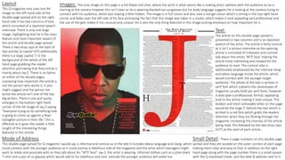
- 1. Layout This Q magazine only uses one A4 image on the left hand side of the double page spread and on the right hand side it has two columns of text, which consisted of a reported speech interview. There is only one large image, highlighting that he is the main feature and most important aspect of this article and double page spread. There is two drop caps at the start of two articles (a capital H/T) additionally there is a large capital ‘J’ in the background of the whole of the left hand page grabbing the reader attention portraying that they article is mainly about Jay-Z. There is no byline on either of the double pages, conveying how important the article is not the person who wrote it, it also might suggest and the person her wrote the article isn’t one of the top big writers. There is one pull quote, enlarged in the bottom right hand corner of the A4 image of Jay-Z saying “everyone trying to do something new is going to come up against a Noel Gallagher picture in their life.” this is effective as it gives the reader a little insight of the interesting things featured in this article. Mode of Address This double page spread for Q magazine I would say is informal and comical as in the text it includes taboo language and slang, which could connect with the younger audience as it could portray a rebellious side of the magazine and the artist which teenagers might want to relate and associate with as they talk about his “WTF face”. Jay-Z; the artist is wearing informal clothes such as a plain black T-shirt and a pair of un glasses which would add to his rebellious and cool attitude the younger audience will relate too. Small Detail: There is page numbers on this double page spread and they are located on the outer corners of each page making them clear and easy to find, in addition on the right hand page along with the page number there is a small square with the Q masthead inside, and the date & website next to it. Images: The only image on this page is a full bleed mid-shot, where the artist is what seems like is making direct address with the audience as he is starring at the camera however this isn’t clear as he is wearing blacked out sunglasses but his body language suggests he is looking at the camera trying to connect with his audience, whilst also staying a little hidden. The image is in full colour and also uses a red gel colour which is strong in the top right hand corner and fades over the left side of his face portraying the fact that this image was taken in a studio, which makes it look appealing and professional and the use of the gels makes it fun unusual and unique. He is also the only thing featured in this image putting emphasis on how important he is. Text: The article on this double page spread is presented in two columns and is an reported speech of the artist. The article is fairly comical as it isn’t a serious interview as the opening article is consisted of irrelevant and comical talk about the artists ‘WTF face’ making the article more interesting and relaxed for the audience to read. The comical vibe is additionally emphasised by the informal slang and taboo language inside the article, which would connect with the younger target audience. The whole of the text is written in serif font which subverts the stereotypes of magazine usually bold san serif fonts, however it does give a professional, formal, appealing look to the article making it look unique. The boldest and most noticeable letter on the page would be the large ‘J’ behind the text which is printed in a red font which grabs the readers attention when they are flicking through the magazine, increasing the chances of the article being read, this followed by the two drop caps (H/T) at the start of each article..
- 2. Layout This Q magazine only uses one A4 image on the right hand side of the double page spread and on the left hand side it has three columns of text which upholds the stereotype of a music magazine, which consisted of a comical interview. There is only one large image, highlighting that he is the main feature and most important aspect of this article and double page spread. There is one drop cap at the start of two articles (a S) additionally there is a large capital ‘T’ in the background of the whole of the left hand page even though it has no significance it adds colour and follows the house style colour of Q magazine which is red, it also grabs the reader attention making them want to read the article. There is a comedic pull quote on the right page of the reaction to Oasis splitting up, due to the use of taboo language grabbing the audiences eye. The layout of this page is very structured and appealing. There is no byline on this double page highlighting the insignificance of the writer/photographer, and that the importance should be the content of the article Mode of Address This double page spread for Q magazine I would say is informal and comical as in the text it includes taboo language and slang, which could connect with the younger audience as it could portray a rebellious side of the magazine and the artist which teenagers might want to relate and associate with. Additionally the fact the artist is wearing rather unsmart and informal clothes which you would stereotypically wear on a normal day adds to the informality of this double page spread. Images: The only image on this page is a full body shot, where the artist is looking away from the camera with his head held high, not making direct address with the audience conveying he doesn’t want to connect with them, but in fact might suggest he think the audience are inferior to him. The image is in full colour and even though it uses fairly dull colours it still stands out a lot against the white background, which leads to the fact that this image was taken in a studio, which makes it look appealing and professional. He is also the only thing featured in this image putting emphasis on how important he is. Small Detail: There is page numbers on this double page spread and they are located on the outer corners of each page making them clear and easy to find, in addition on the left hand page along with the page number there is a small square with the Q masthead inside, and the date & website next to it. Text: The article on this double page spread is presented in three columns and is an interview of an artist. The article is fairly comical as it isn’t a serious interview as the opening article is consisted of irrelevant talk about the artist ‘new sausage dog called Ruby’ making the article more interesting and relaxed. The comical vibe is additionally emphasised by the informal slang and taboo language inside the article, which would connect with the younger target audience. Throughout the article direct and reported speech is used which makes the article more interesting and personal to the artist. The whole of the text is written in serif font which subverts the stereotypes of magazine usually bold san serif fonts, however it does give a professional, formal, appealing look to the article making it look unique. The boldest and most noticeable letter on the page would be the large ‘T’ behind the text which is printed in a red font which grabs the readers attention when they are flicking through the magazine, increasing the chances of the article being read.
- 3. Layout This Q magazine only uses one full bleed A3 image which is spread across the double page, with the artist mainly on the left page and the boxed article on the right which consisted of a comical interview. There is only one large image, highlighting that the artist is the main feature and most important aspect of this article and double page spread. There is one drop cap at the start of the first article which is inside a red box which follows the house colour red which is consistent throughout the magazine, it also grabs the reader attention making them want to read the article. There is a comedic pull quote which is also the headline with the sub title below which is away from the other text making it stand out, and more likely to grab peoples attention. It is located on the left page underneath a picture of Ed Sheeran stating “I'm bringing ginger back” which grabs the audiences eye, especially as ‘ginger’ is printed in the same bold bright red colour. The layout of this page is very structured and appealing. There is a small byline on this double page highlighting his little importance of the writer compared to the artist. Small Detail: There is page numbers on this double page spread and they are located on the outer corners of each page making them clear and easy to find, in addition on both pages of this DPS along with the page number there is a small square with the Q masthead inside, and the date & website next to it. Mode of Address This double page spread for Q magazine I would say is informal and comical as in the text it consists of a light hearted story of the artists day to day life and the head line is a comical play on. Additionally the fact the artist is wearing rather unsmart and informal clothes such as a hoodie and jeans which you would stereotypically wear on a normal day adds to the causal, relaxed and informal tone of this double page spread, which would make the audience feel comfortable and relaxed whilst reading. Images: The only image on this page is a long shot, where the artist is looking away from the camera not making direct address with the audience creating a shy mysterious tone to the artist. The image is in full colour which is bright and eye catching. In addition this photo is a location shot as it was taken outside the studio of Ed Sheeran standing on a bridge in front of Big Ben and the Houses of Parliament. This photograph is effective as it has a personal link to Ed Sheeran as London is where he is from making the article interesting and gives a warm homely feel about the article which is unique. He is also the only main aspect featured in this image putting emphasis on how important he is and that he is the biggest link to the article. Text: The article on this double page spread is presented in two columns and is an interview of the artist and his recent success. The article is fairly comical as it isn’t a serious interview. In the article there is a lot of mention on Ed Sheeran's success and how it hasn’t gone to his head. The interview is a mixture of both reported and said speech giving the article variation meaning it could appeal to more than one fixed audience. Taboo language and slang is used in this article but not noticeably in comparison to the two other articles. The whole of the text is written in serif font which subverts the stereotypes of magazine usually bold san serif fonts, however it does give a professional, formal, appealing look to the article making it look unique.