
Recommended
More Related Content
What's hot
What's hot (20)
Viewers also liked
Viewers also liked (20)
Similar to Contents cover analysis
Similar to Contents cover analysis (20)
Recently uploaded
Recently uploaded (20)
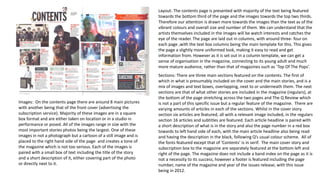
Contents cover analysis
- 1. Images: On the contents page there are around 8 main pictures with another being that of the front cover (advertising the subscription service). Majority of these images are in a square box format and are either taken on location or in a studio in performance or posed. All of the images range in size with the most important stories photos being the largest. One of these images in not a photograph but a cartoon of a still image and is placed to the right hand side of the page and creates a tone of the magazine which is not too serious. Each of the images is paired with a small box of text including the title of the story and a short description of it, either covering part of the photo or directly next to it. Layout: The contents page is presented with majority of the text being featured towards the bottom third of the page and the images towards the top two thirds. Therefore our attention is drawn more towards the images than the text as of the vibrant colours and overall size and number of them. We can understand that the artists themselves included in the images will be watch interests and catches the eye of the reader. The page are laid out in columns, with around three- four on each page ,with the text box columns being the main template for this. This gives the page a slightly more uniformed look, making it easy to read and get information from. However as it is set out in a column template, we can get a sense of organisation in the magazine, connecting to its young adult and much more mature audience, rather than that of magazines such as ‘Top Of The Pops’. Sections: There are three main sections featured on the contents. The first of which in what is presumably included on the cover and the main stories, and is a mix of images and text boxes, overlapping, next to or underneath them. The next sections are that of what other stories are included in the magazine (regulars), at the bottom of the page stretching across the two pages and The Q Review which is not a part of this specific issue but a regular feature of the magazine. There are varying amounts of articles in each of the sections. Whilst in the cover story section six articles are featured, all with a relevant image included, in the regulars section 16 articles and subtitles are featured. Each article headline is paired with a short description of what is in the story and also the page number in a red box towards to left hand side of each, with the main article headline also being read and having the description in the black, following Q’s usual colour scheme. All of the fonts featured except that of ‘Contents’ is in serif. The main cover story and subscription box to the magazine are separately featured at the bottom left and right of the page. The magazine does not include a band index on the page as it is not a necessity to its success, however a footer is featured including the page number, name of the magazine and year of the issues release; with this issue being in 2012.
- 2. Images: there are seven images presented on the pages, with one presumably being that of the magazine cover. These include both location and studio photo shoot images, as well as images taken at concerts and one being a cartoon, showing the magazines much more relaxed tone. All of the images range in sizes showing a lack of uniformity throughout the page. The images are all rectangular or squared format and are all matched with a text box relating to the story the image involved. The reader is therefore interested by the image and is able to know where they can read more through the short description. Layout: The page includes three main sections, including the images and there descriptions, the Q Review and subscription column as well as the Regular articles division. As well as this there is also a section for the title of Contents and a small area in the bottom left for the main cover story. The attention of the reader is initially directed towards the images and especially that of the largest of a man directly addressing the camera. This entices the audience, and makes them want to read on about the images stories throughout the magazine. Also the images are the only elements in the page not in grey, black, white or red and thereby standout against all the other aspects which follow this colour scheme. The images are placed across majority of the page, giving them majority of the importance, with the most of the text being included in the bottom third, showing some organisation in the page and also showing clearly which pages to go to for specific articles. Sections: as already mentioned there are three main sections on the page, one for the images and text boxes paired with them, another for the regulars and cover story information and the third for the Q review and subscription service (featured in the bottom right). The regular news articles would be one of the main selling points as returning readers would be attracted to what they have enjoyed to read before, therefore the editors would have made the smart decision of giving it a large section of the page. There is around 3-4 articles per column and 13 in this section and 19 across the whole double page spread. The page text follows the usual colour scheme of red, black , grey and white, with all the headlines in red and their descriptions in black. This gives consistency to each issue. The cover story section includes a block heading of ‘Cover Story’ as well as a headline, short summary and image, make it distinct from the other articles and stand out. Each text box features a red page number from where the article can be found and also include only serif fonts with the exception of the Contents title, and a few other pieces of text. The magazine does not include a band index on the page as it is not a necessity to its success, however a footer is featured including the page number, name of the magazine and year of the issues release; with this issue being in 2012.
- 3. Images: this contents page differs from the other two example, although all coming from the same magazine. The page includes 10 images ranging from performance shots, to studio location and also one cartoon (one of animated characters from the popular band the Gorillaz). With this specific cartoon and one of the studio images featuring much more mature themes (guns and bullets), we get the idea that this magazine is focused to a much more older audience. Each of the images range in sizes, with some being tilted in certain angles however majority being in a rectangular or squared format. The various angles of the images, make the page look untidy which is also shown by how the images over lap the title of the contents page and also are over lapped by each other. The cartoon images are used in each of the examples I have chosen and also show the relaxed nature of the magazine. Only three of the images include any associated text other than that of the page number the story is featured on, showing how the people in these images may already explain themselves and a description and headline is not needed. Layout: the layout the page in split into four main columns, with some being taken up primarily by text and others just with images. this shows how both the text and also the images are important in the pages layout and each have their own use and intention for attracting the reader. However in this specific issue our attention is directly to the large cartoon image and its page number which takes up an entire column on its own. This depicts that it is an important factor in this issue and will interest the targeted audience. The page is slightly uniformed by not being too busy or mixing different aspects together making it untidy, however we can get a sense of its slight lack of uniformity by the varying angles of some of the images. Sections: there are many different sections on this page including, The Q review, section for the images and one of the large animation, and also lists of articles at each side of the page under the titles of Features and Regulars. Underneath these headings are various articles in black and grey serif fonts, split up by their black font page numbers and a thin red line under and above each. The Q review section however is different by having all of its text except it heading in red and featuring an image to represent what it is talking about. All of the page numbers are placed either to the left hand side to all of the text and in a clear space not coving the image. Those numbers on the image are quite large and increase in size, depending on the size of the image. There is not subscription service of social media links on this contents page, as it is quite an old issue and may not have been a necessary asset at this time and also possibly having these elements featured on a different page. The cover story is not identified on this page, making it different to each of the other examples. There is a small footer of a black line at the bottom of the page with the page number of the contents underneath it, however there is a thick red and black bordered header which includes the issue number Contents page title and name of the magazine. Finally the magazine does not include a band index on the page as it is not a necessity to its success in attracting readers to specific stories.