
Recommended
More Related Content
What's hot
What's hot (16)
Similar to Double page spread analysis
Similar to Double page spread analysis (20)
Recently uploaded
Recently uploaded (20)
Double page spread analysis
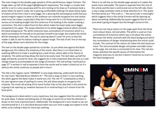
- 1. The main image on the double page spread is of the world famous rapper Eminem. The image takes up half of the page highlighting his importance. The image is a studio shot and he is sat in a very casual way with his arm resting on his knee as if someone took a photo when he wasn’t ready. He is wearing comfortable clothing ( he wears these types of clothes all the time ) that is very baggy. He is wearing the stereotypical outfit that you would imagine rappers to wear so the audience can instantly recognise him and realise what music he makes ( especially if they don’t know who he is ) His facial expression is serious as his looking straight into the camera as if his looking at the reader creating a connection. The shot is taken from his feet which makes his lower body seem bigger compared to his upper. This draws attention to his white baggy tracksuit which contrast the black background. The white tracksuits have connotations of innocence which is a weird connotation for himself as he portrays himself to be tough, this implies the article will be showing his soft side. The top his wearing doesn’t cover his arms so that the reader is able to see his tattoos making hi appear tough. The lack of sell line on the top of the page allows more attention for the image. There is no sell line on this double page spread so it makes the quote more noticeable. The quote is separate from the rest of the article and the text is central and not on the left side, there is also a large quotation mark to draw attention to it. The quote first few words are “The truth is…” the word truth is meaningful which suggests that in the article Eminem will be opening up about something. Additionally the quote suggests that he isn't sure what's going to happen but the thought concerns him. The text on the double page spread has no border, its just white text against the black background, this reflects the simplicity of the article. Also there is no initial letter or anything different to make it anything but a wall of text, which adds to the theme of simplicity. The white writing allows the text to be easily read. The text takes up half the page and bends around his shoe, this suggests he is more important than the text as it will change shape to accommodate to the image of Eminem. The red writing “continued on page 27” is written in red to separate it from the article and to make is stand out so it is obvious the article continues so people don’t miss it. There are not many colours on the page apart from the three main colours black, red and white. The white is used as it has connotations of innocence which says a lot about the article. Moreover the white contrasts with the black background which has connotations of danger emphasising what the article could include. The contrast of the colours all makes the text stand out more. The red connoatate danger and power and adds colour to the page, the red also is connected to his shoe. The red also draws attention the specific pieces of information the magazine want you to see but it doesn’t stand out as much on the black background. The title is the rappers name “EMINEM” in very large lettering, underneath the title is his real name “Marshall Bruce Mathers Ill “. The text is large so that it is eye catching, the white against the black makes it stand out a lot. The red “E” is backwards as that is his own signature way of spelling his name, this will allow people to recognise him instantly. The small red writing of his name further links to the idea that in the article he is going to be opening up, however because its in small writing it isn't meant to be the focal point. The background is black which is very mysterious, but also suggests that the article might be quite deep. It allows everything else on the page to stand out so that the attention is drawn to the most important parts. Additionally the background is very simple so we are not distracted by it, it is also black because when you turn onto a page you expect it to be white so by making it black its more eye catching.
- 2. Subheadings and sell quote are obvious on this double page spread, the quote reads “Do I ever have a casual Friday? Absolutely!” which straight away catches the audiences attention. The pull quote is usually the most interesting part of the interview to show of the artists personality. It is in block capitals in the colours black white and purple and pink which adheres to the house style and colour scheme. The word “Absolutely” is the biggest text on the page as it reveals Davey’s confident bold character. This makes the reader want to read on and find out why his so confident. The page numbers adhere to the codes and conventions of magazines as they are found in the bottom of the corner with the word “page” next to it. Page numbers are there to show what information the page listed consists of and what number they have to go to, to read it. The colour of the numbers follow the colour scheme of the magazine as they are white and are in a bold font just the subheading on the page. The media is used in magazines so that the audience can see the new information on social media sites such a twitter and instagram before the magazine releases or to go get more information. However this double spread doesn’t have a social media section but it does in all the other issues. The magazine does have the website in the top corner where it says you can go there for more music news, this website is likely to have the social media links so that if the audience go to the website they will most likely end up checking out the social media sites to. The short introductory paragraph is used to give the audience an idea of what the article is going to be about. The short introduction usually includes the most exciting information so that the reader will want to read more. This paragraph usually includes information on the artists, their music and what they have achieved or will be talking about, it includes this so that it will grab the readers attention. However on this double page spread “Kerrang” have included the introductory paragraph with the article where as individually, this is most likely because there is already a small paragraph under the pull quote. The main image is of the artist Davey Havok in his original attire which would be similar to the outfit he wears in his music videos/album covers. He looks relaxed and comfortable which shows his laid back personality. This engages the reader as they will aspire to be like him because his a well known artist who is a care free individual solo artist. The picture shows that he is comfortable in his own skin and doesn’t seem worried about hiding his identity as his wearing a low cut top which reveals his covered tattoo arms, by having these on show it makes him look masculine which would make the male audience aspire to be like him. The background colour of the image is a dull light grey which allows all the attention to be on Davey. He is wearing a white shirt and jeans most likely from the positioning of his hands in his pockets, once again representing his personality to be laid back. His facial expression is relaxed as he looks straight into the camera , this emphasises that he has authority, this makes the reader want to read the article to i=find out why Davey is so appreciated / looked upon so highly within the music industry
- 3. The main image is of the artist Nicki Minaj in her usual and recognisable outfit which would have been similar to the outfit she wore in her music videos and album covers. She looks extremely sassy and sarcastic in the image which represents her bold personality. This engages the reader as they will appear to like her as she is a crazy individual who is successful within the music industry. The background is light pink which draws all the attention onto Nicki as she is in a very bold black and white outfit with colourful jewellery which is a juxtaposition of the basic coloured background. Pink has connotations of femininity, Barbie and playfulness which shows NME are very clever with how they use colours to represent the artist. She is wearing a tight body suit which represents how she is comfortable with her body and confident with her appearance. Nicki is wearing very bright and bold makeup on her lips, cheeks and eyes, this draws attention to these particular facial part. Nicki is shown to be looking straight into the camera with a questioning expression, this could be viewed as if she is staring at the audience questioning them. I also think an important part of the photo is her ring which reads “ICON” in bold letters this suggests that she is viewed as an icon by her fans. The pull quote on the double page spread reads “I really toned down on the sexual stuff, there was no need for me to do it “ This would make the audience want to read the article and find out why she has decided to tone down as she is known globally for being sexual within her music videos and lyrics. The pull quote also has a pink box around it which makes it stand out to the rest of the writing on the page, this is so that the audience are drawn to the quote straight away. The page numbers adhere to the codes and conventions of magazines as the numbers are in the bottom corner and have the word page written next to them. They are there to show the reader what the page listed contains and what numbers they have to go to in order to read about what interests them. The colour of the numbers also follow the magazine colour scheme and house style as they are in a black bold font. Short introductory paragraph gives the reader a brief description of what the article is going to be about, usually they include information about the artist themselves, their new and upcoming music, introductory paragraphs are used in order to grab the readers attention and make them continue reading the pages to find out more about the artist. The subheadings on this double page spread adhere to the house style and colour scheme as they are black and bold. They are used so that the audience have an understanding about what the artist will be talking about, they also separate the text to make it look more like an interview rather than just a large amount of text. The main heading is the quote “A gospel according to Nicki Minaj” this is in bold black and pink which adheres to the colour scheme of the magazine The word “gospel” presents Nicki Minaj to be holy and religious . “Nicki Minaj” is next to the main image of herself therefore connecting herself with the idea that she herself is holy to her fans. This double page spread doesn’t include any social media links which would usually be included in the other issues.