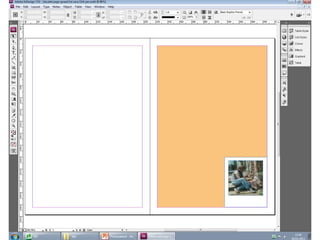
2. Process one
• This is my first process of my double page
spread and here I am designing it in InDesign. I
have opened it so it is two pages just like a
magazine would be. On this process I have
added a orange background to the page on
the left hand side of the page. I have also
added a white box to the right hand side to
make it look like it’s a polaroid picture with a
photo of my cover star when she was a baby.
3.
4. Process two
• Here I have repeated the white box process
and I have added another photo of my cover
star on holiday along with the one in the
garden that I had before. I want to repeat this
process again so I have another two on the
other side of the page. My theme of the
double page spread is a returning to childhood
theme where we look back at the stars past.
5.
6. Process three
• Here I have added my title ‘Cheyennes childhood
chance’ this has been designed on illustrator and I
wanted this to be in pink so this would contrast with
the orange background. I also designed the cars border
on illustrator and decided to put these in pink too. This
border was suppose to link with the childhood theme
and I like the concept of this. At the bottom of the page
I added a tour box dates to advertise the singers band.
This feature would be seen in a professional double
page spread – when the singer is about to go on tour
they ad the venues and phone numbers so people can
get in touch.
7.
8. Process four
• This is my 1st page repeated – with the white
boxes and the border. I have also decided that
the conventional style of a double page
spread has the title of the article on the left
hand side or over the middle but I decided
that I liked it on the left better.
9.
10. Process five
• This is my double page spread on this process
I have added photos on the left hand side of
the page. I am also beginning to add writing to
the polaroid pictures.
11.
12. Process six
• Here I have used illustrator again to make one
of my quotes from the article enlarged. I used
the alphabet font to make it look like a block
font and I also changed the colour to pink also
to match the colour scheme. The main change
is I have also added the text onto the double
page I copied and pasted the questions in and
tried to a line the writing into columns.
13.
14. Process seven
• Here I have added a big ‘I’ as I have noticed
that it’s a conventional aspect to introduce the
start of a new article. So I designed a big I at
the start of the article I used the same
alphabet font again in InDesign. Here I have
added the pink boxes behind the questions to
make them stand out as the writing before
looked too busy and distracting. I also finished
adding the writing of the polaroid on the
bottom and in a pink colour.