
Recommended
More Related Content
What's hot
What's hot (20)
Similar to Horror Poster analysis
Similar to Horror Poster analysis (20)
More from Taslima_B
More from Taslima_B (20)
Recently uploaded
Recently uploaded (20)
Horror Poster analysis
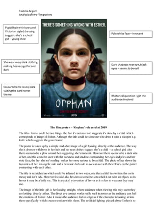
- 1. TaslimaBegum Analysisof twofilmposters The film poster – ‘Orphan’ released at 2009 The titles format could be two things, the fact it’s not neat and suggests it’s done by a child, which corresponds to image of Esther. Although the title could be someone who drew it with a weapon e.g. knife which suggests the genre horror. The poster is taken up by a simple mid-shot image of a girl looking directly at the audience. The way she is dresses with bows in her hair and her neat clothes suggest she’s a child – a school girl, also there seems to be a glow around her suggesting she’s innocent. However there seems to be a dark side of her, and this could be seen with the darkness and shadows surrounding her eyes and jaws and her stoic face, the fact she isn’t smiling makes her more serious to be a child. The photo of her shows the two sides of her, an angelic side and a demonic dark side as we can see with the colours on the poster contrasting with each other. The title is scratched on which could be inferred in two ways, one that a child has written this as its messy and isn’t tidy. However it could also be seen as someone scratched it out with an object, as its horror it may be a knife etc. This is a typical convention of horror as it refers to weapons they may use. The image of the little girl is her looking straight, where audience when viewing this may seem they are looking directly at her. The direct eye contact works really well in poster as the audience can feel the emotions of Esther. Also it makes the audience feelon edge as if the character is looking at/into them specifically which creates tension within them. The artificial lighting placed above Esther is to Pale white face – innocent Dark shadowsneareye,black eyes – seemstobe evil Pigtail hairwithbowsand Victorianstyleddressing suggestsshe’saschool girl – youngchild Rhetorical question –getthe audience involved She wearsverydark clothing makingherverygothicand dark Colourscheme isverydark suitingthe darkhorror theme
- 2. TaslimaBegum Analysisof twofilmposters show the darkness surrounding her eyes, which give the effect of her looking evil and sinister. The black within her eyes stand out and connotes evil and death. As we see Esther directly looking at us, it seems as though she’s angry about something as her expression look very menacing and calculating. There are two taglines on the poster. The first one seems to be more of a statement saying ‘There’s something wrong with Esther’. This intrigues the audience to find out what is wrong with Esther as we can see 2 sides of her. The other tagine at the bottom in red says ‘Can you keep a secret?’ they used a rhetorical question to get the audience involved, the secret links with the other tagline – the problem with her is a secret no one knows. The tagline is in deep dark red which fits with Esther’s red choker and this could hint underneath it lies one of her secrets intriguing the audience even further. Moreover the poster has challenged film conventions by not included in a billing block at the bottom of the poster. Although they have incorporated a website and a release date at the bottom. The website enables the audience to keep up with the movie, to be updated on when teaser posters and trailers come out for audience to find more about the plot. The release date has been added by informing the audience when the film will be released. These have all been placed at the bottom as it has less of an importance then the message the poster is trying to send. The captiontheywrote- ‘Evil will do anythingtolive’the factthey put itnear the demonicperson suggestsit’sabouthim The coloursusedare chilling – a lightgreyand darkblue
- 3. TaslimaBegum Analysisof twofilmposters The film poster – ‘The Unborn’ was released in 2009. The film poster used chilling colours that are used stereotypically to fit the horror conventions. The colours used for the poster are blue and a light grey and this could be used to represent the earth and the cracks and scratches may suggest the cracks in the earth letting out the demons and how everything isn’t how it seems to be. The effects they put on the poster – the scratches and cracks are to put more attention on the twins and make them the centre of attention. The lighting on the poster is very low-key fitting to the horror codes and conventions. The female in front of the mirror is wearing all white suggesting she is pure and the innocent here making her the protagonist/victim here. Her lack of clothes shows her vulnerability to the evil, something typical for the protagonist. The poster features a young lady looking in a mirror in little clothes, which is targeted towards attracting teenage boys/ young adult men to watch the film. This links to Mulvey’s theory of the ‘Male Gaze’ as the women is half naked and is sexually objectified for male’s pleasure. The demonic child in the mirror is wearing black –connoting death and danger, the opposite of her suggesting that he is the antagonist. . Also the demonic child is made to look like the antagonist by the way he looks, he’s all pale with dark eyes and he doesn’t look like an innocent child suggesting he’s the devil. The positioning of the tagline is near the boy in the mirror, which suggests that he is the evil that will do anything to be alive which may suggest he is the evil spirit. His face links to typical horror convention of the dead, with dark circled eyes and a pale face of a ghost/dead. Dark tiled walls; a marble table and dirty dusty walls that look as though it’s covered around cobwebs surround the girl. The colour of the walls are green which connotes envy which the boy represents, that the girl is alive while he is not which links in with the tagline “Evil will do anything to live”. Also her location is made up to look like an old fashioned house with a dark cold atmosphere and makes it more daunting; this is a stereotypical horror convention they’ve applied to the poster. The title has the “the” in the “O” in the poster, which foreshadows the film. The film is about the evil spirit of the girl’s twin brother that had died in the womb. Therefore the placement of the “the” in the “O” could be representative of the young boy in the womb. It represents the unborn trying to escape from the womb/death, as he is willing to do anything to live. Theyusedthe typical conventions on the title puttingitat the bottom and thisisdone so the audience can fixate onthe image more The lightingisverylow-keyinthe posterand the coloursusedare verystereotypical inahorror posterand usedtogive itan evil dark theme The fact the female iswearingall white suggestsshe ispure and Lack of clothesshowher vulnerability
- 4. TaslimaBegum Analysisof twofilmposters A typical convention the poster has applied is the billing block at the bottom as it is a contractual requirement for film posters. They’ve used this font to not attract much attention towards the credits so the audience can look at the daunting poster. Also the website is down there to inform the audience where they can get updates of the movie, for example when it will be released.