1. Poster Analysis 3
By: Miriana Younan
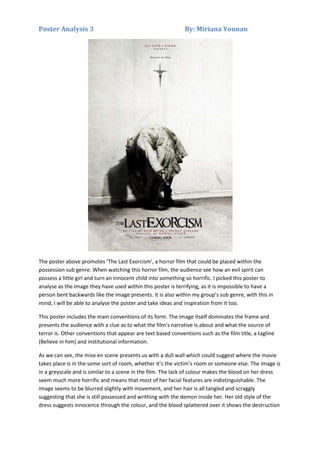
The poster above promotes ‘The Last Exorcism’, a horror film that could be placed within the
possession sub genre. When watching this horror film, the audience see how an evil spirit can
possess a little girl and turn an innocent child into something so horrific. I picked this poster to
analyse as the image they have used within this poster is terrifying, as it is impossible to have a
person bent backwards like the image presents. It is also within my group’s sub genre, with this in
mind, I will be able to analyse the poster and take ideas and inspiration from it too.
This poster includes the main conventions of its form. The image itself dominates the frame and
presents the audience with a clue as to what the film’s narrative is about and what the source of
terror is. Other conventions that appear are text based conventions such as the film title, a tagline
(Believe in him) and institutional information.
As we can see, the mise en scene presents us with a dull wall which could suggest where the movie
takes place is in the some sort of room, whether it’s the victim’s room or someone else. The image is
in a greyscale and is similar to a scene in the film. The lack of colour makes the blood on her dress
seem much more horrific and means that most of her facial features are indistinguishable. The
image seems to be blurred slightly with movement, and her hair is all tangled and scraggly
suggesting that she is still possessed and writhing with the demon inside her. Her old style of the
dress suggests innocence through the colour, and the blood splattered over it shows the destruction
2. Poster Analysis 3
By: Miriana Younan
of that innocence and purity by the evil spirit. Blood is also on her hands showing that she has
murdered someone or something due to her being possessed, adding to the scariness of the image.
Her contorted body and limbs make it seem as if she has no life in her, it has been sucked out by the
devil. The background matches her style of dress in that it is the same colour and both are simple
but dilapidated and dirty. The high angle lighting is supposed to show innocence and vulnerability,
but highlights the blood and creates a dark shadow beneath her, representing the evil within her. As
the girl is in the middle of the page which links to the rule of third, she is the main focus as she is the
middle and the crucifix is right on top of her, suggesting she needs Gods help as nothing can save
her, again linking to religious imagery.
Similarly, the title of this movie create intrigue in the audience at the get go. There is a finality in the
title that makes the audience wonder; why is it the last? Does the last refer to death? Also, if it is the
last, how many were there before? Did they fail? If so why? The implication of failed exorcisms
indicates a more evil and stubborn spirit and adds another layers of sinister to the narrative. The
exorcism in the title creates as strong religious connotation to the film and adds fear. Exorcisms are
serious rituals and are very dangerous. The font gets progressively bigger as the title goes on with
exorcism being the most emphasised. The font is also distorted, black and disjointed of the final
word; it suggests that it is the soul of perhaps the girl in the image. As is conventional, the title is in
completing uppercase and a serif font giving a bold and olden look to it.
Furthermore, the tagline “Believe In Him” is written in a black serif, similar to the film title, in order
to be bold against the background and differ from the text above it. There is a capitalisation on
“Him” that suggests either God or the Devil, both scary prospects and as it is above a crucifix, it reenforces the religious imagery. The tagline is short but powerful as it is the only text in that font and
ends in a full stop, emphasising the importance of the statement.
In addition, the institutional information is in grey test that seems small and insubstantial against the
grey background and blends in to give greater focus to the image and the test “Eli Roth & Strike
present”, “written by...” and “Directed by....” are in a red font connoting danger and blood, possibly
at the hands of the person being exorcised. The font also makes the words stand out to catch the
audience’s eye in a subtle way.
As we have seen, the words “Coming Soon” is featured in the same black font as the title giving a link
between the two, and whilst it is in a small font, the colour makes it stand out against the
background. By not giving a date, the film seems much more scary and mysterious and creates an
intrigue and anticipation that wouldn’t be there with an actual date.
Overall, this poster is successful with using religious imagery and will be able to lure the audience in
as the audience is scared of the devil and God. From this poster the audience will want to find out if
the devil kills the girl or does God save her. So they will need to go watch the movie to find out.