1. Research Task 2B – Contents Page AnalysisLayout:
For NME’s contents the layout is very much subjective to the rule of thirds. The contents and page numbers are split
up depending on what they entail. The “band index” is listed down the left hand third/column, however it is in
alphabetical order rather than chronological. The main description of the magazine is in the centre third and the basic
contents information is displayed on the right hand side with an advert in the bottom right hand corner. This layout
could be part of their house style because they
could use this layout on every front cover.
Fonts:
The fonts used are very basic and easy to read.
Every title is in capital letters with the
description in lower case lettering. This is
because capitalised typography is a lot easier for
the brain to recognise and read and lets each
title stand out on its own. The title for the main
descriptive text in the centre third is a rustic
font as it is meant to look like a beat up
equipment box regularly associated with music
and travel. All of the titles are the opposite
colour to what they are placed upon (i.e black
background = white text).
Content Address:
In the main section of content, a very informal
address has been used. This is shown by the
language used in it such as “eh?” and “giggling”.
However, it starts to become more formal to
more you read on as it is informing you what
you will find within this magazine. It directly
addresses you as a reader as well with using the
pronouns “you” and “we”.
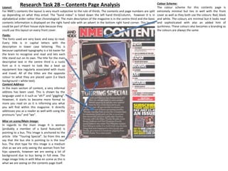
Mise en scene/Main Image:
In regards to the main image It is woman
(probably a member of a band featured) Is
pointing to a bus. This image is anchored to the
article title “Touring Special”. So from this we
say that the bus she is pointing to is the tour
bus. The shot type for this image is a medium
shot as we are only seeing the woman from her
hips upwards, however we are seeing a lot of
background due to bus being in full view. The
mage image links in with Mise en scene as this is
what we are seeing on the contents page itself.
Colour Scheme:
The colour scheme for this contents page is
extremely minimal but ties in well with the front
cover as well as they both use the colours: Red, black
and white. The colours are minimal but it looks neat
and sophisticated with also an added hint of
quirkiness. These colours also becomes a branding as
the colours are always the same.