How Lily is portrayed in the press according to a NME magazine article
•Download as PPT, PDF•
0 likes•347 views


Recommended
More Related Content
What's hot
What's hot (16)
Similar to How Lily is portrayed in the press according to a NME magazine article
Similar to How Lily is portrayed in the press according to a NME magazine article (20)
More from Kirsty Allen
Recently uploaded
Recently uploaded (20)
How Lily is portrayed in the press according to a NME magazine article
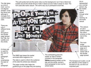
- 1. The subheading gives the reader an idea of what's included in the paragraph below. A drops cap is used for the start of the paragraph. This emphasizes the start of the paragraph. The pull quotes text are the same colour as the background, but it has a black box bubble around the whole thing to make it stand out and make it easier to read. The font used also looks casual – the same way Lily is portrayed to look like. The background is plain, so all the attention of the reader is focused on Lily, as she’s an important part. Lily is represented as a normal person, Eg the reader. This is shown through what she’s wearing, as she looks casual. The NME logo keeps the reader reminded what magazine it is. The date is used to inform the audience of the date the article was released. The page number also helps the audience go on the page they are looking for. The title takes up a lot of room as it is not aligned straight. It has the same font, although it changes from upper to lower case. The colours on Lily’s clothes match the colour scheme on the rest of the page. The subheading breaks up the title and the article, giving a short paragraph to sum up the article below. The main image dominates the page as it takes up a nearly half of the double page spread. There are only 3 different fonts used throughout the double page spread; the Title, the subtitle and the article.
- 2. Analysis of written article. The article is split up into 4 different columns, each with approximately 75-100 words in each one. The article talks about how the interviewee see’s Lily being portrayed through the press. Lily talks about how she likes to tell people the truth about her opinions. The style of the writing is laid back and casual, which makes it enjoyable for the audience.