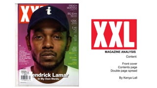
2. The masthead (title of magazine) is a wob because it is white
text laying amongst a red background. A small area of the
magazine has been overlapped by the main image. This may
be because the magazine is a well known magazine which
readers are strongly familiar with. In terms of the style of the
masthead, it is similar to NME and Q which also consists of
white text amongst a red background. All 3 masthead style
differs in the style of text.
A talkie quote is used
which links with the
main headline. I am
sure that most readers
can relate to the quote.
The main headline is fairly basic. It
includes the name of the artist and
the name of the article. In
comparison to previous magazines
that I have analysed, the text is
much smaller in size and the colour
used is basic.
The subheadings are brief
and literate. The names of
each artist are in large
text and includes a small
sentence describing the
feature
The main image
appears to distribute
across the entire
page. It is a close up
shot. It appears to be
dominating the
masthead since it is
overlapping the title
FRONT COVER
3. CONTENTS PAGE
The contents page differs from other magazines. It is on
the left hand side of two facing pages. The contents page
only addresses the features that were put on the front
cover. It doesn’t include other contents in the magazine.
This may be because the important crucially need to be
read first. It is almost as if the magazine wants to give
readers a surprise when they discover contents that
haven’t been mentioned such as fashion pages. The main
headline is at the top of the list which shows its
importance in the magazine issue. Its been addressed in
white as well as black which differs from the subheadings
(features) which are only in black. Additionally, the page
number for the main headline is in big bold sized font. The
image used for the contents page is a long shot which
captures the entire body from tip to toe of the same artist
that was displayed on the front cover. The background
also remains the same as the front cover – combination of
pink and green spot lights.
4. On the left hand side, there is
a image that distributes across
the entire image. On the recto,
it consists of body which fills
the entire page.
I have noticed that there is no
title for the DPS. Perhaps the
pull quote is the title of the
article. It has been enlarged in
very big font which literally
stands out amongst the body
that appears to be in much
smaller text. Additionally, the
font is also in bold black text.
The colour black was probably
used to compliment the black
and white effect of the
photograph.
On the recto there is
barely any negative
space because the
page literally consists
of text which fills the
whole page. perhaps
this is because of the
margin measurements.
Drop cap has been
used at the
beginning of the
body which drops
into a few lines. This
gives an exciting
start to the article
DOUBLE PAGE SPREAD