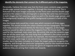
1. Identify the elements that connect the 3 different parts of the magazine.
Personally, I believe the main way that the front cover, contents page and the
double page spread connect together is through the mise-en-scene. This is
featured in the main images especially on the front cover and the double page
spread as the subject in the photographs is wearing the same top and trousers
in both images but he’s wearing a jacket as well in the double page spread, and
the background/ location of the graffiti background is present in both of the
images.
Also the house style would be a main way which connects all three pages
together. This would include the colour scheme and the typography. The house
style helps to build a brand identity for the music magazine, as the target
audience would be able to notice the magazine from the house style. The font
used for the masthead, main cover line, the article title and the contents page
title are all the same type, the only thing that is different is the colour and the
size depending what it was used for. For example, the masthead is featured on
the front cover, quite large in size but on the contents page is reasonably
smaller, but it has been included as it helps the target audience recognise the
magazine, and through the particular typography used for the masthead alone,
it allows the target audience to know the genre of magazine and the type of
audience they are aiming their media text towards.