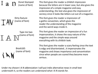
1. Dsnet Stamped This font gives the reader a childish impression
(name of font) because the letters are in lower case, but also gives the
impression of a simple magazine and easy
understanding, the text also gives the impression of
secrecy since it looks like letters cut out of a magazine.
Dirty feature This font gives the reader a impression of
(name of font) a gothic convection, which gives the
reader the understanding of the magazine
and the weird ways inside it.
Type me two This font gives the reader an impression of a fun
(name of font) impersonation, it shows the easy nature of the
magazine and the simple ways around
everything with its childish look.
This font gives the reader a scary feeling since the text
Brock165 is edgy and disorientated , it impersonates the
(name of font) magazine and shows importance and concentration
since when people are scared they become more
serious.
Under my chosen I A N abbreviation I will put indie alternative news in small text
underneath it, so the readers can understand what I A N stands for.
2. I have chosen to use font number 4 because
it suits my style of magazine because it gives
the impression of importance and
concentration and will hopefully attract more
customers that appeal to this
magazine, since the abbreviation of the
name of my magazine is I A N it feels
Indie alternative news
appropriate to use this type of font because
it is unique and catches the readers eyes.