
Recommended
More Related Content
What's hot
What's hot (18)
Similar to Task 2 double page spread
Similar to Task 2 double page spread (20)
More from chloegray
More from chloegray (20)
Recently uploaded
Recently uploaded (20)
Task 2 double page spread
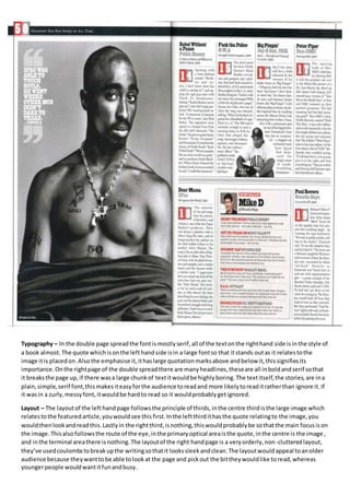
- 1. Typography – In the double page spread the font is mostly serif, all of the text on the right hand side is in the style of a book almost. The quote which is on the left hand side is in a large font so that it stands out as it relates to the image it is placed on. Also the emphasise it, it has large quotation marks above and below it, this signifies its importance. On the right page of the double spread there are many headlines, these are all in bold and serif so that it breaks the page up, if there was a large chunk of text it would be highly boring. The text itself, the stories, are in a plain, simple, serif font, this makes it easy for the audience to read and more likely to read it rather than ignore it. If it was in a curly, messy font, it would be hard to read so it would probably get ignored. Layout – The layout of the left hand page follows the principle of thirds, in the centre third is the large image which relates to the featured article, you would see this first. In the left third it has the quote relating to the image, you would then look and read this. Lastly in the right third, is nothing, this would probably be so that the main focus is on the image. This also follows the route of the eye, in the primary optical area is the quote, in the centre is the image , and in the terminal area there is nothing. The layout of the right hand page is a very orderly, non-cluttered layout, they’ve used coulombs to break up the writing so that it looks sleek and clean. The layout would appeal to an older audience because they want to be able to look at the page and pick out the bit they would like to read, whereas younger people would want it fun and busy.
- 2. Colour – The colour in the double page spread is mostly greyscale, other than the odd hints of red. The dark shades create a sense of darkness and danger, it’s not a very joyful and happy look. They have used basic colours which make it sophisticated and modern, this clearly shows who the target audience is, the older generation. Some of the headings are in red, this makes them stand out and are singled from the rest of the text. This makes them noticeable and they would be one of the first things you read on the page. Images – The image used on the left page is of who the feature is about, 2Pac. It is a mid-shot from his waist upwards, this shot was probably used so that you can see all of his tattoos but also still see his facial expressions. He is wearing a chain around his neck which has a gun as the pendant, and also a jumper, but as if he has just take it off as its only on the bottom of his arms. The chain makes him seem like a tough, violent male, aggressive but also shows that he is wealthy. Because of the size of the chain and the fact that it is gold shows that it would be worth a lot of money, and the fact that he is wearing it and doesn’t have it in its box says that he doesn’t really care about its condition, he might have money to waste. Also the image shows his tattoos, tattoos of this nature (random, dotted around, his name) are associated with gangs and thugs, this makes him seem hostile. His facial expressions on the other hand make him seem innocent and a really nice person, there is no sign of an aggressive person. Language – The language used in the double page spread is very informal. You can recognise this from the headlines, one of the headlines says ‘F*ck tha police.’ The use of words that aren’t actually in the dictionary makes a rude impression, for example rather than them saying ‘that’ they’ve said ‘tha.’ The use of improper language would appeal to males around the teen years as they can relate to it as its common for them to hear that in their everyday lives. Conventions – This double page spread is conventional because it has headlines, headlines are commonly used to break up text and/or give small insights of what the following text is going to be about. It is also conventional because it features a large image, a large image entices the reader, it makes them want to read their story. A quote is also common, they use a shocking or interesting quote to grip the reader into carrying on reading.