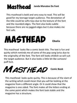
1. Janda Manatee Da Font
This masthead is bold and very easy to read. This will be
good for my teenage target audience. The denotation of
the title could be softs toys due to the texture of the font
and the rounded edges. The font also looks subtle
because there are no jagged edges but it also makes me
feel safe.
Obelix
This masthead looks like a comic book title. The text is fun and
quirky which reminds me of some of the pop song lyrics due to
the originality of the font. The font still looks childish so will suit
the target audience. But it also looks a little bit like cartoons’
puff font.
Comic Book
This masthead looks quite quirky. This is because of the slant of
the writing which could mean that you will be looking at the
magazine from a different angle. Or it could show that the
magazine is one sided. The font makes all the letters ending at
the same point which makes the font look stable and the
magazine has a structure.
2. Comic Andy
This font makes you feel like the writing is a girly gossip type
writing. It gives the feeling of comfort but still keeping the font
readable and looks like the Smarties text which adds an
element of safety to the font. The font has a thick line which
could suggest that there is more to the font than meets the
eye. This would tie in with the magazine really well.
Komika Boogie
This font makes you feel like the font is coming out the font. It
makes the page come alive and it makes you feel excited. This
will liven up the audience. The font also makes me feel that
the audience will be widening their knowledge as the font
spreads out at the top and is skinnier at the bottom.