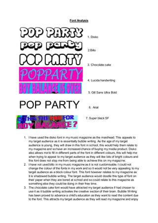
1. Font Analysis
1. Disko
2.Billo
3. Chocolate cake
4. Lucida handwriting
5. Gill Sans Ultra Bold
POP PARTY 6. Arial
7. Super black SF
1. I have used the disko font in my music magazine as the masthead. This appeals to
my target audience as it is essentially bubble writing. As the age of my target
audience is young, they will draw in this font in school, this would help them relate to
my magazine and so have an increased chance of buying my media product. Disko
also allows me to fill in different parts of the font in different colours, this will help me
when trying to appeal to my target audience as they will like lots of bright colours and
this font does not stop me from being able to achieve this on my magazine.
2. I have not used billo in my music magazine as it is not customisable. I could not
change the colour of the fonts in my work and so it would not be very appealing to my
target audience as a block colour font. This font however relates to my magazine as
it is shadowed bubble writing. The target audience would doodle this type of font on
their paper when they are bored at school and so could relate to this magazine as
something else they could be doing in their free time.
3. The chocolate cake font would have attracted my target audience if had chosen to
use it as it bubble writing activates the creative section of their brain. Bubble Writing
has been proved to advance a child's education as they want to read the content due
to the font. This attracts my target audience as they will read my magazine and enjoy
2. the content. I did not however use this font as I believe that at times it can be quite
had to make out and that the disko font relates more to the type of magazine I have
created and it is easier to understand.
4. The lucida handwriting font will be used various times in my magazine as it will attract
my target audience. This is another font that the target audience can relate too as
this could be how they write in school. This allows them to directly relate to my
magazine and give them trust in the magazine as they know it is for them directly.
This font is visually customisable with borders and different colours which allows me
to change the colours based on my article and other contents. The use of this
handwriting text is to have swirly entrances and exits to the letters which the reader
does in school as well.
5. Gill sans ultra bold will be used in my magazine when I am giving the title of my
double page spread. This will be a good font to use as it is very bold and will stand
out to the rest of the page, this will essentially attract my target audience as they will
stop flicking through the mag when they see this article. The boldness represents a
sense of importance that will make the reader feel they must read this article. The
same effect is given by the block writing.
6. The arial writing will be used for the content of the magazine, for example the
answers on the double page spread and the contents. I am using this because it is
simple and easy to read. This gives the target audience a feeling that we are looking
out for them as they are young and may struggle to read some longer pieces of text.
The simple writing used is also smaller than most other text and so I can fit more
content onto the page whilst still being able to have images of the artists to keep the
audience's attention.
7. Super black SF will be used on the front cover for the main sell line as shown above.
This is because it stands out in different colours and allows me to customise the font
with different gradients and fills. This font will be used because it stands out in
different colours on the background and can be easily read by all audiences. This
font can be related to the audience asn it stands out just like kids stand out from each
other. The audience of pop party each have individual personalities but all love pop
music and getting the most attention by standing out, just like this font.