
Recommended
More Related Content
What's hot
What's hot (19)
Similar to House Style and Design Elements of a Music Magazine
Similar to House Style and Design Elements of a Music Magazine (20)
Recently uploaded
Recently uploaded (20)
House Style and Design Elements of a Music Magazine
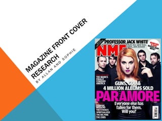
- 2. HOUSE STYLE The house style colours normally depend on who their main band or artist is on the front cover. Because in this case it is Paramore, the colours are dark with pink. The masthead is always red with a white boarder so it can stand out on most images and colours without having to change. The font is always blocky as this is quite a neutral font that can fit with any genre of music featured on the front cover. The main image is always used as the background on the magazines front cover so that the audience can immediately understand what genre of music is featured in that edition. (Or what band or artist is featured).
- 3. MASTHEAD The masthead is always red in the blocky font with a white border. The white border makes it stand out even on a red background. This font is always the biggest text on the magazine cover which makes it stand out as the most important text. The main image slightly covers the title because it is that well known, the audience will be able to know what the magazine name is. The masthead is also an acronym because it is too well known, the audience can know what it is without having the actual words the letters mean.
- 4. TAGLINE This particular magazine doesn’t actually have a tagline but most of the time they should do. Normally they should keep the same font with just smaller fonts and possibly different colours (That keeps with the house style). On other magazines like this, the tagline is usually just what the acronym masthead stands for.
- 5. MAIN IMAGE The main image in the magazines case is mostly used like a background. The main image is the band that has the main story and cover-line. It takes up most of the front cover and all of the people are looking into the camera/audience. This can attract the audiences attention and it makes you feel like you are included with them. The band are all wearing black or dark greys which had a big impact on the house style of this magazine.
- 6. MAIN COVER-LINE The main cover line is in the second biggest font and is in pink. This stands out on the black background and relates to the band. The cover-line is the bands name to make the magazine stand out with this as a unique selling point. There is then smaller text but still quite big. This explains the actual cover line ore so that the audience can know what to expect in the article inside.
- 7. OTHER COVER-LINES The other cover-lines on the cover are in a smaller text so that they don’t stand out as much as the main cover-line but so the audience can see what other articles they are going to be reading inside if they buy the magazine. These will usually contain some of the unique selling pints of the magazine. It is in a white text to stand out and be readable on the darker background. The secondary cover-line is in a bigger font than the others but not as big as the main cover-line. This stand out at the top of the page as another unique selling point.
- 8. BARCODE AND DATE The barcode is on the front cover to make it easy to scan. The date is also on the front cover so that people will be able to know what date the issue cam out, and they will be able to buy the previous one if they missed it by knowing the date or issue number of the magazine’s release.
- 9. BUZZ WORDS Buzz words are used to make the audience more intrigued to read what is inside. The word ‘plus’ makes it look like there even more articles to read even though the cover only features about 7 articles. These words are in a different colour to make them stand out and grab the audiences attention.
- 10. DIRECT ADDRESS The direct mode of address is used to make the audience feel included. Because it uses the word ‘you’ it makes the writing seem more personalised to the reader and can draw their attention to the magazine as it is used in the cover-line details where the font isn’t quite small.