SlideShare a Scribd company logo
1 of 5
my final draft
The use of a question on the           A banner is used across the top
    cover attracts the attention of the    of the magazine to attract the                               The masthead is written in a
    reader because it invites them to      reader. By including a chance to                             clear and bold font, using capital
    answer the question                    win something the reader is        Direct mode of            letters to stand out against the
    subconsciously, increasing their       tempted into buying.               address is used, so       rest of the typography. I’ve used
    curiosity as to what the answer                                           the reader feels as       a sans serif font because it is
    may be.                                                                   if the magazine is        more informal, therefore
                                                                              personal to them.         attracting a younger audience.
                                                                                                        The masthead clearly conveys
The sell line grabs the reader’s attention due                                                          that the magazine is about Pop
to the use of capitals, ‘SHHHH!’ . This shouts                                                          music.
out to the reader and makes them feel like
they’re going to be trusted with
something, which they can’t find anywhere                                                        A puff is used to attract the
else. By using a larger font for the ‘10’ it                                                     reader; this is heightened by the
catches the reader’s eye and shows them how                                                      use of a personal
much they’re getting for such a small cost.                                                      pronoun, ‘your’, which shows that
Lastly, I used a handwriting font for this                                                       the magazine involves the reader.
sell line because I wanted to portray the idea
                                                                                                    A bright pink burst is used to
of note-passing in class, acknowledging the
                                                                                                    draw the reader’s attention to the
types of things my target audience do.
                                                                                                    most important article of the
                                                                                                    issue. The word ‘exclusive’ is used
    This image is placed at a slant to show                                                         because it makes the reader feel
    quirkiness, the use of a handwriting font                                                       like they are getting something
    portrays the magazine as more informal                                                          they can’t get anywhere else, and
    and the use of a quote makes the reader                                                         so tempts them into buying.
    more interested into finding out more
    about the article.
                                                                                                 The barcode, price and issue
                                            A menu bar is placed at the bottom of the            number are all written at the
                                            magazine. It names well known                        bottom of the page, as they are
  A four colour scheme of pink,             celebrities, therefore attracting a wider audience   the less important information,
  blue, white and black is used on the      because there is a range of artists. A ‘hand         yet they still need to be provided
  front cover. I chose this colour          drawn’ asterisk is used to connote something         so the buyers know how much
  scheme as it was bright and visually      which would be found in a school book, as my         the magazine is and what issue
  appealing, yet not too fussy, so          age range is 13-16 year olds. It is also there to    they’re buying.
  attracted the eye of the reader.          highlight that there is a lot in the
                                            magazine, subconsciously making the reader feel
                                            like they are getting more for their money.
A smaller image of the front
                                     cover is used to annotate where         I chose to use a serif font for the masthead of the
                                     to find what story, personally I        contents page to stick to an informal register. The
                                     think this looks appealing and          ellipsis is effective because it shows that there is
                                     makes it easier for the reader to       more to find inside. Pop magazines do not tend to
                                     find which story attracted them         use the title ‘contents’ for the contents page, so I
 The most important, or              into buying and where it is in the      stuck to this convention and labelled with a more
 interesting, pages in the whole     magazine.                               engaging masthead.
 magazine are highlighted so the
 readers know where they are.
                                                                                         A burst is used to attract the eye
                                                                                         of the reader, it is effective
   The page numbers are                                                                  because it then makes the reader
   given, directing the reader to the                                                    feel as if they are getting more
   most important sections of the                                                        than they first thought, due to the
   magazine, the contents. They are                                                      fact that a number of free posters
   written in a clear and colourful                                                      are included. By including boys in
   font to not only be useful, but to                                                    the magazine, it is something
   be visually appealing as well.                                                        which adds to the value.
Pictures are used to reflect the
idea of doodling and emphasise                                                         Page numbers are given next to
the informality of the magazine.                                                       each poster so the reader can
They instantly make the magazine                                                       find them easily.
a lot more aesthetically
pleasing, interesting the reader
just that little bit more.
                                                                                      The page number and website
      A letter from the editor is                                                     address are given at the bottom
      included to make the magazine                                                   of the page for ease of the
      more personal. It is written in first                                           reader. This use of graphics
                                               The contents page uses a bright
      person and uses a conversational                                                shows continuity within the
                                               and cheerful four colour
      tone, instantly making the readers                                              magazine and ‘sells’ the company.
                                               scheme, white, pink, yellow and
      feel at ease . It guides them            orange , to make the page
      through the magazine knowing             visually appealing. The colours
      that they can relax due to the           used connote happiness and
      chatty and informal register.            femininity, relating to the readers
                                               and making them feel happy.
The name of the artist is written
                                                                        The same artist which      in the top corner so the readers
                                         A burst is used to attract     is featured on the cover   are clear on who she is and to
A pull quote is used as the main
                                         the eye of the reader, so      is used for the double     convey the focus of the article. A
heading of the article, making it
                                         that they know this is the     page spread article;       handwriting font is used to
one of the main focuses of the
                                         article featured on the        this reflects the focus    heighten the idea of informality.
page at first glance. The use of
                                         cover.                         of the issue is on Holly
this is effective because it quickly
shows what the body of the                                              Johnson.
                                                                                                            A timeline of what the artist has
article is about and the direction                                                                          been doing in Pop life to get to
that the article takes.                                                                                     where she is today. This is just
                                                                                                            extra information for the reader
                                                                                                            so they feel as if they are getting
   A stand first is written in a                                                                            more than anticipated, adding
   bigger and bolder font than the                                                                          value to the double page spread.
   interview itself in order for it to
                                                                                                               A four colour scheme of
   stand out. It gives the reader a
                                                                                                               pink, yellow, black and white is
   small snippet of information about
                                                                                                               used to make the page look
   the article and the artist.
                                                                                                               visually appealing. The
                                                                                                               colours, like the contents
                                                                                                               page, connote happiness and
    The questions are written                                                                                  femininity.
    in a bolder font and in a
    different colour, so the                                                                                 The page number and website
    reader can easily                                                                                        address are written in the
    differentiate between the                                                                                bottom right hand corner of both
    questions and the answers.                                                                               the pages for two reasons. The
                                                                                                             first being so that the reader
                                                                                                             knows which page to turn to and
                                                  A bordered pull quote is used                              the second to show continuity.
      A smaller picture of the artist is
                                                  to extract a quote which is
      included within the text to make
                                                  significant or amusing; this is         A bright yellow triangle is
      the page look more interesting
                                                  because if the reader is just           positioned at the bottom of the
      and so the readers can
                                                  flicking through the magazine           page to make it look more visually
      understand the type of
                                                  they can realise that the article is    appealing and to add quirkiness,
      personality the artist has, due to
                                                  a general informal chat about           which is something that young
      it being a quirky picture.
                                                  what life is like being a new artist,   readers like to see.
                                                  therefore adding ease for the
                                                  reader, whilst adding comic value.
In Conclusion…
Overall, I am very pleased with the outcome of my front cover, contents page and double page spread. I have
     paid great attention to the research and planning I constructed and thought very carefully about my
    questionnaire results and feedback from my drafts, in order to successfully create my magazine pages.
  The front cover, contents page and double page spread all follow the conventions of Pop magazines and in
 comparison to the magazines I used as style models, I personally feel they look very similar, and so I think I
           have succeeded in ensuring that my magazine looks professional and follows conventions.

More Related Content

What's hot

Music magazine evaluation 4 7
Music magazine evaluation 4 7Music magazine evaluation 4 7
Music magazine evaluation 4 7MicaRossHarris
 
Magazine evaluation
Magazine evaluationMagazine evaluation
Magazine evaluationsophsoph
 
Conventions of contents page
Conventions of contents pageConventions of contents page
Conventions of contents pageLaura-G
 
Music magazine evaluation 4 7
Music magazine evaluation 4 7Music magazine evaluation 4 7
Music magazine evaluation 4 7MicaRossHarris
 
Evaluation Q1
Evaluation Q1Evaluation Q1
Evaluation Q1shanices
 
How did i attract
How did i attractHow did i attract
How did i attractbethfrancis
 
Media studies evaluation
Media studies evaluationMedia studies evaluation
Media studies evaluationGreen1406
 
As media coursework evaluation
As media coursework evaluationAs media coursework evaluation
As media coursework evaluation06esmith
 
Questions 1 & 2 of Media Studies Music Magazine Evaluation
Questions 1 & 2 of Media Studies Music Magazine EvaluationQuestions 1 & 2 of Media Studies Music Magazine Evaluation
Questions 1 & 2 of Media Studies Music Magazine Evaluationxxchloejade94xx
 
front page analysis
front page analysis front page analysis
front page analysis elliotpack1
 
Question 1
Question 1Question 1
Question 1pillowww
 

What's hot (19)

Question 4and5
Question 4and5Question 4and5
Question 4and5
 
Evaluation q5
Evaluation q5Evaluation q5
Evaluation q5
 
Music magazine evaluation 4 7
Music magazine evaluation 4 7Music magazine evaluation 4 7
Music magazine evaluation 4 7
 
Front Cover Analysis
Front Cover AnalysisFront Cover Analysis
Front Cover Analysis
 
Magazine evaluation
Magazine evaluationMagazine evaluation
Magazine evaluation
 
Conventions of contents page
Conventions of contents pageConventions of contents page
Conventions of contents page
 
Music magazine evaluation 4 7
Music magazine evaluation 4 7Music magazine evaluation 4 7
Music magazine evaluation 4 7
 
Evaluation Q1
Evaluation Q1Evaluation Q1
Evaluation Q1
 
Question 1
Question 1Question 1
Question 1
 
Question 1
Question 1Question 1
Question 1
 
Case study notes
Case study notesCase study notes
Case study notes
 
How did i attract
How did i attractHow did i attract
How did i attract
 
Magazine research
Magazine researchMagazine research
Magazine research
 
Media studies evaluation
Media studies evaluationMedia studies evaluation
Media studies evaluation
 
As media coursework evaluation
As media coursework evaluationAs media coursework evaluation
As media coursework evaluation
 
EVALUATIONQ1
EVALUATIONQ1EVALUATIONQ1
EVALUATIONQ1
 
Questions 1 & 2 of Media Studies Music Magazine Evaluation
Questions 1 & 2 of Media Studies Music Magazine EvaluationQuestions 1 & 2 of Media Studies Music Magazine Evaluation
Questions 1 & 2 of Media Studies Music Magazine Evaluation
 
front page analysis
front page analysis front page analysis
front page analysis
 
Question 1
Question 1Question 1
Question 1
 

Viewers also liked

Soldados via sacra salas
Soldados via sacra salasSoldados via sacra salas
Soldados via sacra salashpdf
 
Taller Interno de Hábitos
Taller Interno de Hábitos Taller Interno de Hábitos
Taller Interno de Hábitos Stefan Pribnow
 
EcoFarm Conference
EcoFarm ConferenceEcoFarm Conference
EcoFarm Conferenceammehr3
 
Golden ratio point of the earth
Golden ratio point of the earthGolden ratio point of the earth
Golden ratio point of the earthEnayatali Agharia
 
Amazing love
Amazing loveAmazing love
Amazing lovetgunsch
 
Soldados via sacra salas
Soldados via sacra salasSoldados via sacra salas
Soldados via sacra salashpdf
 
Discriminación hacia los Pueblos Indígenas en México. Una Asignatura pendient...
Discriminación hacia los Pueblos Indígenas en México. Una Asignatura pendient...Discriminación hacia los Pueblos Indígenas en México. Una Asignatura pendient...
Discriminación hacia los Pueblos Indígenas en México. Una Asignatura pendient...Nayeli Amil Zeab
 
Paises ingles
Paises   inglesPaises   ingles
Paises inglesmapague
 
事事扎實第二波
事事扎實第二波事事扎實第二波
事事扎實第二波carloli
 
Cadena de oro del consumismo
Cadena de oro del consumismoCadena de oro del consumismo
Cadena de oro del consumismovictoriacascot
 
Why CEOs should play Magic the Gathering
Why CEOs should play Magic the GatheringWhy CEOs should play Magic the Gathering
Why CEOs should play Magic the GatheringStefan Pribnow
 
King Tutankhamen
King TutankhamenKing Tutankhamen
King TutankhamenTuhin N
 

Viewers also liked (17)

Soldados via sacra salas
Soldados via sacra salasSoldados via sacra salas
Soldados via sacra salas
 
.
..
.
 
DB Development work
DB Development workDB Development work
DB Development work
 
Taller Interno de Hábitos
Taller Interno de Hábitos Taller Interno de Hábitos
Taller Interno de Hábitos
 
EcoFarm Conference
EcoFarm ConferenceEcoFarm Conference
EcoFarm Conference
 
Milacron Maxima MG 4000
Milacron Maxima MG 4000Milacron Maxima MG 4000
Milacron Maxima MG 4000
 
Golden ratio point of the earth
Golden ratio point of the earthGolden ratio point of the earth
Golden ratio point of the earth
 
Amazing love
Amazing loveAmazing love
Amazing love
 
Soldados via sacra salas
Soldados via sacra salasSoldados via sacra salas
Soldados via sacra salas
 
Discriminación hacia los Pueblos Indígenas en México. Una Asignatura pendient...
Discriminación hacia los Pueblos Indígenas en México. Una Asignatura pendient...Discriminación hacia los Pueblos Indígenas en México. Una Asignatura pendient...
Discriminación hacia los Pueblos Indígenas en México. Una Asignatura pendient...
 
.
..
.
 
.
..
.
 
Paises ingles
Paises   inglesPaises   ingles
Paises ingles
 
事事扎實第二波
事事扎實第二波事事扎實第二波
事事扎實第二波
 
Cadena de oro del consumismo
Cadena de oro del consumismoCadena de oro del consumismo
Cadena de oro del consumismo
 
Why CEOs should play Magic the Gathering
Why CEOs should play Magic the GatheringWhy CEOs should play Magic the Gathering
Why CEOs should play Magic the Gathering
 
King Tutankhamen
King TutankhamenKing Tutankhamen
King Tutankhamen
 

Similar to .

Magazine front cover reviews
Magazine front cover reviewsMagazine front cover reviews
Magazine front cover reviewsLeesey28
 
Evaluation question 5
Evaluation question 5Evaluation question 5
Evaluation question 5asmediag12
 
Evaluation question 5
Evaluation question 5Evaluation question 5
Evaluation question 5asmediag12
 
QUESTION 5
QUESTION 5QUESTION 5
QUESTION 5waheda96
 
Annotation of two magazines front cover’s
Annotation of two magazines front cover’sAnnotation of two magazines front cover’s
Annotation of two magazines front cover’sJessieGee14
 
Media question 5
Media question 5Media question 5
Media question 5DomHarms
 
Evaluation-Q5
Evaluation-Q5Evaluation-Q5
Evaluation-Q5giran_11
 
Music magazine evaluation 1
Music magazine evaluation 1Music magazine evaluation 1
Music magazine evaluation 1mjellis
 
Evaluation Q3
Evaluation Q3Evaluation Q3
Evaluation Q3tamsinrwg
 

Similar to . (20)

Top of the Pops
Top of the Pops Top of the Pops
Top of the Pops
 
Q magazine
Q magazineQ magazine
Q magazine
 
Magazine front cover reviews
Magazine front cover reviewsMagazine front cover reviews
Magazine front cover reviews
 
Question 5
Question 5Question 5
Question 5
 
Question 1
Question 1Question 1
Question 1
 
Evaluation question 5
Evaluation question 5Evaluation question 5
Evaluation question 5
 
Evaluation question 5
Evaluation question 5Evaluation question 5
Evaluation question 5
 
Conventions
ConventionsConventions
Conventions
 
Dps !!!!
Dps !!!!Dps !!!!
Dps !!!!
 
QUESTION 5
QUESTION 5QUESTION 5
QUESTION 5
 
Kerrang magazine
Kerrang magazineKerrang magazine
Kerrang magazine
 
Annotation of two magazines front cover’s
Annotation of two magazines front cover’sAnnotation of two magazines front cover’s
Annotation of two magazines front cover’s
 
Media question 5
Media question 5Media question 5
Media question 5
 
Contents Page Analysis
Contents Page AnalysisContents Page Analysis
Contents Page Analysis
 
Evaluation-Q5
Evaluation-Q5Evaluation-Q5
Evaluation-Q5
 
Task 8
Task 8Task 8
Task 8
 
Music magazine evaluation 1
Music magazine evaluation 1Music magazine evaluation 1
Music magazine evaluation 1
 
Question 5 evaluation
Question 5 evaluationQuestion 5 evaluation
Question 5 evaluation
 
Question 5 evaluation
Question 5 evaluationQuestion 5 evaluation
Question 5 evaluation
 
Evaluation Q3
Evaluation Q3Evaluation Q3
Evaluation Q3
 

More from SofieHelps (7)

.
..
.
 
.
. .
.
 
.
..
.
 
.
..
.
 
.
..
.
 
.
..
.
 
Megans Technology
Megans TechnologyMegans Technology
Megans Technology
 

Recently uploaded

SIEMENS: RAPUNZEL – A Tale About Knowledge Graph
SIEMENS: RAPUNZEL – A Tale About Knowledge GraphSIEMENS: RAPUNZEL – A Tale About Knowledge Graph
SIEMENS: RAPUNZEL – A Tale About Knowledge GraphNeo4j
 
FULL ENJOY 🔝 8264348440 🔝 Call Girls in Diplomatic Enclave | Delhi
FULL ENJOY 🔝 8264348440 🔝 Call Girls in Diplomatic Enclave | DelhiFULL ENJOY 🔝 8264348440 🔝 Call Girls in Diplomatic Enclave | Delhi
FULL ENJOY 🔝 8264348440 🔝 Call Girls in Diplomatic Enclave | Delhisoniya singh
 
APIForce Zurich 5 April Automation LPDG
APIForce Zurich 5 April  Automation LPDGAPIForce Zurich 5 April  Automation LPDG
APIForce Zurich 5 April Automation LPDGMarianaLemus7
 
SQL Database Design For Developers at php[tek] 2024
SQL Database Design For Developers at php[tek] 2024SQL Database Design For Developers at php[tek] 2024
SQL Database Design For Developers at php[tek] 2024Scott Keck-Warren
 
Maximizing Board Effectiveness 2024 Webinar.pptx
Maximizing Board Effectiveness 2024 Webinar.pptxMaximizing Board Effectiveness 2024 Webinar.pptx
Maximizing Board Effectiveness 2024 Webinar.pptxOnBoard
 
Understanding the Laravel MVC Architecture
Understanding the Laravel MVC ArchitectureUnderstanding the Laravel MVC Architecture
Understanding the Laravel MVC ArchitecturePixlogix Infotech
 
"LLMs for Python Engineers: Advanced Data Analysis and Semantic Kernel",Oleks...
"LLMs for Python Engineers: Advanced Data Analysis and Semantic Kernel",Oleks..."LLMs for Python Engineers: Advanced Data Analysis and Semantic Kernel",Oleks...
"LLMs for Python Engineers: Advanced Data Analysis and Semantic Kernel",Oleks...Fwdays
 
Streamlining Python Development: A Guide to a Modern Project Setup
Streamlining Python Development: A Guide to a Modern Project SetupStreamlining Python Development: A Guide to a Modern Project Setup
Streamlining Python Development: A Guide to a Modern Project SetupFlorian Wilhelm
 
Pigging Solutions Piggable Sweeping Elbows
Pigging Solutions Piggable Sweeping ElbowsPigging Solutions Piggable Sweeping Elbows
Pigging Solutions Piggable Sweeping ElbowsPigging Solutions
 
#StandardsGoals for 2024: What’s new for BISAC - Tech Forum 2024
#StandardsGoals for 2024: What’s new for BISAC - Tech Forum 2024#StandardsGoals for 2024: What’s new for BISAC - Tech Forum 2024
#StandardsGoals for 2024: What’s new for BISAC - Tech Forum 2024BookNet Canada
 
Key Features Of Token Development (1).pptx
Key  Features Of Token  Development (1).pptxKey  Features Of Token  Development (1).pptx
Key Features Of Token Development (1).pptxLBM Solutions
 
Breaking the Kubernetes Kill Chain: Host Path Mount
Breaking the Kubernetes Kill Chain: Host Path MountBreaking the Kubernetes Kill Chain: Host Path Mount
Breaking the Kubernetes Kill Chain: Host Path MountPuma Security, LLC
 
New from BookNet Canada for 2024: BNC BiblioShare - Tech Forum 2024
New from BookNet Canada for 2024: BNC BiblioShare - Tech Forum 2024New from BookNet Canada for 2024: BNC BiblioShare - Tech Forum 2024
New from BookNet Canada for 2024: BNC BiblioShare - Tech Forum 2024BookNet Canada
 
Unblocking The Main Thread Solving ANRs and Frozen Frames
Unblocking The Main Thread Solving ANRs and Frozen FramesUnblocking The Main Thread Solving ANRs and Frozen Frames
Unblocking The Main Thread Solving ANRs and Frozen FramesSinan KOZAK
 
CloudStudio User manual (basic edition):
CloudStudio User manual (basic edition):CloudStudio User manual (basic edition):
CloudStudio User manual (basic edition):comworks
 
Install Stable Diffusion in windows machine
Install Stable Diffusion in windows machineInstall Stable Diffusion in windows machine
Install Stable Diffusion in windows machinePadma Pradeep
 
How to convert PDF to text with Nanonets
How to convert PDF to text with NanonetsHow to convert PDF to text with Nanonets
How to convert PDF to text with Nanonetsnaman860154
 

Recently uploaded (20)

SIEMENS: RAPUNZEL – A Tale About Knowledge Graph
SIEMENS: RAPUNZEL – A Tale About Knowledge GraphSIEMENS: RAPUNZEL – A Tale About Knowledge Graph
SIEMENS: RAPUNZEL – A Tale About Knowledge Graph
 
FULL ENJOY 🔝 8264348440 🔝 Call Girls in Diplomatic Enclave | Delhi
FULL ENJOY 🔝 8264348440 🔝 Call Girls in Diplomatic Enclave | DelhiFULL ENJOY 🔝 8264348440 🔝 Call Girls in Diplomatic Enclave | Delhi
FULL ENJOY 🔝 8264348440 🔝 Call Girls in Diplomatic Enclave | Delhi
 
APIForce Zurich 5 April Automation LPDG
APIForce Zurich 5 April  Automation LPDGAPIForce Zurich 5 April  Automation LPDG
APIForce Zurich 5 April Automation LPDG
 
SQL Database Design For Developers at php[tek] 2024
SQL Database Design For Developers at php[tek] 2024SQL Database Design For Developers at php[tek] 2024
SQL Database Design For Developers at php[tek] 2024
 
Maximizing Board Effectiveness 2024 Webinar.pptx
Maximizing Board Effectiveness 2024 Webinar.pptxMaximizing Board Effectiveness 2024 Webinar.pptx
Maximizing Board Effectiveness 2024 Webinar.pptx
 
Understanding the Laravel MVC Architecture
Understanding the Laravel MVC ArchitectureUnderstanding the Laravel MVC Architecture
Understanding the Laravel MVC Architecture
 
"LLMs for Python Engineers: Advanced Data Analysis and Semantic Kernel",Oleks...
"LLMs for Python Engineers: Advanced Data Analysis and Semantic Kernel",Oleks..."LLMs for Python Engineers: Advanced Data Analysis and Semantic Kernel",Oleks...
"LLMs for Python Engineers: Advanced Data Analysis and Semantic Kernel",Oleks...
 
Streamlining Python Development: A Guide to a Modern Project Setup
Streamlining Python Development: A Guide to a Modern Project SetupStreamlining Python Development: A Guide to a Modern Project Setup
Streamlining Python Development: A Guide to a Modern Project Setup
 
Pigging Solutions Piggable Sweeping Elbows
Pigging Solutions Piggable Sweeping ElbowsPigging Solutions Piggable Sweeping Elbows
Pigging Solutions Piggable Sweeping Elbows
 
#StandardsGoals for 2024: What’s new for BISAC - Tech Forum 2024
#StandardsGoals for 2024: What’s new for BISAC - Tech Forum 2024#StandardsGoals for 2024: What’s new for BISAC - Tech Forum 2024
#StandardsGoals for 2024: What’s new for BISAC - Tech Forum 2024
 
The transition to renewables in India.pdf
The transition to renewables in India.pdfThe transition to renewables in India.pdf
The transition to renewables in India.pdf
 
Key Features Of Token Development (1).pptx
Key  Features Of Token  Development (1).pptxKey  Features Of Token  Development (1).pptx
Key Features Of Token Development (1).pptx
 
DMCC Future of Trade Web3 - Special Edition
DMCC Future of Trade Web3 - Special EditionDMCC Future of Trade Web3 - Special Edition
DMCC Future of Trade Web3 - Special Edition
 
Breaking the Kubernetes Kill Chain: Host Path Mount
Breaking the Kubernetes Kill Chain: Host Path MountBreaking the Kubernetes Kill Chain: Host Path Mount
Breaking the Kubernetes Kill Chain: Host Path Mount
 
New from BookNet Canada for 2024: BNC BiblioShare - Tech Forum 2024
New from BookNet Canada for 2024: BNC BiblioShare - Tech Forum 2024New from BookNet Canada for 2024: BNC BiblioShare - Tech Forum 2024
New from BookNet Canada for 2024: BNC BiblioShare - Tech Forum 2024
 
Unblocking The Main Thread Solving ANRs and Frozen Frames
Unblocking The Main Thread Solving ANRs and Frozen FramesUnblocking The Main Thread Solving ANRs and Frozen Frames
Unblocking The Main Thread Solving ANRs and Frozen Frames
 
CloudStudio User manual (basic edition):
CloudStudio User manual (basic edition):CloudStudio User manual (basic edition):
CloudStudio User manual (basic edition):
 
Vulnerability_Management_GRC_by Sohang Sengupta.pptx
Vulnerability_Management_GRC_by Sohang Sengupta.pptxVulnerability_Management_GRC_by Sohang Sengupta.pptx
Vulnerability_Management_GRC_by Sohang Sengupta.pptx
 
Install Stable Diffusion in windows machine
Install Stable Diffusion in windows machineInstall Stable Diffusion in windows machine
Install Stable Diffusion in windows machine
 
How to convert PDF to text with Nanonets
How to convert PDF to text with NanonetsHow to convert PDF to text with Nanonets
How to convert PDF to text with Nanonets
 

.

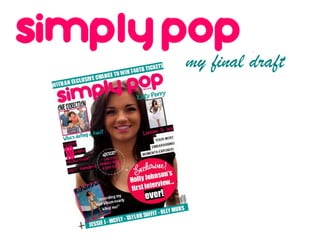
  • 2. The use of a question on the A banner is used across the top cover attracts the attention of the of the magazine to attract the The masthead is written in a reader because it invites them to reader. By including a chance to clear and bold font, using capital answer the question win something the reader is Direct mode of letters to stand out against the subconsciously, increasing their tempted into buying. address is used, so rest of the typography. I’ve used curiosity as to what the answer the reader feels as a sans serif font because it is may be. if the magazine is more informal, therefore personal to them. attracting a younger audience. The masthead clearly conveys The sell line grabs the reader’s attention due that the magazine is about Pop to the use of capitals, ‘SHHHH!’ . This shouts music. out to the reader and makes them feel like they’re going to be trusted with something, which they can’t find anywhere A puff is used to attract the else. By using a larger font for the ‘10’ it reader; this is heightened by the catches the reader’s eye and shows them how use of a personal much they’re getting for such a small cost. pronoun, ‘your’, which shows that Lastly, I used a handwriting font for this the magazine involves the reader. sell line because I wanted to portray the idea A bright pink burst is used to of note-passing in class, acknowledging the draw the reader’s attention to the types of things my target audience do. most important article of the issue. The word ‘exclusive’ is used This image is placed at a slant to show because it makes the reader feel quirkiness, the use of a handwriting font like they are getting something portrays the magazine as more informal they can’t get anywhere else, and and the use of a quote makes the reader so tempts them into buying. more interested into finding out more about the article. The barcode, price and issue A menu bar is placed at the bottom of the number are all written at the magazine. It names well known bottom of the page, as they are A four colour scheme of pink, celebrities, therefore attracting a wider audience the less important information, blue, white and black is used on the because there is a range of artists. A ‘hand yet they still need to be provided front cover. I chose this colour drawn’ asterisk is used to connote something so the buyers know how much scheme as it was bright and visually which would be found in a school book, as my the magazine is and what issue appealing, yet not too fussy, so age range is 13-16 year olds. It is also there to they’re buying. attracted the eye of the reader. highlight that there is a lot in the magazine, subconsciously making the reader feel like they are getting more for their money.
  • 3. A smaller image of the front cover is used to annotate where I chose to use a serif font for the masthead of the to find what story, personally I contents page to stick to an informal register. The think this looks appealing and ellipsis is effective because it shows that there is makes it easier for the reader to more to find inside. Pop magazines do not tend to find which story attracted them use the title ‘contents’ for the contents page, so I The most important, or into buying and where it is in the stuck to this convention and labelled with a more interesting, pages in the whole magazine. engaging masthead. magazine are highlighted so the readers know where they are. A burst is used to attract the eye of the reader, it is effective The page numbers are because it then makes the reader given, directing the reader to the feel as if they are getting more most important sections of the than they first thought, due to the magazine, the contents. They are fact that a number of free posters written in a clear and colourful are included. By including boys in font to not only be useful, but to the magazine, it is something be visually appealing as well. which adds to the value. Pictures are used to reflect the idea of doodling and emphasise Page numbers are given next to the informality of the magazine. each poster so the reader can They instantly make the magazine find them easily. a lot more aesthetically pleasing, interesting the reader just that little bit more. The page number and website A letter from the editor is address are given at the bottom included to make the magazine of the page for ease of the more personal. It is written in first reader. This use of graphics The contents page uses a bright person and uses a conversational shows continuity within the and cheerful four colour tone, instantly making the readers magazine and ‘sells’ the company. scheme, white, pink, yellow and feel at ease . It guides them orange , to make the page through the magazine knowing visually appealing. The colours that they can relax due to the used connote happiness and chatty and informal register. femininity, relating to the readers and making them feel happy.
  • 4. The name of the artist is written The same artist which in the top corner so the readers A burst is used to attract is featured on the cover are clear on who she is and to A pull quote is used as the main the eye of the reader, so is used for the double convey the focus of the article. A heading of the article, making it that they know this is the page spread article; handwriting font is used to one of the main focuses of the article featured on the this reflects the focus heighten the idea of informality. page at first glance. The use of cover. of the issue is on Holly this is effective because it quickly shows what the body of the Johnson. A timeline of what the artist has article is about and the direction been doing in Pop life to get to that the article takes. where she is today. This is just extra information for the reader so they feel as if they are getting A stand first is written in a more than anticipated, adding bigger and bolder font than the value to the double page spread. interview itself in order for it to A four colour scheme of stand out. It gives the reader a pink, yellow, black and white is small snippet of information about used to make the page look the article and the artist. visually appealing. The colours, like the contents page, connote happiness and The questions are written femininity. in a bolder font and in a different colour, so the The page number and website reader can easily address are written in the differentiate between the bottom right hand corner of both questions and the answers. the pages for two reasons. The first being so that the reader knows which page to turn to and A bordered pull quote is used the second to show continuity. A smaller picture of the artist is to extract a quote which is included within the text to make significant or amusing; this is A bright yellow triangle is the page look more interesting because if the reader is just positioned at the bottom of the and so the readers can flicking through the magazine page to make it look more visually understand the type of they can realise that the article is appealing and to add quirkiness, personality the artist has, due to a general informal chat about which is something that young it being a quirky picture. what life is like being a new artist, readers like to see. therefore adding ease for the reader, whilst adding comic value.
  • 5. In Conclusion… Overall, I am very pleased with the outcome of my front cover, contents page and double page spread. I have paid great attention to the research and planning I constructed and thought very carefully about my questionnaire results and feedback from my drafts, in order to successfully create my magazine pages. The front cover, contents page and double page spread all follow the conventions of Pop magazines and in comparison to the magazines I used as style models, I personally feel they look very similar, and so I think I have succeeded in ensuring that my magazine looks professional and follows conventions.