1. DEVELOPMENTS ON MY TITLE
AND FONTS:
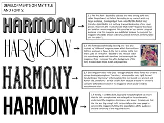
1.1- The first font I decided to use was this retro looking bold font
called ‘Magnificent’ on DaFont. According to my research with my
target audience, the majority of them voted for this font at first,
therefore I decided to test out how it would look on top of my cover
picture. However, the results showed that it didn't’t appear too large
and bold for a music magazine. This could’ve led to a smaller range of
audience once this magazine was published because the name of the
magazine should be known and it should look dominant. Unfortunately
this font didn't’t.
1.2- This font was aesthetically pleasing and I was also
inspired by ‘ Billboard’ magazine cover which featured Lana
Del Rey, as shown in figure 1, the font is similar to the font
that is used on her name. I decided to test this out to but
this looked very weak and it devalued the meaning of the
magazine. Once I removed the white background of this
font, it looked even more duller and powerless.
1.3- Since my genre was indie- pop, I thought that old school fonts may create a
vintage looking atmosphere. Therefore, I attempted to use a rigid formed
handwriting as ‘Harmony’. Unfortunately, this font looked very ancient and
Roman-like. Therefore, I did not use this font because it would’ve created a
complete different connation of my magazine which would’ve led to
miscommunication.
1.4- Finally, I used this bold, large and eye catching font to ensure
that the title is emphasized and enlarged for the audience to
understand the magazines dominancy and power. I made sure that
the title was big enough to fit horizontally on the cover page to
connote the magazine fulfilling the expectations of the audience
and the continuity of the magazine issues.