Current scenario of Energy Retail utilities market in UK
Articles
1. White background which is simple,
easy for the text to be seen/read,
makes the image of Eric and Ernie
stand out also and gives it a
professional look. If it was aimed at a
younger audience it would be
something that stands out and is bold
whereas for a older mature audience
it needs to look clear and professional
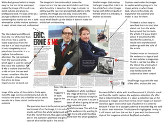
The image is in the centre which shows the
importance of the two men which is Eric and Ernie,
who the article is based on, the image is simple, no
editing just the two men giving direct address to the
camera. The image also not only shows who this
article is about it attracts the audience because it is
visual which breaks up the text so it doesn’t make the
article look uninteresting.
Smaller images that overlap
the larger image that links in to
the article/text, other images
that go with different parts of
the text which it is linked to, it
anchors to the text.
The title is bold and different
from the rest of the font from
the article, this is used to
make it stand out from the
rest but it isn’t too much that
it looks completely out of
place from the article. It is to
capture the audiences
attention. The red contrasts
from the black and white,
which again is used to capture
the eye of the audience. The
& Me is to show that there is
a add on from the two well
known comedians. Also the
red it used in other parts of
the article to show
importance or to stand out
The text is a clear easy to
read font that is in black that
stands out from the white
background, the font suits
the article, if it was a bright
colour it would be hard to
read for the audience, it
would look unprofessional
and not go with the style of
the article.
The bold letter at the start of
the sentence is a typical part
of most articles in magazines.
The W is red like the &Me in
the title of the article which
expresses importance but
also stands out to the
audience for them to read.
Small image to go with the text
of the offer, anchors the text.
Date, title of
the
magazine is
on each
page at the
bottom.
Quotation in white overlay on
the image of the two in white
which again follows the style of
the article, the quote is to give a
taster of what is going to be said
The quotation here is in the actual part ofor is included in the
the
article/interview. This will draw
text instead of on the image, it is in red so it
in
stands out from the white background and the audience into wanting to
read
from the rest of the text, this again will be to more and understanding
more from this small quotation.
attract the audiences attention and give a
Image of the writer of this article to firstly again
make the page look less uninteresting but also to
introduce the writer and to feel like we are able to
see who he is. Gives a bit of familiarity for the
audience
Captions used under the images
to explain what is going on in the
image, where or when it was
took, who is in the photo etc.
explains for the audience and
makes it clear for them.
taste of what will be said in the article.
Buzzword offer in white with a red box around it, this is to stand
out from the rest to capture the audiences attention of a offer
that is linked into this article, it is about a collection box set for
obviously a cheaper price than normal. It isn’t large so it doesn’t
stand out again shows what type of audience it is aimed to
because if it was for a younger audience it would be big and bold
to attract their attention. The Buzzword is highlighted clearly so
it still stands out from the rest but it goes with the theme and
style of this magazine article of Red/black and white .