Call Girls Jodhpur Park - [ Cash on Delivery ] Contact 8250192130 Escorts Ser...
Nme Magazine Analysis
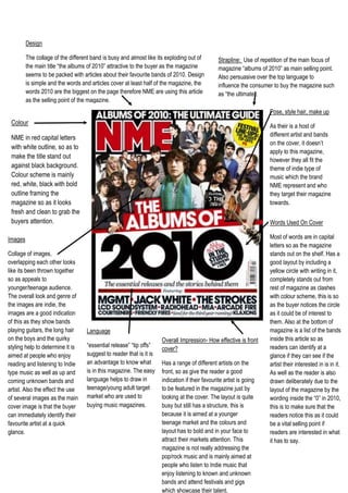
1. DesignThe collage of the different band is busy and almost like its exploding out of the main title “the albums of 2010” attractive to the buyer as the magazine seems to be packed with articles about their favourite bands of 2010. Design is simple and the words and articles cover at least half of the magazine, the words 2010 are the biggest on the page therefore NME are using this article as the selling point of the magazine. Strapline: Use of repetition of the main focus of magazine “albums of 2010” as main selling point. Also persuasive over the top language to influence the consumer to buy the magazine such as “the ultimate”. Overall Impression- How effective is front cover?Has a range of different artists on the front, so as give the reader a good indication if their favourite artist is going to be featured in the magazine just by looking at the cover. The layout is quite busy but still has a structure, this is because it is aimed at a younger teenage market and the colours and layout has to bold and in your face to attract their markets attention. This magazine is not really addressing the pop/rock music and is mainly aimed at people who listen to Indie music that enjoy listening to known and unknown bands and attend festivals and gigs which showcase their talent. Language“essential release” “tip offs” suggest to reader that is it is an advantage to know what is in this magazine. The easy language helps to draw in teenage/young adult target market who are used to buying music magazines.Words Used On CoverMost of words are in capital letters so as the magazine stands out on the shelf. Has a good layout by including a yellow circle with writing in it, completely stands out from rest of magazine as clashes with colour scheme, this is so as the buyer notices the circle as it could be of interest to them. Also at the bottom of magazine is a list of the bands inside this article so as readers can identify at a glance if they can see if the artist their interested in is in it. As well as the reader is also drawn deliberately due to the layout of the magazine by the wording inside the “0” in 2010, this is to make sure that the readers notice this as it could be a vital selling point if readers are interested in what it has to say. Pose, style hair, make up As their is a host of different artist and bands on the cover, it doesn’t apply to this magazine, however they all fit the theme of indie type of music which the brand NME represent and who they target their magazine towards.1076325442595ImagesCollage of images, overlapping each other looks like its been thrown together so as appeals to younger/teenage audience. The overall look and genre of the images are indie, the images are a good indication of this as they show bands playing guitars, the long hair on the boys and the quirky styling help to determine it is aimed at people who enjoy reading and listening to Indie type music as well as up and coming unknown bands and artist. Also the effect the use of several images as the main cover image is that the buyer can immediately identify their favourite artist at a quick glance.ColourNME in red capital letters with white outline, so as to make the title stand out against black background. Colour scheme is mainly red, white, black with bold outline framing the magazine so as it looks fresh and clean to grab the buyers attention.