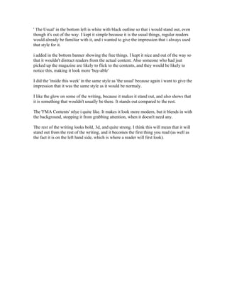
1. ' The Usual' in the bottom left is white with black outline so that i would stand out, even
though it's out of the way. I kept it simple because it is the usual things, regular readers
would already be familiar with it, and i wanted to give the impression that i always used
that style for it.
i added in the bottom banner showing the free things. I kept it nice and out of the way so
that it wouldn't distract readers from the actual content. Also someone who had jsut
picked up the magazine are likely to flick to the contents, and they would be likely to
notice this, making it look more 'buy-able'
I did the 'inside this week' in the same style as 'the usual' because again i want to give the
impression that it was the same style as it would be normaly.
I like the glow on some of the writing, because it makes it stand out, and also shows that
it is something that wouldn't usually be there. It stands out compared to the rest.
The 'FMA Contents' stlye i quite like. It makes it look more modern, but it blends in with
the background, stopping it from grabbing attention, when it doesn't need any.
The rest of the writing looks bold, 3d, and quite strong. I think this will mean that it will
stand out from the rest of the writing, and it becomes the first thing you read (as well as
the fact it is on the left hand side, which is where a reader will first look).