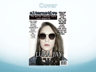
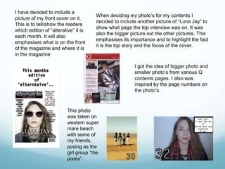
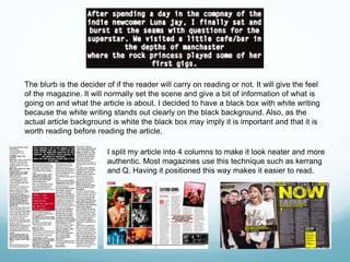
-The artist is the main focus of the magazine which suggests the
main story is based around her. She is positioned right in the center
so it will be the first thing a reader look see’s when they look at the
cover.
-The background is 1 colour so that the writing and Image is more
clear. This is a popular technique which is simple but effective when
showing the audience information.
-There is nothing in the way of the artists face which makes the
focus on her and doesn’t over power the photo.
-The magazine has a masthead to show the name of the magazine
which is above the image so it doesn’t take the focus away from the
artist.
-She has no direct eye contact with the audience but she is still
looking at the camera creating a mysterious indie rock vibe.
-The headline links to the artist, Luna Jay, this gives the audience a
visual representation of the artist. The headline shows the main
article is about Luna jay, this lets the audience know that she is the
main focus and can link the image to the headline.
 The font I used for my masthead was only used on my masthead. This is to
show that the masthead is like a brand name and it can be associated with
alternative.
 Also, The blue colour has only been used for the mast head and can be
easily seen on the white background. This makes the title stand out more
and can be seen clearly. The black box with the white writing also stands
out on the white background easily.
 It is situated at the top of the page because if it was being sold in a shop
the consumer has got to be able to see the magazine title even if the rest
of the page was covered with different magazines. This is also following the
convention of a normal magazine.
 I've decided to have my masthead being the biggest piece of text on my
magazine cover to show that it is the most important aspect of the
magazine.
I have decided to include a
picture of my front cover on it.
This is to tell/show the readers
which edition of “alterative” it is
each month. It will also
emphasises what is on the front
of the magazine and where it is
in the magazine
When deciding my photo’s for my contents I
decided to include another picture of “Luna Jay” to
show what page the top interview was on. It was
also the bigger picture out the other pictures. This
emphasises its importance and to highlight the fact
it is the top story and the focus of the cover.
I got the idea of bigger photo and
smaller photo’s from various Q
contents pages. I also was
inspired by the page numbers on
the photo’s.
This photo
was taken on
western super
mare beach
with some of
my friends,
posing as the
girl group “the
pixies”.
This is the ‘features’ part of my
magazine contents page. I have
used the same font as my cover
lines on my magazine cover.
This creates a more bold/strong
house style, meaning whenever
readers see the font it will
remind it of “alternative”. I got
the inspiration for my contents
features from many Q
magazines as it is positioned on
the left hand side.
I also decided to include a
“subscribe” box in the
contents page to inform
readers about the forms of
promotions e.g. Facebook
and twitter. It also reminds
them about subscribing to
the monthly subscription
package. I was influenced
by all the NME magazines.
I thought it was essential to include the masthead of the magazine in the
contents page as nearly indie/rock/alternative magazine does it. It provides
the link between the cover and the contents page. Having the name of the
magazine on the contents page will familiarise the reader from where they
have seen it on the cover. It will become a more known piece of text to them.
The Photo of “Luna Jay” is positioned on the left hand side
of the page following a normal convention as magazines
such as NME and Q. The photo provides eye contact with
the audience making a connection with them. Both of these
articles images also provide direct eye contact.
The image is of Luna jay because she is the focus of the
article. As she is an upcoming artist Its important for Luna
jay to have as much coverage as possible and for people to
know her by not only her music but for herself as well.
She also presents the genre of the music she performs very
well. Her facial expression shows a mysterious kind of vibe
and makes the reader curious.
I have decided to include
Luna Jay’s name on the side
of the photo of her to caption
the photo and to let
everyone know who it is.
A text grab was
used to zoom in on
the interview and
hopefully attract a
consumer.
This is the introduction to the article so
the readers know who I’m talking to
and the setting. I have used this to not
just jump into the interview.
Credits and page
numbers are essential
and common
conventions of a music
magazine which make
the article more
professional and
authentic.
The blurb is the decider of if the reader will carry on reading or not. It will give the feel
of the magazine. It will normally set the scene and give a bit of information of what is
going on and what the article is about. I decided to have a black box with white writing
because the white writing stands out clearly on the black background. Also, as the
actual article background is white the black box may imply it is important and that it is
worth reading before reading the article.
I split my article into 4 columns to make it look neater and more
authentic. Most magazines use this technique such as kerrang
and Q. Having it positioned this way makes it easier to read.
I decided to use a pull quote from my article
as my headline as I was influenced by
various Q and NME articles. I decided to use
that particular quote because it shows the
attitude of Luna Jay. It offers a strong visual
contrast to the body text and catches the eye
of a potential reader who’s skimming or
flipping pages. It makes the reader think
about what Luna is referring too making
them read on.
From researching into a wide range of
indie/alternative/rock music magazines I don’t think I have
challenged any conventions as I have been influenced by
a lot of magazines such as Kerrang, NME and Q. I have
taken all of their idea’s which have inspired me to come
up with my own music magazine. I have followed a lot of
standard music magazine forms and conventions such as
eye contact in images and an introduction into the article
but I have also followed specific indie/rock/alternative
conventions such as different types of poses and shades
of colour.

Media Question 1

  • 4.
    -The artist isthe main focus of the magazine which suggests the main story is based around her. She is positioned right in the center so it will be the first thing a reader look see’s when they look at the cover. -The background is 1 colour so that the writing and Image is more clear. This is a popular technique which is simple but effective when showing the audience information. -There is nothing in the way of the artists face which makes the focus on her and doesn’t over power the photo. -The magazine has a masthead to show the name of the magazine which is above the image so it doesn’t take the focus away from the artist. -She has no direct eye contact with the audience but she is still looking at the camera creating a mysterious indie rock vibe. -The headline links to the artist, Luna Jay, this gives the audience a visual representation of the artist. The headline shows the main article is about Luna jay, this lets the audience know that she is the main focus and can link the image to the headline.
  • 5.
     The fontI used for my masthead was only used on my masthead. This is to show that the masthead is like a brand name and it can be associated with alternative.  Also, The blue colour has only been used for the mast head and can be easily seen on the white background. This makes the title stand out more and can be seen clearly. The black box with the white writing also stands out on the white background easily.  It is situated at the top of the page because if it was being sold in a shop the consumer has got to be able to see the magazine title even if the rest of the page was covered with different magazines. This is also following the convention of a normal magazine.  I've decided to have my masthead being the biggest piece of text on my magazine cover to show that it is the most important aspect of the magazine.
  • 7.
    I have decidedto include a picture of my front cover on it. This is to tell/show the readers which edition of “alterative” it is each month. It will also emphasises what is on the front of the magazine and where it is in the magazine When deciding my photo’s for my contents I decided to include another picture of “Luna Jay” to show what page the top interview was on. It was also the bigger picture out the other pictures. This emphasises its importance and to highlight the fact it is the top story and the focus of the cover. I got the idea of bigger photo and smaller photo’s from various Q contents pages. I also was inspired by the page numbers on the photo’s. This photo was taken on western super mare beach with some of my friends, posing as the girl group “the pixies”.
  • 8.
    This is the‘features’ part of my magazine contents page. I have used the same font as my cover lines on my magazine cover. This creates a more bold/strong house style, meaning whenever readers see the font it will remind it of “alternative”. I got the inspiration for my contents features from many Q magazines as it is positioned on the left hand side. I also decided to include a “subscribe” box in the contents page to inform readers about the forms of promotions e.g. Facebook and twitter. It also reminds them about subscribing to the monthly subscription package. I was influenced by all the NME magazines.
  • 9.
    I thought itwas essential to include the masthead of the magazine in the contents page as nearly indie/rock/alternative magazine does it. It provides the link between the cover and the contents page. Having the name of the magazine on the contents page will familiarise the reader from where they have seen it on the cover. It will become a more known piece of text to them.
  • 11.
    The Photo of“Luna Jay” is positioned on the left hand side of the page following a normal convention as magazines such as NME and Q. The photo provides eye contact with the audience making a connection with them. Both of these articles images also provide direct eye contact. The image is of Luna jay because she is the focus of the article. As she is an upcoming artist Its important for Luna jay to have as much coverage as possible and for people to know her by not only her music but for herself as well. She also presents the genre of the music she performs very well. Her facial expression shows a mysterious kind of vibe and makes the reader curious.
  • 12.
    I have decidedto include Luna Jay’s name on the side of the photo of her to caption the photo and to let everyone know who it is. A text grab was used to zoom in on the interview and hopefully attract a consumer. This is the introduction to the article so the readers know who I’m talking to and the setting. I have used this to not just jump into the interview. Credits and page numbers are essential and common conventions of a music magazine which make the article more professional and authentic.
  • 13.
    The blurb isthe decider of if the reader will carry on reading or not. It will give the feel of the magazine. It will normally set the scene and give a bit of information of what is going on and what the article is about. I decided to have a black box with white writing because the white writing stands out clearly on the black background. Also, as the actual article background is white the black box may imply it is important and that it is worth reading before reading the article. I split my article into 4 columns to make it look neater and more authentic. Most magazines use this technique such as kerrang and Q. Having it positioned this way makes it easier to read.
  • 14.
    I decided touse a pull quote from my article as my headline as I was influenced by various Q and NME articles. I decided to use that particular quote because it shows the attitude of Luna Jay. It offers a strong visual contrast to the body text and catches the eye of a potential reader who’s skimming or flipping pages. It makes the reader think about what Luna is referring too making them read on.
  • 16.
    From researching intoa wide range of indie/alternative/rock music magazines I don’t think I have challenged any conventions as I have been influenced by a lot of magazines such as Kerrang, NME and Q. I have taken all of their idea’s which have inspired me to come up with my own music magazine. I have followed a lot of standard music magazine forms and conventions such as eye contact in images and an introduction into the article but I have also followed specific indie/rock/alternative conventions such as different types of poses and shades of colour.