MAGAZINE CONVENTIONS
By Lauren Szulc
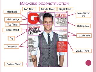
MAGAZINE DECONSTRUCTION
Main Cover
line
Main Image
Masthead
Left Third Middle Third Right Third
Top Third
Middle Third
Bottom Third
Model credit
Selling line
Tag
Cover line
Cover line
KEY TERMINOLOGY
Masthead – This is the title of the magazine, it is usually done in a font
(typography) that is unique and that is associated to the specific brand.
Main image – The main image has to an eye catching picture that is normally
directly connected to the main feature of the magazine.
Tag – The ‘tag’ is also used to entice the reader, it uses words or phrases such as
‘An exclusive interview’, this tells the readers that they will not see it anywhere else.
Cover line – Cover lines are usually down the right hand side of a magazine and
they state the main articles that are inside the magazine.
Left third – This is an important feature for magazines that are sold from shelves,
when magazines are lined up along side each other, only the left third is visible to
the customers, so it needs to be eye-catching and stand out from other magazines.
Top third- The top section is also a really important part of the magazine as the
magazines may be stacked up so it could be the only part they see, this is usually
where the masthead and the face of the person on the magazine are found as
these are what the customer will recognise straight away.
Main cover line – This is a short statement about the main article within the
magazine.
Selling line – This is a short description that describes the magazine, it should be
sharp and should draw the reader in.
They use celebrity
endorsements on the front of
magazines to draw the reader
in. If the customer likes the
celebrity on the cover or if
they’ve heard of the person
they are more likely to
purchase the magazine as they
want to know what this
influential person have done to
be on the front cover
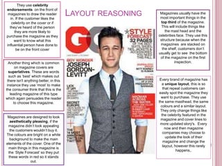
Magazines usually have the
most important things in the
top third of the magazine.
This will include things like
the mast head and the
celebrities face. They use this
structure because when the
magazines are stacked on
the shelf, customers don’t
usually get to see the bottom
of the magazine on the first
inspection.
Magazines are designed to look
aesthetically pleasing, if the
magazine didn’t look appealing
the customers wouldn’t buy it.
The colours are bright on a white
background to make the main
elements of the cover. One of the
main things in this magazine is
the ‘Style Forecast’ so they put
these words in red so it stands
out.
LAYOUT REASONING
Every brand of magazine has
a unique layout, this is so
that repeat customers can
easily spot the magazine they
want to purchase. They use
the same masthead, the same
colours and a similar layout.
They only change things like
the celebrity featured in the
magazine and cover lines to
more updated story's. Every
now and then magazine
companies may choose to
update the look of their
magazine and change the
layout, however this rarely
happens,.
Another thing which is common
on magazine covers are
superlatives. These are words
such as ‘best’ which makes out
there isn't anything better, in this
instance they use ‘most’ to make
the consumer think that this is the
leading magazine of this type
which again persuades the reader
to choose this magazine.
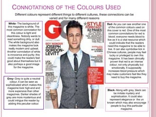
CONNOTATIONS OF THE COLOURS USED
Different colours represent different things to different cultures, these connections can be
varied and for many different reasons
White- The background of
this magazine is white. The
most common connotation for
this colour is light and
cleanliness. Nobody wants to
read something dirty, or dull.
The white background also
makes the magazine look
really modern and upbeat.
Another connotation of white
is innocence and purity; this
could make the readers feel
good about themselves but it
also portrays a good image
for the magazine.
Red- As you can see another one
of the common colours used on
this cover is red. One of the most
common connotations for red is
blood; everyone needs blood to
live as it is a vital resource which
could indicate that the readers
need this magazine to be able to
live. It can also symbolise lick in
Chinese cultures, people may feel
lucky or privileged to own this
magazine. It has been clinically
proven that red is an intense
colour, not only physically but
emotionally. It supposedly
increases blood pressure which
may make customers feel like they
need to buy the magazine.
Grey- Grey is quite a neutral
colour, it can be seen as
sophisticated which makes this
magazine look high-end and
more expensive than other
magazines. Darker shades of
grey are more mysterious and
could intrigue the reader by
adding this peculiar colour.
Black- Along with grey, black can
be imitate mystery and
sophistication. It could also
represent elegance or the un
known which may also encourage
people to buy this particular
magazine.
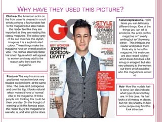
WHY HAVE THEY USED THIS PICTURE?
Clothes- The American actor on
the front cover is dressed in a suit
which portrays a fashionable feel
to the magazine but also makes
the reader feel like they are
important as they are reading this
classy magazine. The colour grey
of the suit matches this stylish
image as it is a sophisticated
colour. These things make the
magazine have an overall positive
vibe. The clothes also help flatter
his toned figure which will appeal
to women and may add to the
reason why they want the
magazine.
Posture- The way his arms are
positioned makes him look very
relaxed but confident at the same
time. The pose isn't outrageous
and over the top; it looks natural
which makes it have a ‘normal’
vibe to the magazine. It tricks
people into thinking this could be
them one day. On the thought of
wanting to be this famous actor,
the reader buys the magazine to
see who is and what job he does.
Facial expressions- From
faces you can tell many
different things. One of the
things you can tell is
emotions, the actor on this
magazine isn't overly
smiling but isn't frowning
either. This intrigues the
reader and makes them
think why is he in this
magazine. His eyebrows
are also raised slightly
which looks him look a bit
smug or arrogant, but also
very pleasing to the women
out there which could be
who this magazine is aimed
at.
Hair- How the models hair
is done can also indicate
what type of person they
are. In this case, his hair
looks a bit messy in places,
but not too shabby. In fact
some people may find this
look attractive.

Magazine conventions

  • 1.
  • 2.
    MAGAZINE DECONSTRUCTION Main Cover line MainImage Masthead Left Third Middle Third Right Third Top Third Middle Third Bottom Third Model credit Selling line Tag Cover line Cover line
  • 3.
    KEY TERMINOLOGY Masthead –This is the title of the magazine, it is usually done in a font (typography) that is unique and that is associated to the specific brand. Main image – The main image has to an eye catching picture that is normally directly connected to the main feature of the magazine. Tag – The ‘tag’ is also used to entice the reader, it uses words or phrases such as ‘An exclusive interview’, this tells the readers that they will not see it anywhere else. Cover line – Cover lines are usually down the right hand side of a magazine and they state the main articles that are inside the magazine. Left third – This is an important feature for magazines that are sold from shelves, when magazines are lined up along side each other, only the left third is visible to the customers, so it needs to be eye-catching and stand out from other magazines. Top third- The top section is also a really important part of the magazine as the magazines may be stacked up so it could be the only part they see, this is usually where the masthead and the face of the person on the magazine are found as these are what the customer will recognise straight away. Main cover line – This is a short statement about the main article within the magazine. Selling line – This is a short description that describes the magazine, it should be sharp and should draw the reader in.
  • 4.
    They use celebrity endorsementson the front of magazines to draw the reader in. If the customer likes the celebrity on the cover or if they’ve heard of the person they are more likely to purchase the magazine as they want to know what this influential person have done to be on the front cover Magazines usually have the most important things in the top third of the magazine. This will include things like the mast head and the celebrities face. They use this structure because when the magazines are stacked on the shelf, customers don’t usually get to see the bottom of the magazine on the first inspection. Magazines are designed to look aesthetically pleasing, if the magazine didn’t look appealing the customers wouldn’t buy it. The colours are bright on a white background to make the main elements of the cover. One of the main things in this magazine is the ‘Style Forecast’ so they put these words in red so it stands out. LAYOUT REASONING Every brand of magazine has a unique layout, this is so that repeat customers can easily spot the magazine they want to purchase. They use the same masthead, the same colours and a similar layout. They only change things like the celebrity featured in the magazine and cover lines to more updated story's. Every now and then magazine companies may choose to update the look of their magazine and change the layout, however this rarely happens,. Another thing which is common on magazine covers are superlatives. These are words such as ‘best’ which makes out there isn't anything better, in this instance they use ‘most’ to make the consumer think that this is the leading magazine of this type which again persuades the reader to choose this magazine.
  • 5.
    CONNOTATIONS OF THECOLOURS USED Different colours represent different things to different cultures, these connections can be varied and for many different reasons White- The background of this magazine is white. The most common connotation for this colour is light and cleanliness. Nobody wants to read something dirty, or dull. The white background also makes the magazine look really modern and upbeat. Another connotation of white is innocence and purity; this could make the readers feel good about themselves but it also portrays a good image for the magazine. Red- As you can see another one of the common colours used on this cover is red. One of the most common connotations for red is blood; everyone needs blood to live as it is a vital resource which could indicate that the readers need this magazine to be able to live. It can also symbolise lick in Chinese cultures, people may feel lucky or privileged to own this magazine. It has been clinically proven that red is an intense colour, not only physically but emotionally. It supposedly increases blood pressure which may make customers feel like they need to buy the magazine. Grey- Grey is quite a neutral colour, it can be seen as sophisticated which makes this magazine look high-end and more expensive than other magazines. Darker shades of grey are more mysterious and could intrigue the reader by adding this peculiar colour. Black- Along with grey, black can be imitate mystery and sophistication. It could also represent elegance or the un known which may also encourage people to buy this particular magazine.
  • 6.
    WHY HAVE THEYUSED THIS PICTURE? Clothes- The American actor on the front cover is dressed in a suit which portrays a fashionable feel to the magazine but also makes the reader feel like they are important as they are reading this classy magazine. The colour grey of the suit matches this stylish image as it is a sophisticated colour. These things make the magazine have an overall positive vibe. The clothes also help flatter his toned figure which will appeal to women and may add to the reason why they want the magazine. Posture- The way his arms are positioned makes him look very relaxed but confident at the same time. The pose isn't outrageous and over the top; it looks natural which makes it have a ‘normal’ vibe to the magazine. It tricks people into thinking this could be them one day. On the thought of wanting to be this famous actor, the reader buys the magazine to see who is and what job he does. Facial expressions- From faces you can tell many different things. One of the things you can tell is emotions, the actor on this magazine isn't overly smiling but isn't frowning either. This intrigues the reader and makes them think why is he in this magazine. His eyebrows are also raised slightly which looks him look a bit smug or arrogant, but also very pleasing to the women out there which could be who this magazine is aimed at. Hair- How the models hair is done can also indicate what type of person they are. In this case, his hair looks a bit messy in places, but not too shabby. In fact some people may find this look attractive.