Bur Dubai Call Girls O58993O4O2 Call Girls in Bur Dubai
Media evaluation question 1
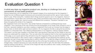
1. Evaluation Question 1
In what way does my magazine product use, develop or challenge form and
conventions of real media products?
Having researched a lot of magazines in the research stages of our productions for the magazine. I
looked at a lot of different types of products and conventions that would suit the genre I have chosen
which is pop. When doing this, I realised which things would be good to use in my magazine. Some of
the conventions I found were very commonly used, these conventions were ones such as rule of thirds,
the three colour palette rule, mise-en-scene and different font variations. Therefore I decided to use
these throughout the whole of my magazine.
My magazine's front cover has some very similar features compared to a professional pop music
magazine. This is because of the rule of thirds from the photograph of my model. Rule of thirds is one of
the main elements needed to use when creating a magazine's front cover as it shows how the page is
broken down (in thirds left to right and top to bottom). On my magazine the title is along the top and the
headline is in the lower third. This reflects professionalism in my magazine, making it appear realistic.
The reason I put the main headline in the lower third, was because it was easy for the reader to see and
stood out underneath the models face. This can also show the audience that it is the most important part
of the page, so at a quick glance they will want to buy the magazine if they can see the headline. The
removal of dead space is also used to make a magazine appear full and attracting the audience as the
audience can see a busy page causing them to want to read more.. Finally the image is towards the right
hand side of the magazine, this was placed here as this is the way the audience’s eye will go to it
straight away, however because your eyes naturally read from left to right, this will make the audience
read the writing to the left of it. The size of the image will help the audience view it easily, showing them
what the main interview is about.
2. Content page - On most content pages the rule of thirds is usually not very
clear, this is mainly because they have to be organised and show as much
detail of what will be included inside the magazine, this can really benefit to
selling the magazine to people as they could find something inside they would
like to read about and want to buy it to read the article. On both of the
magazines you can see where rule of thirds is put into place clearly, this is
another convention that is important to follow as it shows good organisation
skills and it makes it easier for the reader to find what they want. The main
article in my magazine has a large image in the middle of the page, this will
help draw the audience to the middle and show of the magazine to the
audience. I also decided to add an editor's note and a subscription number, this
is because they are used in all professional magazines and makes my
magazine look more realistic and professional. Finally all of the other stories
that may interest the audience are to the left side of the contents page, this is
because people naturally read from left to right so it is one of the first things
that the audience will see.
Double Page Spread - Even though the double page spread is made mainly
using text, magazines also use some of the key features in the rule of thirds
that I have used in my work such as using the three colour palate rule, this
makes the page look neater and easier for the audience to read.