Explaning my media contents
•Download as DOC, PDF•
0 likes•69 views
The document discusses design choices made for a magazine. Key elements like "The Usual" and "Inside This Week" were kept in a simple consistent style to look familiar to regular readers. Additional sections like free offers and contents were placed discreetly to not distract from the main content but still be noticeable. Bold 3D text is used for important sections to make them stand out from other writing and be the first thing a reader sees. Glow effects are also used sparingly to draw attention to select elements.
Report
Share
Report
Share
Recommended
Research
The document discusses the layout and design elements of a school magazine cover. It notes that the main image features a smiling school girl to appeal to the target audience. However, the cover is criticized for lacking a splash headline to attract readers' attention. The masthead clearly displays the magazine's name for branding purposes. Subheadings and additional photos provide a preview of stories and depict student life to engage readers.
Front cover analysis
The document discusses the design choices for a magazine masthead and cover. The title "Mash-up" was selected to appeal to fans of rock and metal music. A distinctive but readable font was used for the masthead. A centered photo of the author with a serious expression was used as the main cover image to suit the magazine's tone. A barcode was placed in the bottom corner out of the way but following industry standard. A brief advertisement on the cover highlights some inside content and aims to attract the target readership.
Step by step front page.png
The document describes the process of designing the front cover of a magazine. Key details include choosing a darker purple for the masthead to stand out against the off-white background, adding a photo of a band to portray a lighthearted feel, and including promotional text and headlines in different colors and styles to draw attention and curiosity from potential readers. The goal is to craft an eye-catching cover that will entice people to buy the magazine from the store shelf.
Interview
The interviewee expressed interest in a grime music magazine to keep up with the genre. They would like to see playlists of classic songs, images, interviews, and posters. They prefer a print magazine over a digital one for ease of reading. A monthly release schedule would allow for more content between issues. The interviewee stated they would pay £5 maximum for the magazine and would want good value for that price.
Front cover analysis
The document discusses the design choices made for the magazine cover. The title "Mash-up" was selected to appeal to fans of rock and metal music. A centered photo of the author with a serious expression was used as the main visual. Additional elements like a barcode, advertisements of interior articles, and colored text against a gradient background were included to make the cover appealing while clearly presenting information to the target audience.
Contents page analysis
The document summarizes the contents page of a magazine. It notes that there are three images on the contents page - a medium-long image of the model from the front cover to entice readers to buy the magazine, and two other medium-sized images, one in black and white portraying a classical theme. It also discusses the layout, organization, colors, and codes and conventions used on the contents page.
Contents page analysis
The document discusses design elements and strategies for crafting an effective contents page for a music magazine. It notes that the model's bright costume on one page stands out among darker images and grabs readers' attention. Text sizes must be large enough to read easily while maintaining interest. A variety of images and clear labeling of featured artists provides readers insight into the magazine's content and prevents boredom. Facial expressions need to appear welcoming to engage the audience.
Contents page analysis 2
The contents page of the magazine "We Love Pop" follows conventions of typical magazine contents pages. It includes a short letter from the editor to set the tone, brief details and page numbers for articles, and related images. The main title stands out in bold black letters, and the magazine logo helps maintain brand identity. Images of featured artists help guide the reader's eye around the page. The list of articles is brief but intriguing, leaving an element of surprise. Through direct address, informal language, and a focus on topics of interest like music and fashion, the magazine aims to feel like a friend to its young female readers.
Research on NME Music Magazines
Olivia Atkinson wants to research magazine covers, specifically NME magazines. She plans to look closely at cover designs and also visit shops to examine magazines firsthand. This will provide a broader range than online research alone. Olivia has also reviewed other students' blogs about magazine design for ideas. Her goal is to apply research, software skills, feedback and best efforts to create a high-quality magazine of her own.
Favourtie Front Covers
This document summarizes the key aspects that the author likes from different music magazine covers that could inspire their own magazine cover design. The covers have large prominent images, minimal additional information presented in a light and organized manner, and appeal to different music genres to attract a wide audience.
Final front cover print screens
This document describes the process of designing the front cover of an EDM magazine. The designer chose a crowd photo from an EDM club in London as the main image. Text was added including the magazine masthead, skyline, festival name, artist names, and cover lines. Feedback indicated the cover had too much text and was too dark, so the designer lightened the image and reduced the text based on magazines like NME and DJ Mag.
Media evaluation question 1
My magazine uses conventions from real media products to appear professional and realistic. On the front cover, I followed the rule of thirds by placing the title along the top and main headline in the lower third, with the image on the right side to guide the eye. The content page also uses conventions like rule of thirds and a large central image to draw the eye to stories of interest. Even on text-heavy spreads, I apply techniques like the three-color palette rule to make the pages neat and easy to read. Overall, my magazine adopts standard formatting rules and features found in professional pop music magazines.
Front cover analysis
The document analyzes the front covers of three music magazines: MixMag, NME, and Kerrang. For MixMag, it discusses the use of a flash box to attract readers and a photo of Carl Craig looking serious to portray him as dedicated to his music. For NME, it notes the use of photos in flash boxes requiring readers to open the magazine, and full name identification. For Kerrang, it describes the many flash boxes to continually engage readers and a "K" identifier for fans. Across magazines, headlines are designed to entice readers to learn more and buy the issue.
Evaluation draft answers
This document discusses how the media product follows conventions of real magazines. It puts the title in the corner to draw attention as other magazines do. It includes things like issue numbers, dates, barcodes and prices to look like a real product. The front cover uses an interesting celebrity story to grab readers. The document also discusses how the product was developed, like expanding on the artistic style of Blend magazine but changing it to fit a music genre rather than fashion. The photos were made larger to better draw in readers rather than being small like in Blend.
Magazine Research
The document summarizes the author's visit to a magazine newsstand to research teen fashion magazines for a school project. The author observes that Seventeen magazine stood out due to its central location and eye-catching cover designs. Upon closer examination, Seventeen had an organized table of contents that inspired the author. The target demographic for Seventeen is teenage girls ages 15-18. Overall, visiting the newsstand helped the author better understand magazine layout and design elements to apply to their own school project.
How does your media represent a particular social
This document discusses how a teen magazine represents young adult social groups. The cover features Tanisha, a stereotypical portrayal of an older teen girl doing her makeup and dressing in a stylish way. The contents page again shows Tanisha and another young woman standing confidently. A quote from Tanisha serves as the magazine's main focus, intended to inspire readers to believe in themselves. The layout is simple with pictures, writing categories, and a pop star interview article used as an example to attract the target age range by intriguing them to learn more about her confidence.
Magazine research
Little White Lies magazine is known for its artist themes. The article notes strong clashing colors and small page details in the magazine. It recommends basing a magazine on Little White Lies' lead reviews down the sides and printing photos over page folds to make images stand out. The text is aligned in a singular column rather than multiple columns as in most magazines. The page layout is the same as the previous one, with a conventional three-part small summary at the bottom.
Deconstruction Of School Magazines
The document summarizes and compares the front covers of two issues of a school magazine called "Pinch of Salt". The older cover has a plain design with younger student models in school uniform and a banner indicating the magazine's contents. The newer cover maintains a similar basic design but with more prominent text, student models whose school affiliation is unclear, and a slogan at the bottom to create future recognition.
Q5
To attract their target audience of 6th form students, the author sent out a questionnaire to learn what aspects would grab their attention. Respondents said a bright, colorful color scheme and masthead would attract attention on shelves. The main image in a common room setting and headlines on the left third address the audience by showing content is about them and their interests.
Researching Genre
The document discusses different elements that are commonly found on rock music magazine covers, including the masthead, main headline, and vignettes. It notes that the masthead is usually the largest text located at the top of the cover to grab attention. The main headline conveys the main story and helps readers identify the genre. Vignettes use subtle gradients to draw the eye into the center of the cover. The document concludes that an effective magazine cover should include these features and use high-quality images and appropriate attire for the genre.
Content 2
The document provides guidance for designing the contents page of a magazine to attract and engage readers. It recommends listing the title on the left side for consistency, including a picture of a well-known band to appeal to many readers, and organizing the content into clear sections. It also suggests including a teaser for an article to encourage reading further and advertisements about subscription offers and an upcoming gig guide.
Fonts
The document discusses font and color choices for a magazine cover. For fonts, the author wants to use three similar sans serif fonts for text, with a bolder font for the masthead to make it stand out. Sans serif fonts are chosen to seem more informal for the target audience of females aged 18-30. The chosen colors are purples and blues, as these were advised to suit the target audience better than other colors like pink. Blues represent qualities like trust and calmness, relating to the beach sunset cover image. Purples represent luxury, relevant to the magazine's luxury boutique shop contents. Darker blues and purples will mainly be used.
Magazine deconstructions (media coursework)
This document summarizes Rumaana Haq's research on magazines. It deconstructs a school magazine and music magazine in 4 slides each. The school magazine uses large text and photos to emphasize the school name and catch parents' eyes. It provides information without being too detailed to entice reading the full magazine. The music magazine uses bold colors, large headlines and photos taking the full page to attract attention and showcase the featured artist. It provides just enough information under headlines to make readers want to purchase the magazine to learn more. Both magazines aim to effectively catch readers' eyes and interest them with their layout, images and short descriptions.
Magazine conventions
The document discusses magazine layout conventions and design. It explains that magazines strategically place elements like the masthead, main image, and cover lines in the top third to attract customers browsing shelves. Celebrity images and eye-catching designs draw readers' attention. Layout, color choices, and language are carefully crafted to entice purchases and reinforce the magazine's brand.
Contents page analysis
The document discusses the layout and design of a magazine contents page. It describes several key design elements, including the masthead in the top left corner, sub-images showing a range of emotions, and a main image of an artist featuring prominently. The page number is written in white to stand out against dark photos and help readers easily find the corresponding article. The contents listing and page numbers are intended to provide readers a guide to the magazine's features and allow them to quickly locate sections of interest.
Evaluation of preliminary task
The document summarizes the student's process for developing a preliminary task of designing a college magazine cover and contents page. The student followed typical magazine conventions like using a masthead, slogan, coverline, central image focusing on a student's eyes, and barcode. For the contents page, the student included a relating title, words to create a friendly tone, and buzzwords to draw attention. The student learned following conventions helps make the magazine look realistic, and better photography quality would improve realism.
House Style Analysis.
The document discusses techniques that demonstrate the house style of the music magazine Vibe. Specifically:
1) The masthead is always located in the top corner and split over three lines for consistency and readability.
2) The font sizes, styles and colors are the same throughout issues, making the magazines organized, professional and easy to read.
3) Striking central images on the covers, such as of an attractive person or public figure, are used to attract different audiences and advertise the main focus of each issue.
Research
The document analyzes and summarizes several existing magazine covers. It finds that they commonly have a minimalist and neutral color scheme, with occasional pops of bold color. Images focus on clothing and models in clean, bright lighting. Layouts are simple with large central images and fonts that are easy to read. While basic, these designs look elegant and help the magazines stand out on shelves. The analysis considers incorporating similar minimalist styles for a new magazine, including a patterned background and subtle use of color.
Research
The document analyzes and summarizes several existing magazine covers. It finds that they commonly have a minimalist and neutral color scheme, with one or two bold colors used sparingly. Images are laid out clearly without overlapping. Fonts are usually bold, capitalized, and easy to read. The analyzed magazines demonstrate clean, elegant styles that appeal to target audiences. Overall, the document examines the visual design elements of different magazine covers to inform the creation of a new magazine.
Research
Based on the primary and secondary audience research provided, the target audience for this magazine would be:
- Women ages 18-49
- Employed professionals
- College educated
- Middle to high income earners ($50k+)
- Interested in fashion and lifestyle topics like beauty, health, culture
- Engage with fashion content online through social media more than print magazines
- Follow trends but also wear their own style
- Enjoy both affordable and high-end clothing brands
- Prefer convenience of online shopping over in-store
The research indicates this magazine should feature fashion forward content and focus on visual presentation to engage audience online. Both mainstream trends and individual styles should be represented. The tone should be aspir
More Related Content
What's hot
Research on NME Music Magazines
Olivia Atkinson wants to research magazine covers, specifically NME magazines. She plans to look closely at cover designs and also visit shops to examine magazines firsthand. This will provide a broader range than online research alone. Olivia has also reviewed other students' blogs about magazine design for ideas. Her goal is to apply research, software skills, feedback and best efforts to create a high-quality magazine of her own.
Favourtie Front Covers
This document summarizes the key aspects that the author likes from different music magazine covers that could inspire their own magazine cover design. The covers have large prominent images, minimal additional information presented in a light and organized manner, and appeal to different music genres to attract a wide audience.
Final front cover print screens
This document describes the process of designing the front cover of an EDM magazine. The designer chose a crowd photo from an EDM club in London as the main image. Text was added including the magazine masthead, skyline, festival name, artist names, and cover lines. Feedback indicated the cover had too much text and was too dark, so the designer lightened the image and reduced the text based on magazines like NME and DJ Mag.
Media evaluation question 1
My magazine uses conventions from real media products to appear professional and realistic. On the front cover, I followed the rule of thirds by placing the title along the top and main headline in the lower third, with the image on the right side to guide the eye. The content page also uses conventions like rule of thirds and a large central image to draw the eye to stories of interest. Even on text-heavy spreads, I apply techniques like the three-color palette rule to make the pages neat and easy to read. Overall, my magazine adopts standard formatting rules and features found in professional pop music magazines.
Front cover analysis
The document analyzes the front covers of three music magazines: MixMag, NME, and Kerrang. For MixMag, it discusses the use of a flash box to attract readers and a photo of Carl Craig looking serious to portray him as dedicated to his music. For NME, it notes the use of photos in flash boxes requiring readers to open the magazine, and full name identification. For Kerrang, it describes the many flash boxes to continually engage readers and a "K" identifier for fans. Across magazines, headlines are designed to entice readers to learn more and buy the issue.
Evaluation draft answers
This document discusses how the media product follows conventions of real magazines. It puts the title in the corner to draw attention as other magazines do. It includes things like issue numbers, dates, barcodes and prices to look like a real product. The front cover uses an interesting celebrity story to grab readers. The document also discusses how the product was developed, like expanding on the artistic style of Blend magazine but changing it to fit a music genre rather than fashion. The photos were made larger to better draw in readers rather than being small like in Blend.
Magazine Research
The document summarizes the author's visit to a magazine newsstand to research teen fashion magazines for a school project. The author observes that Seventeen magazine stood out due to its central location and eye-catching cover designs. Upon closer examination, Seventeen had an organized table of contents that inspired the author. The target demographic for Seventeen is teenage girls ages 15-18. Overall, visiting the newsstand helped the author better understand magazine layout and design elements to apply to their own school project.
How does your media represent a particular social
This document discusses how a teen magazine represents young adult social groups. The cover features Tanisha, a stereotypical portrayal of an older teen girl doing her makeup and dressing in a stylish way. The contents page again shows Tanisha and another young woman standing confidently. A quote from Tanisha serves as the magazine's main focus, intended to inspire readers to believe in themselves. The layout is simple with pictures, writing categories, and a pop star interview article used as an example to attract the target age range by intriguing them to learn more about her confidence.
Magazine research
Little White Lies magazine is known for its artist themes. The article notes strong clashing colors and small page details in the magazine. It recommends basing a magazine on Little White Lies' lead reviews down the sides and printing photos over page folds to make images stand out. The text is aligned in a singular column rather than multiple columns as in most magazines. The page layout is the same as the previous one, with a conventional three-part small summary at the bottom.
Deconstruction Of School Magazines
The document summarizes and compares the front covers of two issues of a school magazine called "Pinch of Salt". The older cover has a plain design with younger student models in school uniform and a banner indicating the magazine's contents. The newer cover maintains a similar basic design but with more prominent text, student models whose school affiliation is unclear, and a slogan at the bottom to create future recognition.
Q5
To attract their target audience of 6th form students, the author sent out a questionnaire to learn what aspects would grab their attention. Respondents said a bright, colorful color scheme and masthead would attract attention on shelves. The main image in a common room setting and headlines on the left third address the audience by showing content is about them and their interests.
Researching Genre
The document discusses different elements that are commonly found on rock music magazine covers, including the masthead, main headline, and vignettes. It notes that the masthead is usually the largest text located at the top of the cover to grab attention. The main headline conveys the main story and helps readers identify the genre. Vignettes use subtle gradients to draw the eye into the center of the cover. The document concludes that an effective magazine cover should include these features and use high-quality images and appropriate attire for the genre.
Content 2
The document provides guidance for designing the contents page of a magazine to attract and engage readers. It recommends listing the title on the left side for consistency, including a picture of a well-known band to appeal to many readers, and organizing the content into clear sections. It also suggests including a teaser for an article to encourage reading further and advertisements about subscription offers and an upcoming gig guide.
Fonts
The document discusses font and color choices for a magazine cover. For fonts, the author wants to use three similar sans serif fonts for text, with a bolder font for the masthead to make it stand out. Sans serif fonts are chosen to seem more informal for the target audience of females aged 18-30. The chosen colors are purples and blues, as these were advised to suit the target audience better than other colors like pink. Blues represent qualities like trust and calmness, relating to the beach sunset cover image. Purples represent luxury, relevant to the magazine's luxury boutique shop contents. Darker blues and purples will mainly be used.
Magazine deconstructions (media coursework)
This document summarizes Rumaana Haq's research on magazines. It deconstructs a school magazine and music magazine in 4 slides each. The school magazine uses large text and photos to emphasize the school name and catch parents' eyes. It provides information without being too detailed to entice reading the full magazine. The music magazine uses bold colors, large headlines and photos taking the full page to attract attention and showcase the featured artist. It provides just enough information under headlines to make readers want to purchase the magazine to learn more. Both magazines aim to effectively catch readers' eyes and interest them with their layout, images and short descriptions.
Magazine conventions
The document discusses magazine layout conventions and design. It explains that magazines strategically place elements like the masthead, main image, and cover lines in the top third to attract customers browsing shelves. Celebrity images and eye-catching designs draw readers' attention. Layout, color choices, and language are carefully crafted to entice purchases and reinforce the magazine's brand.
Contents page analysis
The document discusses the layout and design of a magazine contents page. It describes several key design elements, including the masthead in the top left corner, sub-images showing a range of emotions, and a main image of an artist featuring prominently. The page number is written in white to stand out against dark photos and help readers easily find the corresponding article. The contents listing and page numbers are intended to provide readers a guide to the magazine's features and allow them to quickly locate sections of interest.
Evaluation of preliminary task
The document summarizes the student's process for developing a preliminary task of designing a college magazine cover and contents page. The student followed typical magazine conventions like using a masthead, slogan, coverline, central image focusing on a student's eyes, and barcode. For the contents page, the student included a relating title, words to create a friendly tone, and buzzwords to draw attention. The student learned following conventions helps make the magazine look realistic, and better photography quality would improve realism.
House Style Analysis.
The document discusses techniques that demonstrate the house style of the music magazine Vibe. Specifically:
1) The masthead is always located in the top corner and split over three lines for consistency and readability.
2) The font sizes, styles and colors are the same throughout issues, making the magazines organized, professional and easy to read.
3) Striking central images on the covers, such as of an attractive person or public figure, are used to attract different audiences and advertise the main focus of each issue.
What's hot (19)
Similar to Explaning my media contents
Research
The document analyzes and summarizes several existing magazine covers. It finds that they commonly have a minimalist and neutral color scheme, with occasional pops of bold color. Images focus on clothing and models in clean, bright lighting. Layouts are simple with large central images and fonts that are easy to read. While basic, these designs look elegant and help the magazines stand out on shelves. The analysis considers incorporating similar minimalist styles for a new magazine, including a patterned background and subtle use of color.
Research
The document analyzes and summarizes several existing magazine covers. It finds that they commonly have a minimalist and neutral color scheme, with one or two bold colors used sparingly. Images are laid out clearly without overlapping. Fonts are usually bold, capitalized, and easy to read. The analyzed magazines demonstrate clean, elegant styles that appeal to target audiences. Overall, the document examines the visual design elements of different magazine covers to inform the creation of a new magazine.
Research
Based on the primary and secondary audience research provided, the target audience for this magazine would be:
- Women ages 18-49
- Employed professionals
- College educated
- Middle to high income earners ($50k+)
- Interested in fashion and lifestyle topics like beauty, health, culture
- Engage with fashion content online through social media more than print magazines
- Follow trends but also wear their own style
- Enjoy both affordable and high-end clothing brands
- Prefer convenience of online shopping over in-store
The research indicates this magazine should feature fashion forward content and focus on visual presentation to engage audience online. Both mainstream trends and individual styles should be represented. The tone should be aspir
Research
The document analyzes and summarizes several existing magazine covers. It finds that they commonly have a minimalist and neutral color scheme, with one or two bold colors used sparingly. Images are laid out clearly without overlapping. Fonts are usually bold, capitalized, and easy to read. The analyzed magazines demonstrate clean, elegant styles that appeal to target audiences. Overall, the document examines the visual design elements of different magazine covers to inform the creation of a new magazine.
Deconstruction.
This document provides an analysis of magazine covers and pages. It examines elements like layout, color schemes, images, and text to understand how they attract readers and represent the magazine's brand. Specific covers and pages from magazines like Q, Billboard, and Vibe are deconstructed in detail. The purpose is to understand techniques used to make the content appealing and informative for the target audience.
The Screenshots
The document discusses the process of designing a magazine cover and contents page. It describes choosing and editing photos to use, designing coverlines and mastheads, and arranging layouts. The goal was to attract teenage girl readers by including fashion, music, and topics of interest like horoscopes and puzzles. Photos were edited to pop out and draw attention, with coverlines used to entice readers to learn more inside. The color scheme and creative designs aimed to stand out from other magazines and bridge the gap between fashion and music publications.
Contents
The document discusses the contents page of a magazine, praising certain design elements and critiquing others. It notes that the contents page is split into groups to make it easier to read and uses simple, unisex colors. However, it criticizes a yellow box that disrupts the color scheme and makes the page look "tacky." Overall, it appreciates the use of bold images and titles to draw the eye while keeping the text concise and readable.
Market research
This document provides information about magazines published in the UK and their production companies through four paragraphs. The first paragraph introduces that many music magazines are published in the UK by a handful of large production companies that also work in other media. The following paragraphs then discuss the specific companies that publish popular music magazines like Kerrang!, Mojo, Classic Rock, Q Magazine, and Prog, providing details on their ownership and other publications.
Contents page analysi
The document analyzes and compares the contents pages of three music magazines: MixMag, NME, and Kerrang. It finds that MixMag and NME have neatly organized contents pages that make articles and sections easy to find. Kerrang's page is less neat but still readable. All three magazines use prominent images related to current music topics and group regular sections together clearly.
Contents page analysi
The document analyzes and compares the contents pages of three music magazines: MixMag, NME, and Kerrang. It finds that MixMag and NME have neatly organized contents pages that make articles easy to find. Kerrang's page is less neat but still readable. All three magazines use prominent images related to current music topics and group regular features separately from other articles.
Draft Magazine Analysis
The document provides details on the design choices for the mock magazine's front cover, contents page, and double page spread. For the front cover, the designer wants the masthead to dominate and the main image to overlap it slightly. On the contents page, they choose to list the page numbers on the side rather than top to stand out. For the double page spread, they plan to feature a full-length interview across both pages in their consistent red and black color scheme.
Powerpoint
This document provides details on the design process for creating a film magazine called "Total Movie". Key points include:
- The creator used dark grey as the background color to effectively portray thrillers on the magazine cover.
- Elements like the title "MOVIE" and slogan "The Greatest Film Magazine Ever" were styled with different fonts, sizes, and positioning to draw attention.
- Film titles and the word "EXCLUSIVE" were added to attract interested readers and highlight exclusive content.
- Additional details like date, price, and planned addition of a barcode were included to provide relevant information to readers.
Evaluation question 1
My magazine shares some similarities with other music magazines, such as featuring a main image on the front cover to advertise the main article. However, it also has unique elements, such as being named after a Foster the People song. The front cover features an up-close photo of a friend portrayed as a rising music star, with the magazine's logo in the top left corner. Inside, it maintains a consistent three-color house style of red, black and white. The double-page interview spread prominently features the subject's photo across both pages and keeps the questioning and answers visually distinct through font coloring.
Music Magazine Research
The magazine cover uses large, bold fonts and bright colors to attract attention. Celebrities smiling and looking friendly helps appeal to younger audiences. While the busy layout and random placement of images and text distract from the main message. Overall the cover aims to draw readers in with popular celebrities and energetic designs, though could be more focused on its key selling points.
Evaluation 1
The document discusses various aspects of a music magazine front cover and contents page that the author created, including how they conform to or challenge conventions of real music magazines. For the front cover, the author focuses on the masthead, a centered image of two models, font and title style. The contents page aspects discussed are costumes and props of images and the portrayal of people. Overall, the author aims to create a simple, girly style for a pop music magazine while still following some standard magazine design conventions.
Research on music magazines
Olivia wants to research NME magazines by examining their front covers in detail and visiting shops to see magazines on display. She wants to buy an NME magazine as a guide for her own magazine's cover, contents page, and spreads. Online research only provides a limited selection, so physical magazines will offer more examples. Olivia has also researched other students' blogs with magazine samples for design ideas. She aims to make full use of research, software, information, and feedback to create the best magazine possible.
Media Question 1
- The magazine cover focuses on the artist Luna Jay, who is positioned in the center of the cover to draw the reader's eye.
- The background is a single color for clarity and the artist's face is unobstructed, keeping attention on her.
- The masthead is above the image so as not to distract from Luna Jay, and the headline links her to the main article inside.
Existing Acoustic Based Magazine Covers
The document summarizes the author's analysis of the covers of two magazines - "Acoustic" and "Rolling Stone". For "Acoustic", the author likes the simple layout and positioning of the image and text, but finds the fonts and color scheme too masculine. For "Rolling Stone", the author appreciates the simplicity, large central image, and representation of the artist's music, but dislikes the posed expression. Overall, the author is inspired to feature a natural-looking central image of a model holding a guitar in their own magazine cover design.
Analysing 3 magazine covers
The document analyzes 3 magazine covers. It summarizes each cover's key elements including the header, masthead, main image, main sell line, barcode/price, and additional details. For each cover, it describes design elements like fonts, colors, images and their purpose in attracting the intended audience for each magazine's genre of music.
2. Research
Based on the interview, here are some key points:
- Bright colors and interesting content would encourage reading a magazine
- Attractive design and eye-catching aspects would generate interest in a CD cover
- Including more content and varied font styles across products could make them seem more interesting
- The interviewee prefers listening to classic hit songs rather than newer music
This provides helpful insight into appealing to audiences. Focusing on visual design, inclusion of engaging content, and variety could make the products stand out. Catering to fans of older music broadens the target demographic. Overall, prioritizing attractiveness and interesting presentation seems important to capture attention and interest.
Similar to Explaning my media contents (20)
Recently uploaded
Andreas Schleicher presents PISA 2022 Volume III - Creative Thinking - 18 Jun...
Andreas Schleicher, Director of Education and Skills at the OECD presents at the launch of PISA 2022 Volume III - Creative Minds, Creative Schools on 18 June 2024.
BÀI TẬP BỔ TRỢ TIẾNG ANH LỚP 8 - CẢ NĂM - FRIENDS PLUS - NĂM HỌC 2023-2024 (B...
BÀI TẬP BỔ TRỢ TIẾNG ANH LỚP 8 - CẢ NĂM - FRIENDS PLUS - NĂM HỌC 2023-2024 (B...Nguyen Thanh Tu Collection
https://app.box.com/s/nrwz52lilmrw6m5kqeqn83q6vbdp8yzp220711130083 SUBHASHREE RAKSHIT Internet resources for social science
Internet resources for social science
Elevate Your Nonprofit's Online Presence_ A Guide to Effective SEO Strategies...
Whether you're new to SEO or looking to refine your existing strategies, this webinar will provide you with actionable insights and practical tips to elevate your nonprofit's online presence.
BPSC-105 important questions for june term end exam
BPSC-105 important questions for june term end exam
مصحف القراءات العشر أعد أحرف الخلاف سمير بسيوني.pdf
مصحف أحرف الخلاف للقراء العشرةأعد أحرف الخلاف بالتلوين وصلا سمير بسيوني غفر الله له
A Free 200-Page eBook ~ Brain and Mind Exercise.pptx
(A Free eBook comprising 3 Sets of Presentation of a selection of Puzzles, Brain Teasers and Thinking Problems to exercise both the mind and the Right and Left Brain. To help keep the mind and brain fit and healthy. Good for both the young and old alike.
Answers are given for all the puzzles and problems.)
With Metta,
Bro. Oh Teik Bin 🙏🤓🤔🥰
欧洲杯下注-欧洲杯下注押注官网-欧洲杯下注押注网站|【网址🎉ac44.net🎉】
【网址🎉ac44.net🎉】欧洲杯下注在体育博彩方面,不难发现,欧洲杯下注多为英式运动提供投注。欧洲杯下注为丰富多彩的体育项目提供投注,如足球、赛马、板球和飞镖,但这不是欧洲杯下注的唯一优势。在欧洲杯下注,全世界玩家都可以找到自己感兴趣的比赛进行投注。欧洲杯下注为网球和美式运动如棒球、美式足球、篮球、冰球开出的投注同样值得关注。在夏季或冬季奥运会方面,欧洲杯下注为玩家开出了丰富多彩的服务,是你的不二之选。你还可以投注水球、自行车和班迪球等小众体育项目,甚至可以为武术、拳击和综合格斗投注。欧洲杯下注为众多体育项目开出滚球投注。
Educational Technology in the Health Sciences
Plenary presentation at the NTTC Inter-university Workshop, 18 June 2024, Manila Prince Hotel.
Gender and Mental Health - Counselling and Family Therapy Applications and In...
A proprietary approach developed by bringing together the best of learning theories from Psychology, design principles from the world of visualization, and pedagogical methods from over a decade of training experience, that enables you to: Learn better, faster!
How to Manage Reception Report in Odoo 17
A business may deal with both sales and purchases occasionally. They buy things from vendors and then sell them to their customers. Such dealings can be confusing at times. Because multiple clients may inquire about the same product at the same time, after purchasing those products, customers must be assigned to them. Odoo has a tool called Reception Report that can be used to complete this assignment. By enabling this, a reception report comes automatically after confirming a receipt, from which we can assign products to orders.
CapTechTalks Webinar Slides June 2024 Donovan Wright.pptx
Slides from a Capitol Technology University webinar held June 20, 2024. The webinar featured Dr. Donovan Wright, presenting on the Department of Defense Digital Transformation.
Information and Communication Technology in Education
(𝐓𝐋𝐄 𝟏𝟎𝟎) (𝐋𝐞𝐬𝐬𝐨𝐧 2)-𝐏𝐫𝐞𝐥𝐢𝐦𝐬
𝐄𝐱𝐩𝐥𝐚𝐢𝐧 𝐭𝐡𝐞 𝐈𝐂𝐓 𝐢𝐧 𝐞𝐝𝐮𝐜𝐚𝐭𝐢𝐨𝐧:
Students will be able to explain the role and impact of Information and Communication Technology (ICT) in education. They will understand how ICT tools, such as computers, the internet, and educational software, enhance learning and teaching processes. By exploring various ICT applications, students will recognize how these technologies facilitate access to information, improve communication, support collaboration, and enable personalized learning experiences.
𝐃𝐢𝐬𝐜𝐮𝐬𝐬 𝐭𝐡𝐞 𝐫𝐞𝐥𝐢𝐚𝐛𝐥𝐞 𝐬𝐨𝐮𝐫𝐜𝐞𝐬 𝐨𝐧 𝐭𝐡𝐞 𝐢𝐧𝐭𝐞𝐫𝐧𝐞𝐭:
-Students will be able to discuss what constitutes reliable sources on the internet. They will learn to identify key characteristics of trustworthy information, such as credibility, accuracy, and authority. By examining different types of online sources, students will develop skills to evaluate the reliability of websites and content, ensuring they can distinguish between reputable information and misinformation.
220711130082 Srabanti Bag Internet Resources For Natural Science
Internet resources for natural science
Level 3 NCEA - NZ: A Nation In the Making 1872 - 1900 SML.ppt
The History of NZ 1870-1900.
Making of a Nation.
From the NZ Wars to Liberals,
Richard Seddon, George Grey,
Social Laboratory, New Zealand,
Confiscations, Kotahitanga, Kingitanga, Parliament, Suffrage, Repudiation, Economic Change, Agriculture, Gold Mining, Timber, Flax, Sheep, Dairying,
Recently uploaded (20)
Andreas Schleicher presents PISA 2022 Volume III - Creative Thinking - 18 Jun...
Andreas Schleicher presents PISA 2022 Volume III - Creative Thinking - 18 Jun...
BÀI TẬP BỔ TRỢ TIẾNG ANH LỚP 8 - CẢ NĂM - FRIENDS PLUS - NĂM HỌC 2023-2024 (B...
BÀI TẬP BỔ TRỢ TIẾNG ANH LỚP 8 - CẢ NĂM - FRIENDS PLUS - NĂM HỌC 2023-2024 (B...
220711130083 SUBHASHREE RAKSHIT Internet resources for social science
220711130083 SUBHASHREE RAKSHIT Internet resources for social science
Elevate Your Nonprofit's Online Presence_ A Guide to Effective SEO Strategies...
Elevate Your Nonprofit's Online Presence_ A Guide to Effective SEO Strategies...
BPSC-105 important questions for june term end exam
BPSC-105 important questions for june term end exam
مصحف القراءات العشر أعد أحرف الخلاف سمير بسيوني.pdf
مصحف القراءات العشر أعد أحرف الخلاف سمير بسيوني.pdf
A Free 200-Page eBook ~ Brain and Mind Exercise.pptx
A Free 200-Page eBook ~ Brain and Mind Exercise.pptx
220711130088 Sumi Basak Virtual University EPC 3.pptx
220711130088 Sumi Basak Virtual University EPC 3.pptx
Gender and Mental Health - Counselling and Family Therapy Applications and In...
Gender and Mental Health - Counselling and Family Therapy Applications and In...
CapTechTalks Webinar Slides June 2024 Donovan Wright.pptx
CapTechTalks Webinar Slides June 2024 Donovan Wright.pptx
Information and Communication Technology in Education
Information and Communication Technology in Education
220711130082 Srabanti Bag Internet Resources For Natural Science
220711130082 Srabanti Bag Internet Resources For Natural Science
Level 3 NCEA - NZ: A Nation In the Making 1872 - 1900 SML.ppt
Level 3 NCEA - NZ: A Nation In the Making 1872 - 1900 SML.ppt
Explaning my media contents
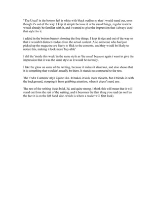
- 1. ' The Usual' in the bottom left is white with black outline so that i would stand out, even though it's out of the way. I kept it simple because it is the usual things, regular readers would already be familiar with it, and i wanted to give the impression that i always used that style for it. i added in the bottom banner showing the free things. I kept it nice and out of the way so that it wouldn't distract readers from the actual content. Also someone who had jsut picked up the magazine are likely to flick to the contents, and they would be likely to notice this, making it look more 'buy-able' I did the 'inside this week' in the same style as 'the usual' because again i want to give the impression that it was the same style as it would be normaly. I like the glow on some of the writing, because it makes it stand out, and also shows that it is something that wouldn't usually be there. It stands out compared to the rest. The 'FMA Contents' stlye i quite like. It makes it look more modern, but it blends in with the background, stopping it from grabbing attention, when it doesn't need any. The rest of the writing looks bold, 3d, and quite strong. I think this will mean that it will stand out from the rest of the writing, and it becomes the first thing you read (as well as the fact it is on the left hand side, which is where a reader will first look).